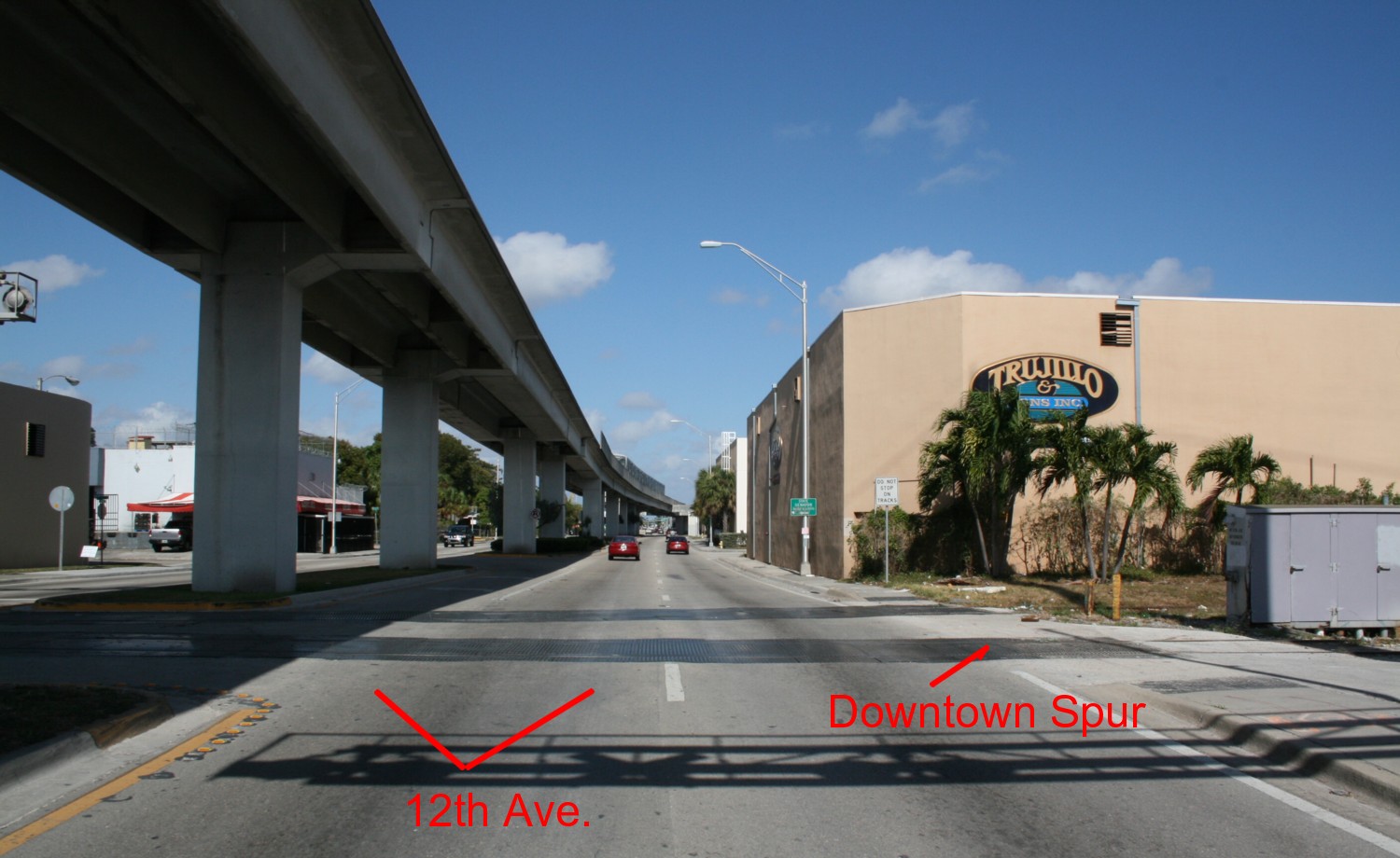
A key scene on The Downtown Spur is the point where the line crosses 12th Avenue. A major element is the Metrorail line running overhead. However, just because it’s there, should we model it?
My next book will be “Realism Principles For Model Railroaders”. Give me four to six months to get it on the shelves. Throwing a spoiler alert out there, it’s not going to go in the direction you might expect. Here’s one example. It’s counterintuitive, but there is tremendous power in strategic omission. That is, intentionally leaving something out. It’s odd, but the concept is one of “not” doing something to improve your results. Looked at another way I’d call it, “not shooting yourself in the foot”.
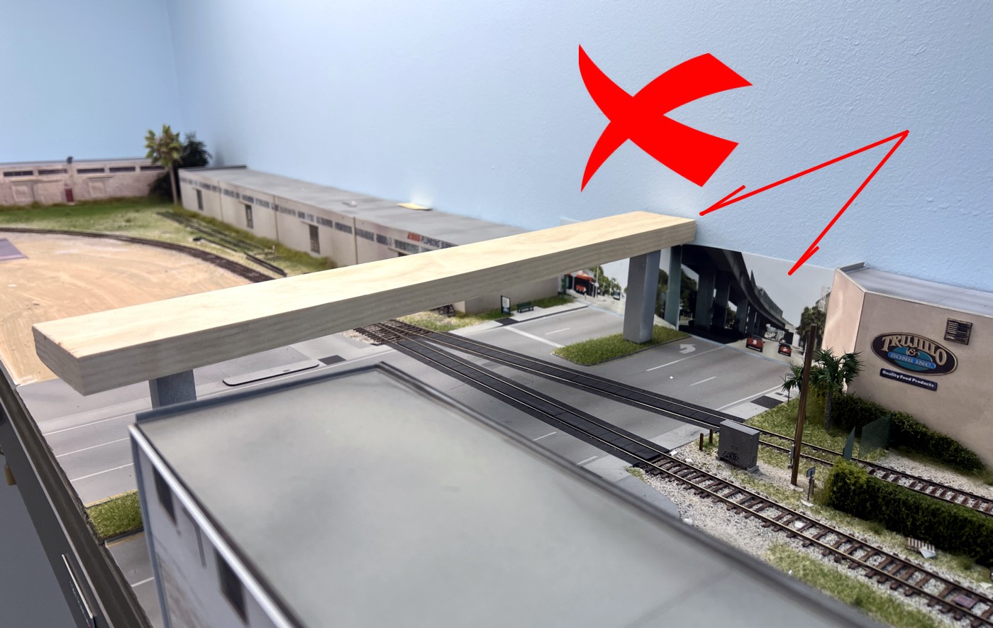
Prototype modelers have a tendency to fall into a subtle trap of what I call the “placeholder approach”. We look at a scene, make note of the elements in that scene, and then dutifully try to represent them tit for tat. It sounds reasonable but let’s think it through for a second. Three problems commonly come up. First, a high quality casting for that part may not be on the market. Putting a soap carving on the layout just because Tichy or Alkem doesn’t make what we need is, in fact, shooting yourself in the foot. You’re just checking a box on a laundry list. Second, we may not have the skill to pull it off. For example, there may be very prominent graffiti in the scene but graffiti can be very difficult to model. Finally, the geometry of the element may not lend itself to being represented in model form. A common example is elevated features, such as roads or mass transit lines, running into the backdrop.
Here’s a mockup of the 12th Avenue Metrorail scene on the layout. The point where it meets the backdrop is a total visual nightmare. I made the strategic decision to exclude it from the layout. Just because you can, doesn’t mean you should.
I intend to allocate an entire chapter of the book on developing an awareness of visual landmines so that you can make strategic decisions as to whether you are better off just not trying to model them. Once again, the old adage is “no detail is better than a bad detail”. Stay tuned.
When I’m running a solo op. session on my layout I try to visualize what the crew would be doing along the way. This encompasses things such as allowing time for the conductor to walk, setting car brake wheels, three step protection, etc. The question becomes, how do you represent some of those activities? Perhaps the bigger question is, “should” you even try to represent them with anything more than a pause? Over the years I’ve gone back and forth on this and even experimented with props from time to time. For me, personally, the props were something I grew to dislike. You may come to a different conclusion. To each their own.
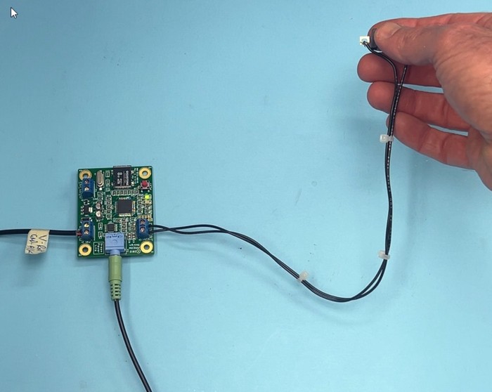
Is there a middle ground? Is there a way of representing at least some of these activities realistically without resorting to the gameboard approach? In the back of my mind I’ve always wondered if short sound clips were a partial solution. Push a button and a short audio clip plays of a brake wheel being set, calling for three step, etc. Obviously this won’t apply to everything. As an experiment, I bought a sound player (Pricom’s Dream Player Lite), loaded the sound of brake wheels being set/released and gave it a whirl. The results are promising. The key to making this work is to keep it simple. One button push followed by the sound. Stationary decoders have their place but they involve a lot of hoops to jump through to get a result…aka the sound. The more “button pushes” any sound prop approach involves, the less desirable it becomes….in my opinion. One push…instant sound….K.I.S.S.
I just uploaded a YouTube video showing a live version of the experiment.
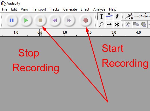
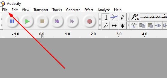
Working with the Dream Player Lite is as simple as can be. You do need to get the sounds though. To do so I use a free sound editor called “Audacity”. After you have Audacity on your computer, search through YouTube prototype switching videos for the track you want. Play the video and hit Audacity’s “record” button. When finished, hit the “End Recording” button. To save the file to your computer, go to “File” then to “Export” (export not save) and export it in .wav format which is the only format that the Dream Player will accept.
Start your desired YouTube video in motion and when you get to the desired audio hit the “Start” button on Audacity. When finished, hit the “Stop” button.
Next, go to “File” and then “Export”. Export your clip in .wav format. Simple!
Once you have your audio clip on your computer, save it to the SD card that comes with your Pricom player. In order for the player to recognize it, you need to put a “1-” designation in front of the file name. For example save it as “1-ThreeStepAudio”.
Plug the player into some computer speakers, hit the red button, and you’ll have sound! Note that the Dream Player Lite only handles one sound file. If you want several files on one board, you’ll need to get their MK2 player.
At this point it’s only an experiment. Will the sound clips improve the ops experience above the simple “pause and visualize” approach? Time will tell but the tests show promise.
Correction: I made a procedural error in the timing of releasing the hand brakes. They would not be released until AFTER the loco. couples on. Thanks to professional railroader Tim Garland for writing “No, you definitely need to couple to the car first before releasing the hand brake, otherwise it could roll away if the air brakes have bled off during the time the car has been at the industry. Before 3-step was mandated around year 2000 we used to say air and brakes or A& B over the radio. We also had a hand signal for it. On a side note, it is good practice to stop short of a coupling when initially entering an industry to check the car out before coupling. You want to check to make sure they are no wheel chocks in place, the wheels are all on the rails, no dock boards in the cars and that the doors are secured properly. At facilities where they receive tank cars and covered hoppers you want to make sure nothing is connected to the cars and that the roof hatches are shut.” Check out Tim’s excellent YouTube Channel HERE.
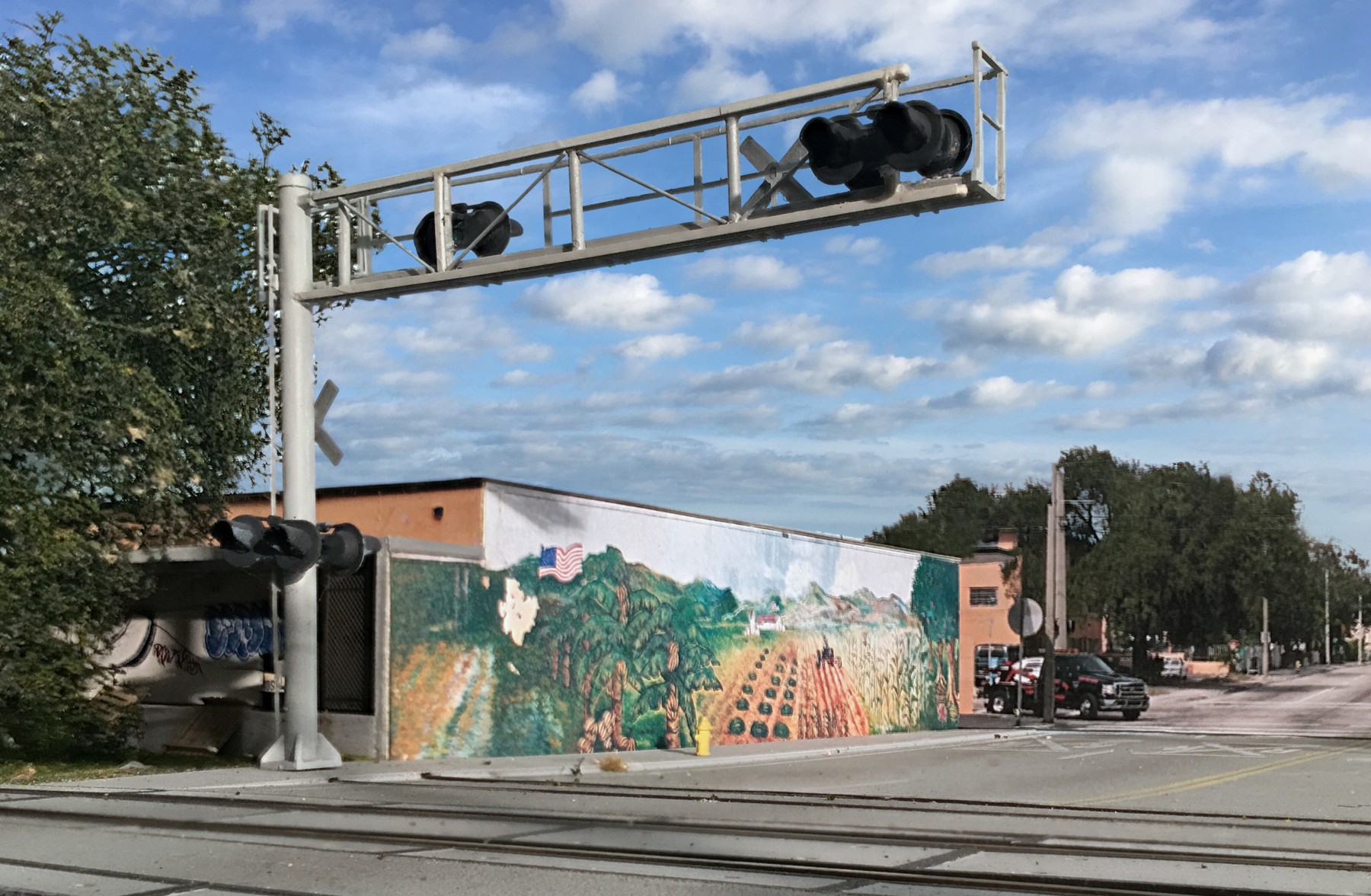
One of the signature features of Miami are the wall murals. They’re everywhere. This shot was taken on my Downtown Spur layout. You’re looking north up 22nd Avenue. The backdrop starts at the black pick-up truck. The focal point industry is called The Produce Connection and it’s just across the street from Family and Son. The structure was scratch built but it was a pretty easy project, basically a styrene cube. I made a point of getting a good photo of the mural during a site visit and just glued it to the side of the model. The crossing signal is a modified Walthers part.
Creating an eye-catching model of UP’s Anaheim Yard has less to do with skill than effective decision making. That being the case, doing so is within reach for even entry-level modelers.
A world-class musician? Pure skill. A PGA golfer? Pure skill. Artists such as Vermeer and Hopper? The same. Exceptional model railroading results? Not so much. Nope, the lion’s share of a model’s visual impact isn’t related to skills that take decades to learn. In most cases, the necessary techniques are so basic that any first-timer could employ them. The cost of supplies and tools is minimal. Creating a great model railroad scene has far less to do with skill than it does with effective decision-making. (For our purposes I’ll define the term “skill” as anything that requires eye/hand coordination or motor skills. Masterful weathering would be an example). The decisions that are made are what drives the bus. Those crucial decisions center on:
Material selection
Color selection & application
Element selection
Generous spacing between elements
Sheen (Flat vs. Glossy)
Inserting contrast
Basic neatness
Details? Who doesn’t enjoy detailing a model? However, the contribution to visual impact is minimal when compared to other aspects. Detail a model because you enjoy it. Just understand its place in the visual hierarchy. Looking at the seven elements above, in every case, an effective decision is as easy, or often easier to apply than a less effective one.
Materials: In the case of man-made elements, choose the parts and kits that have the finest detail and thinnest cross sections. With structures, look for those appropriate to your era and select ones featuring “ordinary” architecture. Buildings should be ordinary, mundane, and look like they belong. For soils and ballast use natural products.
Color: Lean on the side of low saturation to account for atmosphere and sun fade. When in doubt go “light, pastel, and faded”. Use brilliant, brightly saturated colors with caution. Don’t paint overly thick castings and parts (such railings and windows) bright colors
Composition: Spread your elements out. You are far better off with fewer, widely placed objects, than an overly crowded scene that contains everything but the kitchen sink.
–Give everything a dead flat sheen, even those are actually glossy in the real world. Shine is lost with distance and atmosphere. Pay particular attention to making sure things that are flat in nature are flat on your layout. Examples include masonry, wood, tree trunks, etc. (Glossy bricks and roofs are scene busters)
-Light doesn’t bounce off of a model the way it does in real life. You don’t get the necessary shadows and contrast. Inserting contrast manually with washes adds snap and realism.
-Basic neatness goes a long way. If nothing else, it prevents you from shooting yourself in the foot and letting sloppiness detract from an otherwise great effort.
To illustrate the skill vs. decision making point let’s run through a hypothetical thought experiment. Let’s say we have a motivated high school student, totally new to the hobby and talk him through how to pull off the scene.
Use earth toned grout for the soil base. I’d start with a blend of “Bone” and “Neutral Gray” . Once that’s dried, take a slightly darker hue of gray or brown grout and rub it around in spots with your finger.
Track. Use Micro Engineering or the new Walthers code 70. The finer details and smaller spikes are very apparent in photos. Paint the rail with Rustoleum Earth Brown camo. paint. Lay the track directly on the layout surface with no elevated roadbed cork or otherwise.
Use only natural rock based products for the ballast, preferably Arizona Rock and Mineral. Apply it in several light passes. Make sure you have no grains stuck to the sides of the rail or laying on the ties (even if it does on the prototype). Neatness really, really matters with ballast. Go light. Work in layers.
Walthers Clayton County Lumber would work well for the distant building. Paint the walls Rustoleum Light Gray Primer. Once the walls are dry, give them a wash of dilute India Ink and alcohol to insert contrast in the corrugations. Go easy on the roof color, making it even less of an orange than the prototype. Dial the orange back. (Start with a raw umber followed by a dusting of Rustoleum Earth Brown. Finish it off with an India ink/alcohol wash). Make sure that all of the paint has a dead flat finish
There are decent commercial palms on the market. Don’t rely on the pre-colored plastic that they come in. Paint the trees and do so with a dead flat finish.
Note the wall in the distance, boring yes, but a signature element of the area. Include it. It could be modeled with a strip of styrene. Paint it first with light gray primer and then follow up with a light dusting of white primer.
Commercial billboards are easily found. Just make sure that you paint give it a totally flat sheen.
When choosing the signal boxes be aware that not all parts are made the same. Some have much finer details than others. Develop an awareness of that. If you can find them, the old BLMA products are preferred. Note that the boxes aren’t silver. They aren’t grainy silver. They’re pale gray approaching white.
All of the painting could be handled with rattle cans. The cost of materials would be nominal. The good news is that a standout scene can be achieved largely by making the right decisions when it comes to material selection and color treatment. That being the case it’s achievable for anybody.
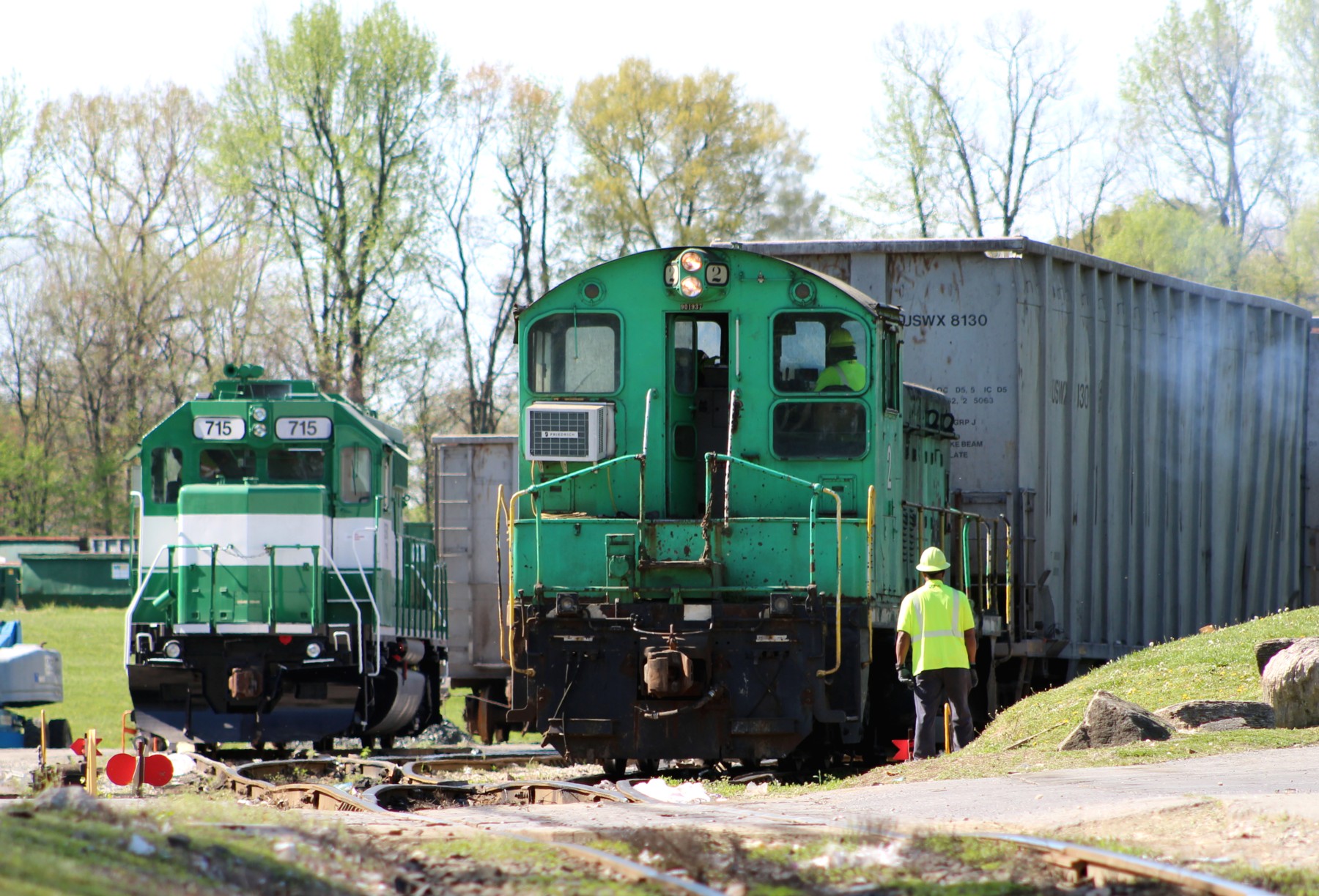
Getting out more often to rail fan industrial switching operations has had a direct impact on how much I enjoy operating my layout. The above shot was taken a few months ago in Annapolis Junction, MD.
I was a little surprised with the response I received from my recent Operations 101 YouTube videos. What it comes down to….I think….is that most of us don’t really know how to “play” with our trains. We put all of this effort into building our models….,we engage with the hobby community, and still it comes to “What in the sam hell do I do with all of this?!!”
What doesn’t help is the negative image people conjure up when they hear the term “operations” or worse yet…”FORMAL operations”. Boredom. Stress. Being forced to follow rules and procedures we don’t want to follow. Total confusion and disorientation when visiting another modelers layout. Confusing paperwork. The hobby has brought it upon itself and I’m as guilty as anybody (my apologies to anybody that attended my early operating sessions). Let’s step back for a second and do a re-boot.
I do, in fact, have friends with larger layouts that routinely and successfully host monthly sessions with multiple operators. They are in the distinct minority. My readership base skews towards smaller, modern era, industrial and branchline themes. The multi-operator, long mainline run, session you normally associate with “operating sessions” doesn’t apply to you. You will be operating solo. That fact alone changes everything. It gives you total freedom to set a session up anyway you please. Common sense dictates that you should do so in a way that maximizes your satisfaction does it not? Nobody cares how you do things. They really don’t. That being the case, let’s take a look at some ways to approach operating that might make things more satisfying. Obviously, these thoughts are totally subjective.
For me, the chess game aspect of operations has zero appeal. Moving a six inch long piece of plastic (aka a freight car) in front of another piece of plastic (aka a structure) does nothing for me. What does interest me is capturing the prototype experience. Visualizing the power,mass, vibe and rhythm of prototype railroading is what I enjoy. To do that I need a library of mental images that I can ratchet back and forth from when I’m running. The only way to build that library is through watching videos and rail fanning. (A subtle caution on the videos….as a practical matter, video producers need to edit out much of the process. If you dig around you can find some where this cropping is not done or at least is limited).
So, the first step is building that mental library. The second is to gain a basic understanding of what happens when the prototype performs switching operations. Professional railroaders, on the whole, are great folks that are extremely generous and patient when it comes to explaining things. That’s your first source. The other is going back to the videos and studying them. Finally, if you can, do some rail fanning.
Once you know the steps involved, what a real railroad actually does, you’re then in a position to apply those procedures in a way that you find most satisfying. The steps that a modeler incorporates, or chooses to skip, will vary from person to person. How fast you run? Up to you. How long to pause between moves? Up to you. Props or no props? You get the idea.
Personally, I try to run at least once a week and generally go for thirty to forty-five minutes. My approach is: Run….Pause…..Sip…..Visualize….Relax….Repeat. I’ll do a move, pause while I visualize an operation going on in the field (Three step, walking, opening a gate, etc.), take a sip of coffee or adult beverage, then move on to the next step. This is a hobby. We’re evolving into a “cat chasing a laser pointer…check your phone every few minutes” species. Industrial switching operations provides an opportunity to escape from that hamster wheel…but only if you let it.
Sidebar. Professional railroader Tom Holly has been very generous with his time when it comes to educating me on how the pros do it. We all appreciate it Tom! As part of my “training” he sent me THIS video of a NS switch crew in action. If your scroll to the 2:30 mark you’ll see what’s involved in the basic act of throwing a switch. First you have to unlock it. Then you do a quick visual check of the points. Note the pace they are working at. The locos are moving slightly above walking speed. He also sent me THIS CSX training video explaining the importance of and procedures related to hand brakes. I represent dealing with this step with a short pause.
On the same subject, Matty Gunn produced THISexcellent video of a very basic loads-for-empties swap that gives you a good sense for speed, pacing and the steps involved.