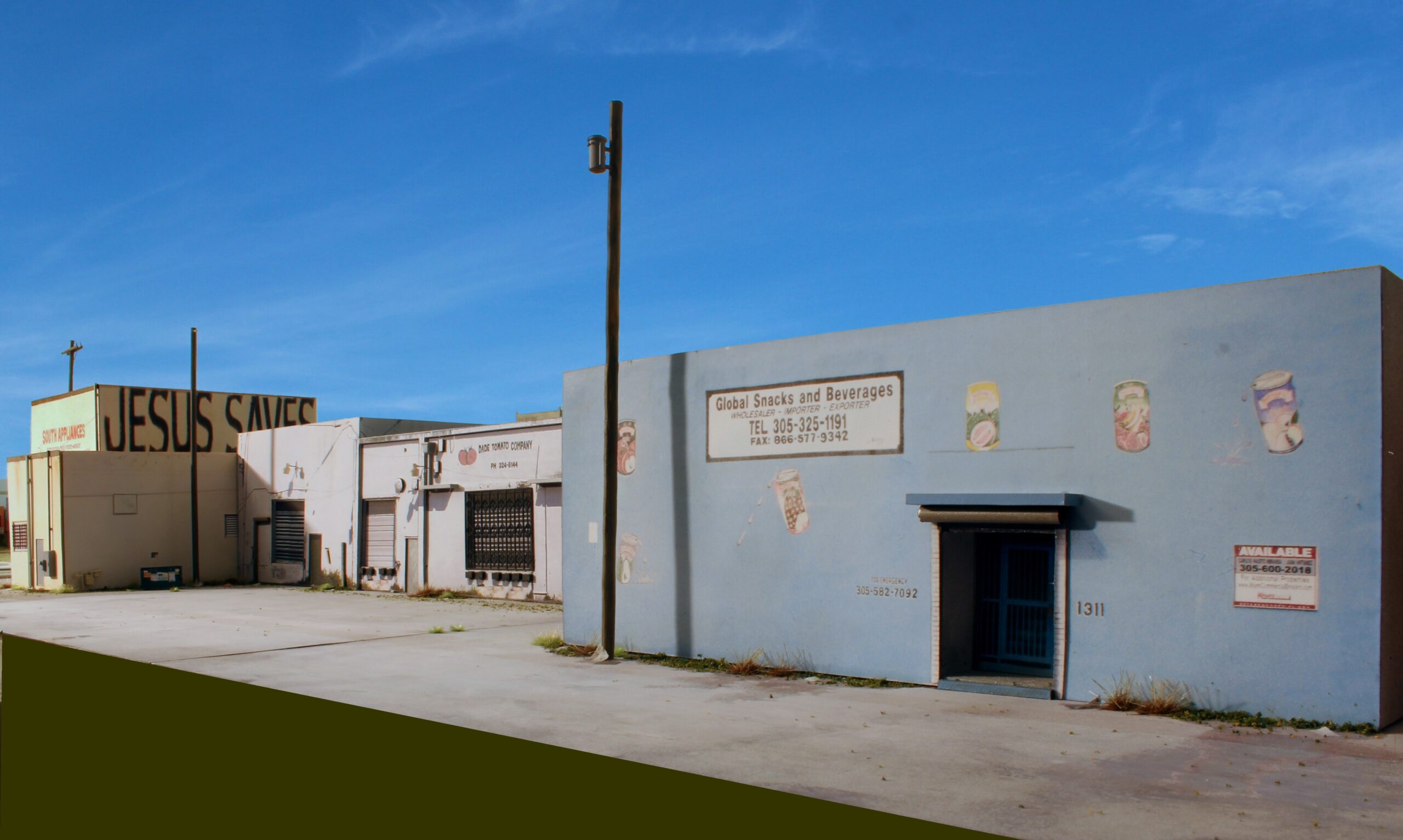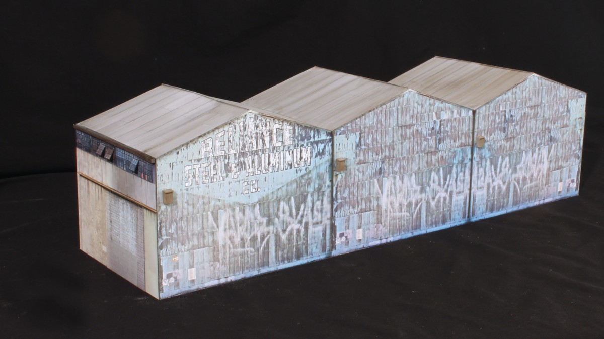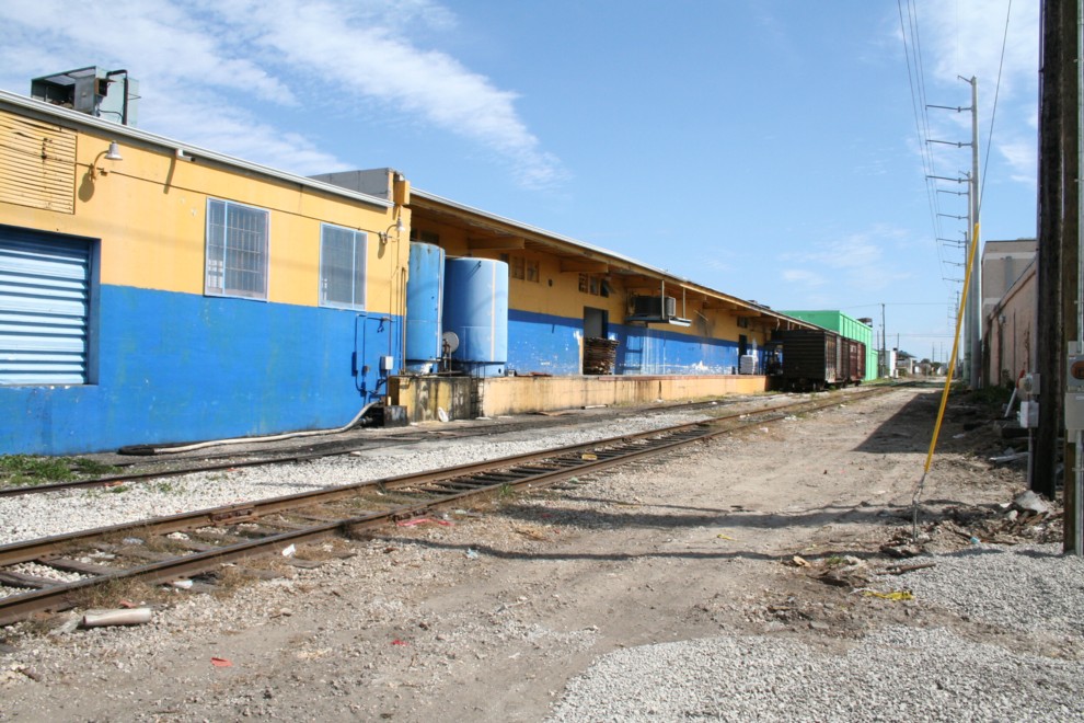
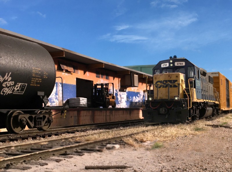
Two boxcars sit at Family & Son, a foot products company in Miami, circa 2006. The two blue storage tanks in the foreground are for vegetable oil. This scene would be ideal for a small shelf layout and would provide a lot of operation fun as well.
I’ve been doing more and more short “mini op. sessions” lately. I find myself gravitating to one industry in particular, Family & Son. F&S is a Hispanic and Caribbean food producer that takes incoming boxcars and tanks which I suspect contain some form of food based oil . Finished product goes out via truck only. Working it is fairly simple and fun, but not necessarily quick. Typically it takes ten to fifteen minutes.
A number of years ago I published a plan called the one turnout layout. My intent wasn’t for it to be any sort of gimmick. The point was that something simple could still provide several years of construction fun and be realistic to operate. It occurred to me that Family and Son could serve as another “One Turnout” layout design.
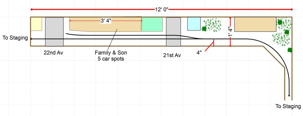
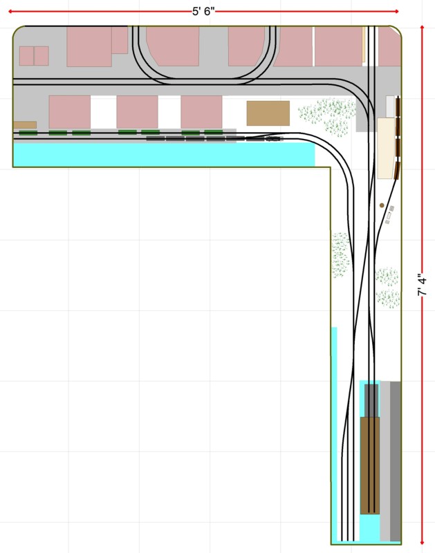
The visual portion of the layout is 12 feet long by 16 inches deep, attainable for an apartment dweller, beginner, or somebody with limited time. You’d want to work in a few feet of staging, at least on the right side. The industry itself is forty inches long.
Operations are fairly straightforward but do vary from day to day. An incoming train does a trailing point move exchanging loads for empties. Sometimes it’s tanks, others it’s boxes, often it’s both. Sometimes two tanks, sometimes two boxes. Boxcars are often hi-cubes. It’s still active today. Tolga Erbora produced a YouTube video showing the prototype in action.
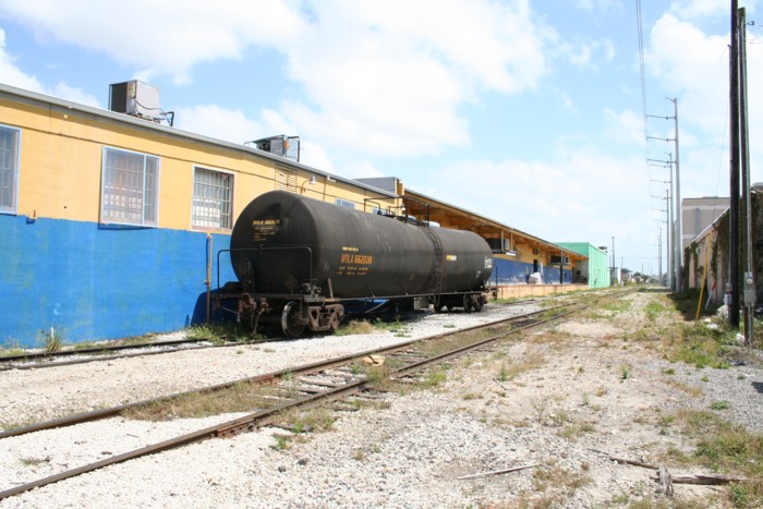
Here’s another photo showing a tank car on location.
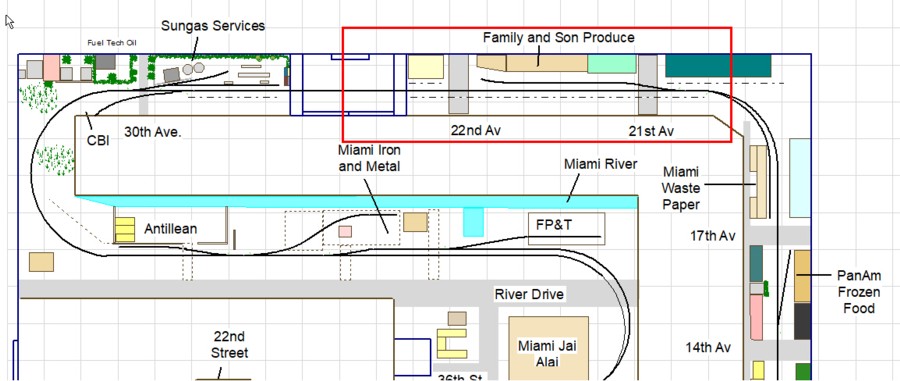
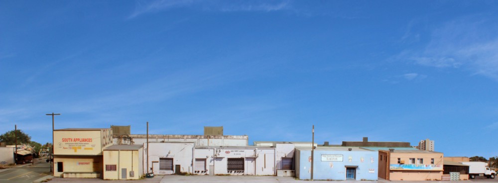
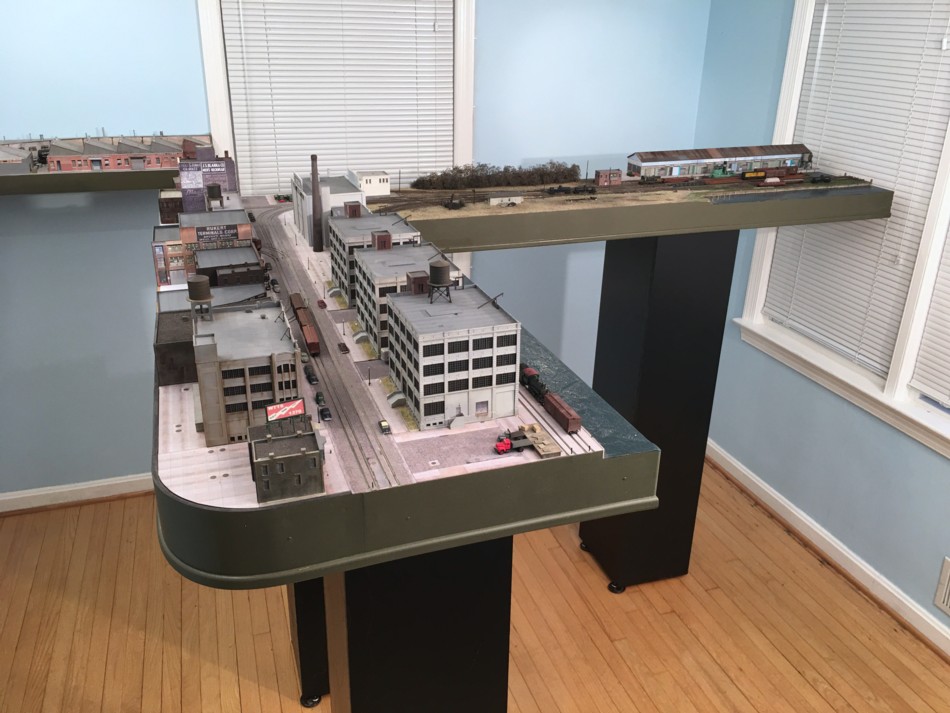
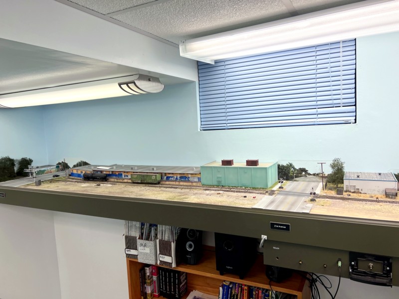
To give you a sense of context, here’s where the F&S scene is on the layout as a whole.
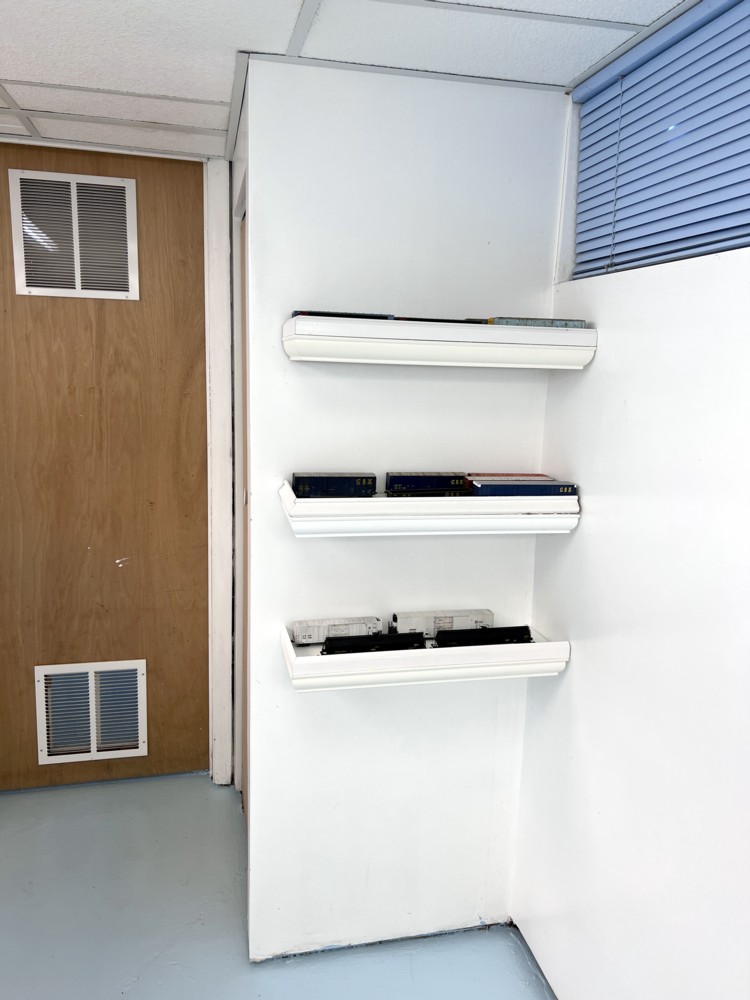
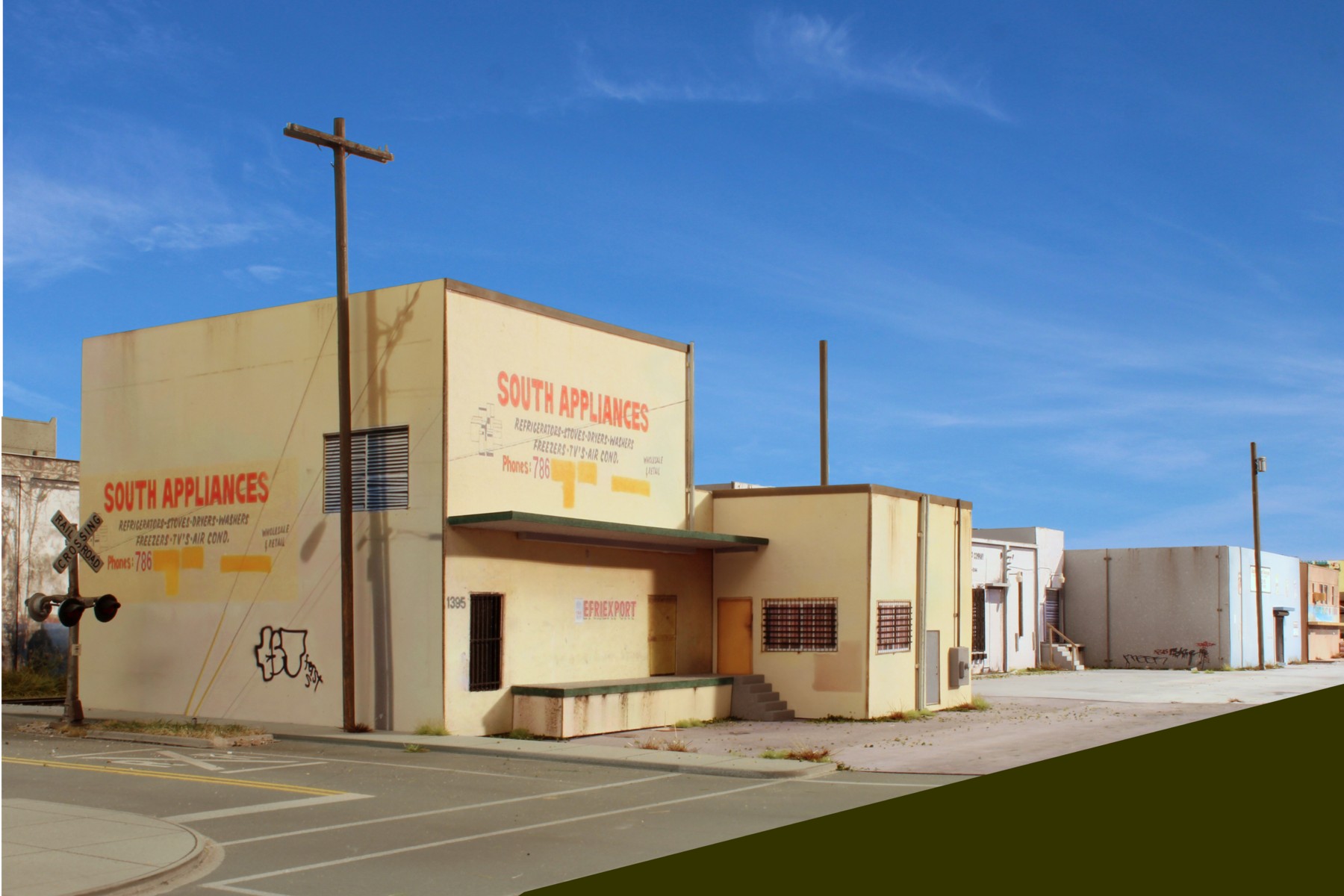
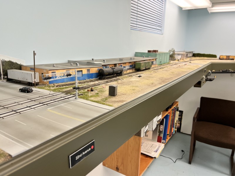
Finally, a few photos of the scene on the layout….
Need Help Designing Your Layout? Check out my model railroad design services HERE.