Planning a railroad for some point down the road? I wrote a blog on my business site about a few things to consider. You can read about it HERE.
Model Railroad Blog
Alco’s!

When the LAJ bug first bit me in the 1970’s, they were running zebra striped Alco S-2’s. Next on the project list is doing a backdated rolling stock roster so I can run them. The Atlas S-2 is a superbly smooth runner, to which I just installed a Tsunami 2 decoder over the weekend. Next up is the time consuming task of procuring detail parts. As you know, no one supplier has more than a few parts so it becomes an exercise in a lot of three dollar orders doubled in cost with four dollar shipping. It becomes expensive. The owner of Rail Graphics is retiring at the end of the year so I had him make up some custom LAJ decals before closing shop. Those came in a few months ago and turned out really,really well. I think I’m going to have to do the barricade striping myself from striping sheets. After many hours of searching it appears that the barricades currently out there are either 8″ or 5″ (CP). The LAJ’s were 6″. If anybody knows of a source of white, 6″ barricades, let me know.
Can You Go Home Again?
“You can almost always return to Home, The Place. But — eventually — you can never return to Home, The Actuality. It’s as gone as gone can be.” John Simpson
There’s an old expression, you can never go home again. In the quote above, taken from an online essay, John Simpson explains it succinctly. Although the physical place may still be there, the environment that made it “home” is long gone.
I’ve been thinking about that this week in terms of how it might apply to going back and taking another run at a previously built, long since dismantled or otherwise disposed of, model railroad. It’s tempting on a couple of fronts, especially if that previous railroad was a success. I’ll define success as the enjoyment it provided, the friends that experienced it with you, and the enduring pleasant memories. The other issue that factors in is that, if you spend a lot of time on any endeavor, you’ll get better at it. The layout we can build now would be of far higher quality than what we did five years ago, both in terms of planning and execution.
I’ve reached the stage in life where I’ve done enough modeling to have a fairly firm grasp on the type of model railroading that is most interesting to me, modern era, moderately sized, switching layouts. Other than a slight side track to build some backdated equipment, the LAJ layout is done. When I get to this point my mind starts wandering to “what’s next” and in that vein Miami’s East Rail is a recurring thought. It’s as compelling of a theme as ever, visually, romantically, operationally. The size and layout are perfect for working into a variety of small to mid-sized layout designs. I’ve enjoyed all my layouts but there was something about the East Rail project, hard to define, that put it above all of the others. Should I take another crack at it? My modeling skills have improved. I could do a better job on a second attempt. It’s the ideal size.
But….can you ever go home again? Can the things that made it so fun ever be re-captured? The thrill of discovery, the excitement and interest other modelers felt as I gave it a coming out and documented it’s construction on my blog, the new friendships that evolved out of it. You can’t recapture that. You never want what others think to be the reason you pick a theme but I really enjoyed making my discovery and journey the discovery and journey of others. You know you have something when it inspires a number of similar themed layouts. However, an East Rail 2 would likely be received with polite, been there, done that, seen it before yawns from other modelers. Does that matter? Somehow there’s a loneliness in that, very likely, reality.
The modeling bug really took hold in my teens. Since then, Miami and LA have consistently drawn me in, an appeal spanning almost four decades now. Is it likely another region would capture my interest as much as those two? Possible but it’s really hard to imagine as I write this today.
So, what is next? That’s the sixty-four dollar question.
Robmar Produce
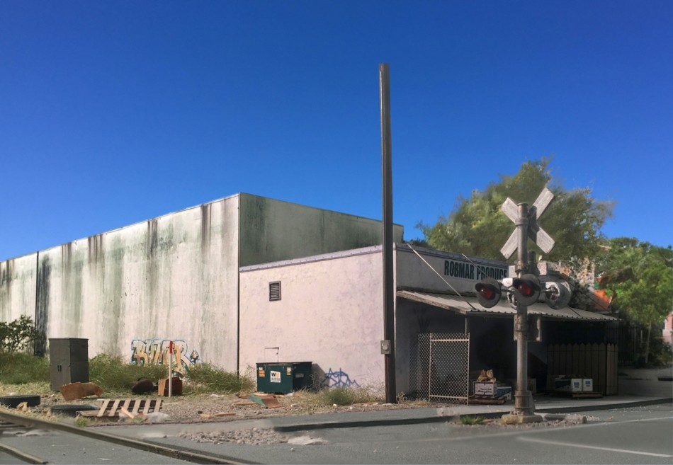
It’s been awhile since I’ve taken some photos on the Downtown Spur layout. Shown above is Robmar Produce on 14th Avenue, NW. A larger format version can be found on my Flickr page.
September 3, 2017
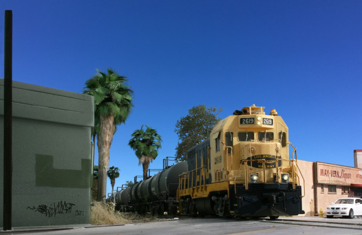
This shot was a little challenging because I didn’t have as much room as I would have liked to move the photo floods back where I really wanted them. After some trial and error I got something workable but was getting a lot of light burnout on the green building to the left. By holding a square of cardboard up I was able to block the light falling on that structure and insert a shadow. Longer scenes are harder to light as there is a tendency to get dark gloomy regions in the back. The room has overhead 3200 K LED strip lights and by turning those on I was able to get a more even light fill. After taking a few test shots something just seemed off. Things were too clean. I went back and added three pieces of trash, subtle but did the trick. You can see them on the sidewalk between the loco and pole. When photo editing (Adobe Photoshop) one of the first corrections I apply is the levels tool. First I apply this globally to the entire image. Further improvements can be made by applying it to select areas. Using the selection tool I highlighted the sides of the tanks and made a second pass with the levels tool. I did the same for the nose of the locomotive.
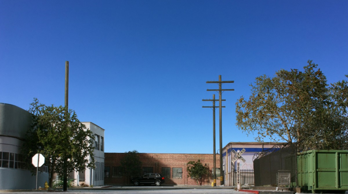
The second image, shown above, was an exercise in working with shadows. All overhead lights were turned off and a single photo flood was positioned about three feet to my left and back a bit. Moving the light around a little I was able to create glare on the stop sign, highlights on the dumpster face, and a shadow on the brick background structure. To me, many elements go into making a rail scene, elements that go far beyond just rolling stock. It isn’t necessary to have a freight car or locomotive in every shot. Viewers are smart enough to pick up on the suggestion of rail activity through hints such as the side of a rail, crossbucks, an abandoned loading platfrom, etc.
Full size versions of both images can be found on my Flickr page.