Just uploaded a new blog on my business site with an idea for preparing for the day you eventually have a layout. You can read it HERE.
Model Railroad Blog
CF-7 Upgrade

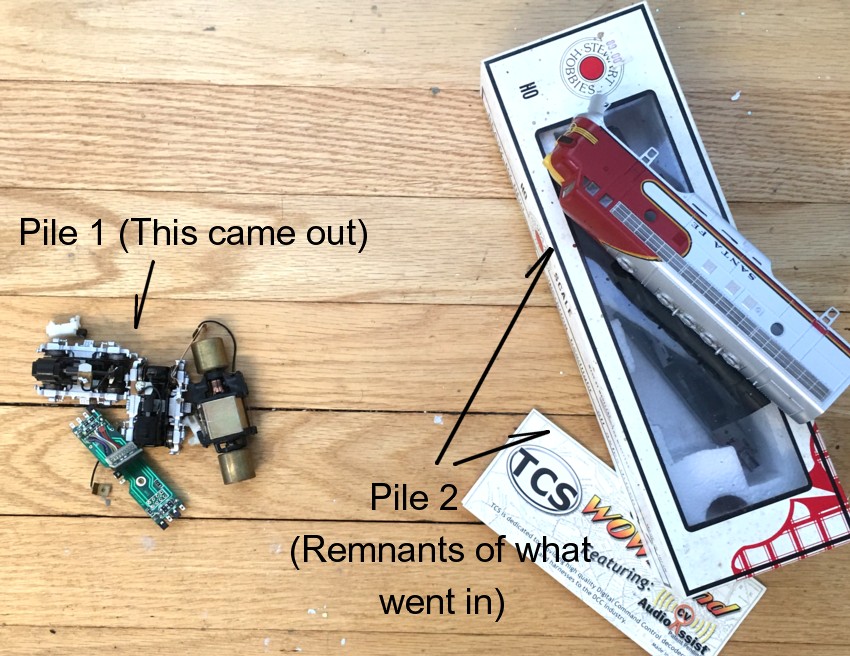
Adding A Kato Drive Train and Wow Decoder to an Athearn CF-7
Well, that was a process (or, in terms my less refined readers can understand…a major pain in the ass) but in the end entirely worth it. The CF-7 now houses an upgraded Kato drive and TCS Wow decoder. I’m happy. Essentially the major surgery involved two steps, mechanical and control, with the control side of things ending up being the easier of the two.
I’d been curious about the TCS Wow decoders and decided to take a flyer on them for this project. To say I’m impressed is an understatement. Wow is right! The sound is richer and more vibrant than any decoder I’ve used previously. The keep alive is great but a little unnerving until you get used to it. If you take your loco. off the layout and set it on your desk it keeps running until the capacitors discharge! The major surprise, however, was the motor control. The Athearn RTR/Blue boxes have a low cost/mediocre drive train. Before getting into the major surgery of the drive train replacement I tested the Wow system by clipping it into the existing Athearn drive train (TCS provides an excellent online photo tutorial BTW. Perfectly engineered fit. Super simple ten-minute install). I couldn’t believe how much the back emf smoothed things out. I seriously considered forgoing the drive train replacement. You may want to as well. However, I’d already purchased a donor locomotive with the Kato drive so couldn’t leave well enough alone. Half way through I was wishing I had!
The mechanical end (replacing the drive with that from Kato) proved to be more daunting. As a starting point, I used Richard New’s excellent tutorial on RMweb. That would only take me so far because the dimensions of the Wow decoder, with the attendant capacitors and motherboard, were much larger than which was used in Richard’s example. I also had a speaker taking up additional room. On top of that, the Wow decoder is precisely engineered for the configuration of an Athearn motor. The Kato unit is entirely different. A fair bit of surgery and wandering off the beaten path ensued. I swear to God, Norm at TCS tech support is the most patient human to walk the face of the earth. He talked me through the necessary changes and revisions in soldering points, all of which worked perfectly. There are so many wires to contend with between truck pick ups, motor pick ups, speaker wires, and headlights. Wire management becomes an issue. I also had to do a lot of careful shifting around to position the relatively large decoder so it wouldn’t interfere with the speaker directly above it. In the end, I made small “zip” ties out of electrical tape and shims from styrene to keep things organized and positioned.
The second problem that arose was keeping the drive train aligned. Richard was correct in saying the Kato trucks and motor fall right into place in the Athearn frame. However, the motor needs to shimmed up .060″ with a styrene pad for the shaft to align with the trucks. The motor cradle is also made of soft plastic. Add the two together and it took a lot of work to align the shaft vertically, horizontally, and secure them given the soft plastic foundations of the cradles and shim. The spacer renders the motor mounting screws too short so I had to go The Home Depot and pick up some number 4 half inch long replacements. After two full days, over two weekends, it all sorted out in the end. I now have an ultra smooth runner with excellent truck pick up, great sound, keep alive, and a decoder with the capacity for immense tuning capabilities and features.
Finally, a call out to my blog followers. The next project is intalling a working Santa Fe style roof beacon/gyralight. If any of you have experience with doing this effectively I’d love to hear from you.
A Little Bit of History
I have to laugh when you watch those crime shows and they have somebody in the hot seat asking them where they were/what they were doing at 1pm six years ago. I couldn’t tell you what I was doing at 1 pm last Wednesday! From time to time people ask me about previous layouts, when they existed, and what happened to them. Surprisingly it took more digging than I expected to find some of the dates.
Monon Limestone Region
Throughout my twenties I’d pick up an occasional modeling magazine and go to a show now and then but wasn’t really actively engaged in the hobby. I’d rate my modeling skills at the time as “below average”. For whatever reason, sometime in ’93 or ’94, I was just sitting around and decided to build a layout. There was a spare bedroom serving as an office in my apartment that would work but only if the room could continue to serve its original purpose. To make this happen the layout had to be elevated to a whopping 70 inches off of the floor! Although it looked “o.k.” in all honesty it wasn’t that great of an effort. The bench work height was totally impractical and the handlaid track was constantly buckling. Two good things came out of it. First layouts are totally underrated in terms of the “launch” they provide into the hobby and this certainly served that purpose. Second, Model Railroader ran a short article on it. Out of that I met Paul Dolkos who did the photography. Paul became my modeling mentor, introduced me to his group of exceptionally talented friends, and is largely responsible for my transition from being a fairly bad modeler to a a much better one.
Monon N scale
By 1996 I found myself owning a basement with a roof on top (i.e. a home) and was ready to become more serious in my modeling efforts. I was totally mesmerized by the work of David Haines and the Reed brothers and elected to move to N scale. The N scale layout provided many years of enjoyment and was really my springboard into becoming a more well known modeler. As successful as it was, I made one major miscalculation with this layout and that was how “huge” N scale is. I had looked at my space with HO scale blinders on. An 18 by 18 foot space in HO is considered average size. It didn’t sink in during the planning stage, however, that in N scale the space was comparable to something almost 40′ by 40′! Massive! It was a double edged sword, enough space to do anything and enough space to hang myself. By 2004 I was growing weary of the maintenance and never ending laundry list of projects in front of me. I’d always been interested in Florida themes and began casually looking around for prototypes to model on a small scale. As my interest in Florida themes picked up, my interest in the Monon layout began to wane and it became dormant. In 2008 I tore it down, sold the rolling stock, and kept the structures. With the room gutted I prepped the space with drywall and better lighting.
East Rail
Although I was interested in modeling a Florida theme, I was struggling finding one that was a good fit. As luck would have it, I met David Orr and Bill McCoy, former SAL employees, at the Cocoa Beach RPM meet in 2006. David and Bill gave me a detailed explanation of the Miami rail scene, explained how it met all of the criteria I was looking for, and provided me with a seemingly limitless supply of prototype data. I made a trip to Miami to check it out in person and East Rail was born! I had so much emotional investment in my Monon layout that I didn’t have the heart to tear it down. East Rail therefore occupied a corner of my shop while the Monon N scale lay dormant in my basement. In terms of enjoyment provided this tiny switching layout ended up being my most successful layout I’ve ever had. With the Florida “proof of concept” established, I was ready to rip out the Monon layout and construct a much more developed Florida switching layout in it’s location, in this case The Downtown Spur. I sold the East Rail layout to Greg Luers, who transported it to Indiana and has maintained it in pristine condition.
Downtown Spur
The Downtown Spur is my “main” layout at this time. Although I haven’t written much about it on my blog lately, I still run it frequently. It’s about three fourths “done”. The LAJ layout is a side fling which I expect to wrap up in a year or so. At that point I’ll pick up the unfinished projects with the Spur. In terms of planning, modeling execution, and enjoyment I’d consider the Spur one of my best efforts. That said, it’s offbeat theme has proven to be a relatively unpopular “yawner” within the modeling community. Oh well, even ugly dogs are adored by their owners! After struggling so hard with the 1950’s research constraints of the Monon layout it’s been a joy to have a seemingly endless supply of prototype information as the basis for a layout.
LAJ
As I mentioned, the LAJ is sort of a fling. I’ve been fascinated with the prototype since I was a teen and always wanted to model it in some form. Located in a now vacant bedroom it gives me a taste of LA while providing a test bed for new modeling ideas.
What’s next?
After taking a breather from the spur layout while I putter with the LAJ, my plan is to move back to the many unfinished projects and scenes on the Downtown Spur layout. I’d guess I have about three more years I’d like to dedicate to it before moving on to the next idea.
A Little Perspective
Looking back on this long journey it’s been a path that started out with, to be blunt, being a relatively shitty modeler to one of being much better. A path that snared many lifelong friendships along the way. If I had to pick the four things that ultimately led to achieving better modeling results they would be:
- I wanted to be better. It’s as simple as that. You can’t achieve something if you don’t have the desire to do so.
- Persistence. It’s been 22 years and I stuck with it.
- Great mentors. Part by luck, part through conscious effort to seek them out, I’ve had some great teachers. You can’t do it alone. Every skill I’ve picked up I learned from somebody else.
- Being a “doer”. Endless chat room and internet surfing, writing long winded, philosophical missives on forums about the latest conspiracy, analysis paralysis, none of that ends up in a physically tangible result. You need to turn off the computer, pick up the glue bottle, put in your best effort, and adjust as you go.
Palms
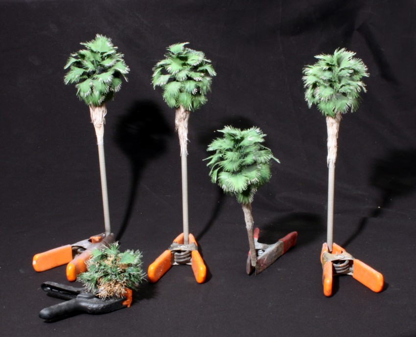
My venture into making the palms entirely on my own from scratch seems to have worked. I wasn’t sure going in if it would. The trunks were made by taking a 1/4″ styrene rod, chucking it in a drill, and spinning it slowly while holding the sharp edge of a jeweler’s file against it as it turned. I then painted it with Rustoleum “Sandstone” textured paint and gave it a wash of India Ink and alcohol. The fronds were made from Oracal peel and stick vinyl cut on a home craft cutter. The fronds were painted Zinc Chromate primer and then given a wash of a darker green acrylic craft paint. The dead fronds were painted with a beige acrylic craft paint and then given a wash of burnt umber.
October 29, 2016

It’s been a week of fine tuning on the LAJ. Micro Engineering currently has the market on the most prototypical looking turnouts. They are prone to electrical dead spots though. Tam Valley frog juicers, absolutely ingenious devices, quickly solved that problem. I also had some gremlins in the track around one of the grade crossings that occasionally dumped cars in the dirt. Some work with a file fixed that. With my new CF-7’s in hand, it was time to do a little CV tuning to smooth things out. Nothing major, just Vstart and a hair of acceleration and deceleration.
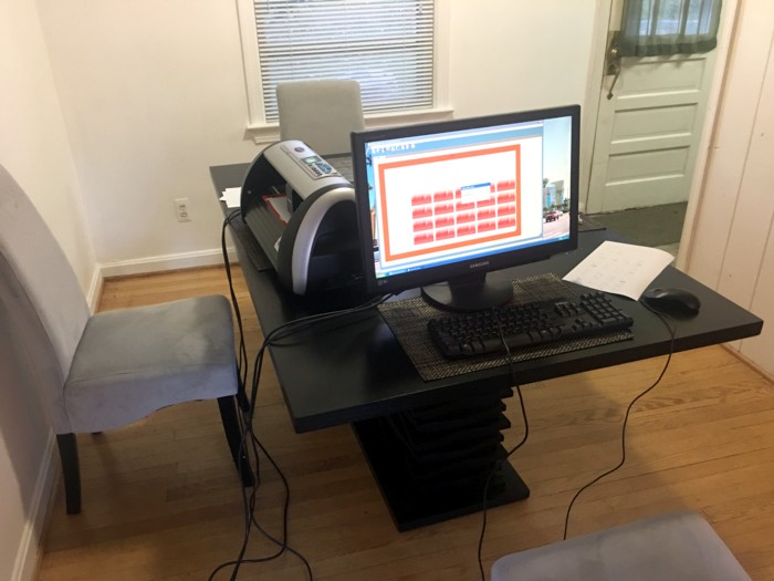
Given that this is LA, I really need palms to put the geographical stamp on things. Unfortunately, the one source of craftsman palm kits has become somewhat inconsistent in their supply process. Having totally lost patience with that route, I decided to make my own on my Blackcat cutter.

