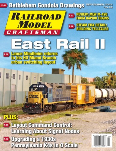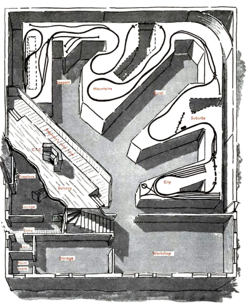
In his classic 1951 piece, If I Had A Million, Linn Westcott outlines how the money could be applied to the hobby. Would you do the same?
Those who have been around awhile likely remember Model Railroad editor Linn Westcott’s famous article “If I Had a Million”. The article posed the hypothetical possibility of becoming suddenly wealthy and how to apply that change of circumstances to the hobby. He immediately made the leap that the funds would be applied to a massive layout. Every few years, the same thought experiment pops up on one of the general discussion forums and evokes the same feeding frenzy leap to buying a pole barn and filling it with a railroad. In each case, a direct connection is made between square footage and hobby satisfaction. Is that the case though? For some people, maybe. The missing piece in all of this is having a true understanding of yourself and what aspects of model railroading you get the most enjoyment from. For most of us, that may take decades to sort out. If you don’t jump into the game and start building things, you’re running totally blind.
It does make for an interesting exercise in introspection both in terms of the hobby implications as well as life in general. The answers are likely all over the map and driven by individual circumstances. Here’s the thing though, just as with athletics, music, or the arts, no amount of money will make you a better modeler. Having a ton of money won’t make you a better tennis player or golfer and it won’t make you better at scratch building that saw mill scene.
I suspect what a person would do with the windfall would depend on how much they equate layout size with hobby enjoyment. When you really dig deep into it though, things become more interesting. What if you’ve spent twenty years building your current layout and don’t want to part with it? What if your satisfaction comes from structure and freight car building? In those situations, I don’t see how money will move the needle for you. If your enjoyment comes from having a representation of a long stretch of transportation system, it would.
I’m curious how my readers would hypothetically handle a windfall like this, not only on the modeling front but with life in general. My career experience has given me a fascinating, forty-five-year, fly-on-the-wall witness account of how personal wealth plays out in life, if not modeling. I spent twenty years in financial services working primarily with first-generation wealth holders, mostly small business owners and professionals. My custom building clientele is similar. What I’ve learned is that real-world wealth is nothing at all like what you see in the media. My clients typically “got rich slowly” and, for the most part, live pretty under-the-radar lifestyles. Many stayed in their old neighborhoods and drove Camry’s, Buicks, and pickup trucks. They are a generally happy and content group of nice, high-integrity, classy folks. What’s interesting is that none of them pursued wealth, they pursued a passion and the money slowly built up, almost unnoticed. By the time it dawned on them that they were in fact, “wealthy”, they were pretty set in their ways and not that motivated to make huge changes. (For a fascinating, and very accurate read, check out Thomas Stanley’s The Millionaire Next Door)
My guess is that on the modeling side, the answers would depend on how much modeling experience you have. The fans of the hobby, those with little or no experience, would probably want to go large. The more experienced modelers would probably be less likely to simply because they know the tradeoffs and have more self-awareness. Experienced modelers are more likely to be mid-stream into a layout you’d need the jaws of life to pry them away from.
What about life changes? Would you retire? Buy a new house locally? Move? Stay in your house and build an addition? Make no changes? My guess is that those folks who are employees would probably retire. Business owners and private practice professionals, as a group, prefer to keep working until they are planted six feet under.
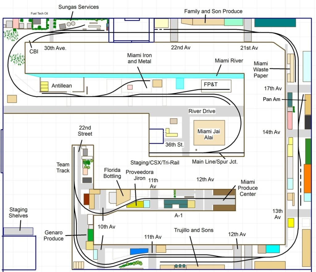
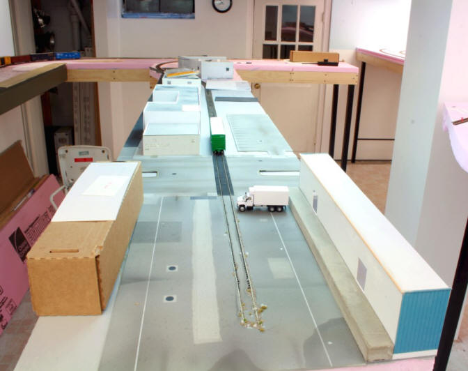
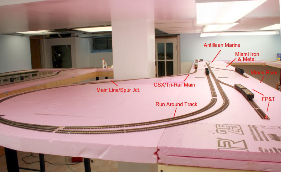
I’m unlikely to hit the lottery, primarily because I don’t play it. If I did hit the jackpot, let’s say 5 mill, I suspect I probably wouldn’t alter my life that much. I find my custom layout building, design, and writing business satisfying (most days). I think I’d go nuts if I retired. It’s taken me decades to get my 1952 house close to the way I want it. I like my neighbors and living in DC so I’d be unmotivated to move. The thought of tearing down my layouts makes me cringe. My interests lie more with industrial railroading which doesn’t take much space to model. I’m keenly aware that massive layouts are not a free lunch and what they entail.
What to do with all of that money? Hmmm. All I can think of would be buying three or four top-of-the-line locomotives and sending those out for boutique electronic upgrades. I could use a full-scale LED light upgrade in my basement. Now I’m running out of ideas. As a scratch builder, I spend less than a hundred bucks a month on the hobby. I guess that’s it on the modeling front. On the travel side I’d make more frequent trips to LA and Miami for rail fanning. I might make some minor home renovations. That’s about it. In short, it would be nice to have the money from a security standpoint but I wouldn’t change that much in terms of my modeling habits or lifestyle.
What about you? What would you do on the modeling and “life” front if five mill. plopped in your lap?
