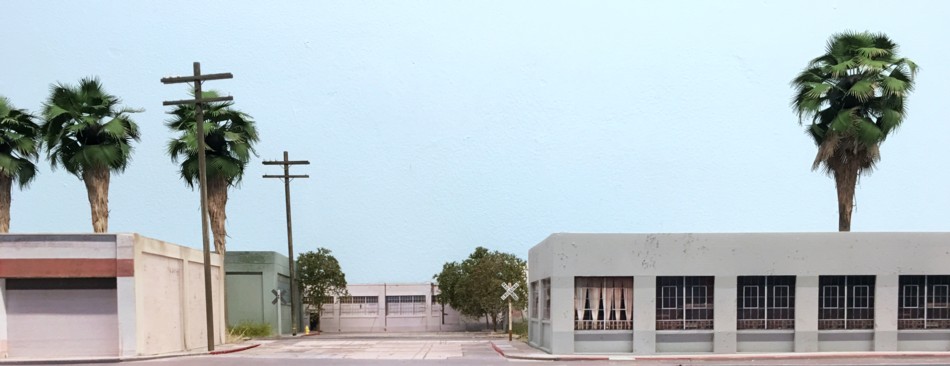
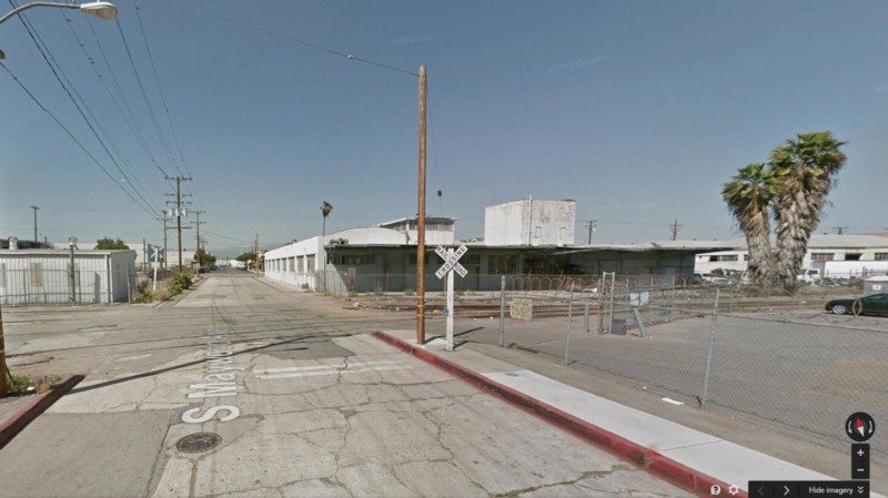
View of completed scene looking south towards the Corona Avenue grade crossing.
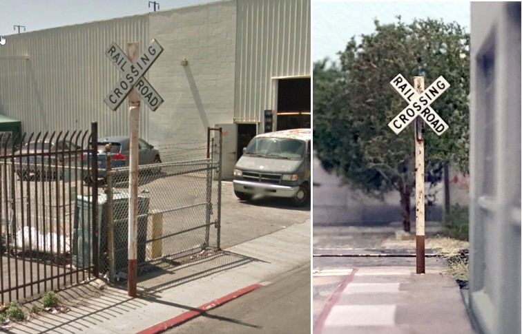
This unique crossbuck, although just a block from the LAJ, actually belongs to BNSF. Note the flattened pipe post. Too interesting not to “borrow” for my layout!
View of completed scene looking south towards the Corona Avenue grade crossing.
This unique crossbuck, although just a block from the LAJ, actually belongs to BNSF. Note the flattened pipe post. Too interesting not to “borrow” for my layout!
For fans of Miami’s East Rail, Tolga got some great video of the local getting ready to go about its work.
Here’s the link: https://www.youtube.com/watch…
Scroll to the 13:45 mark. The tanks are for Sentry, the boxes for Salco. He thinks the bulkheads are for the team track in the yard. Love the great audio of the turbo whine on the GP-39-2!
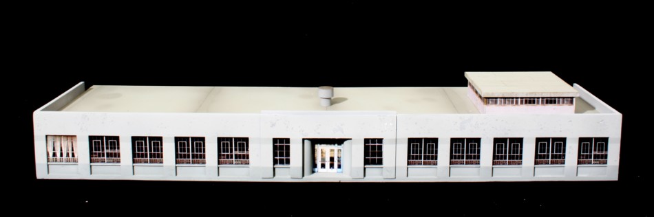
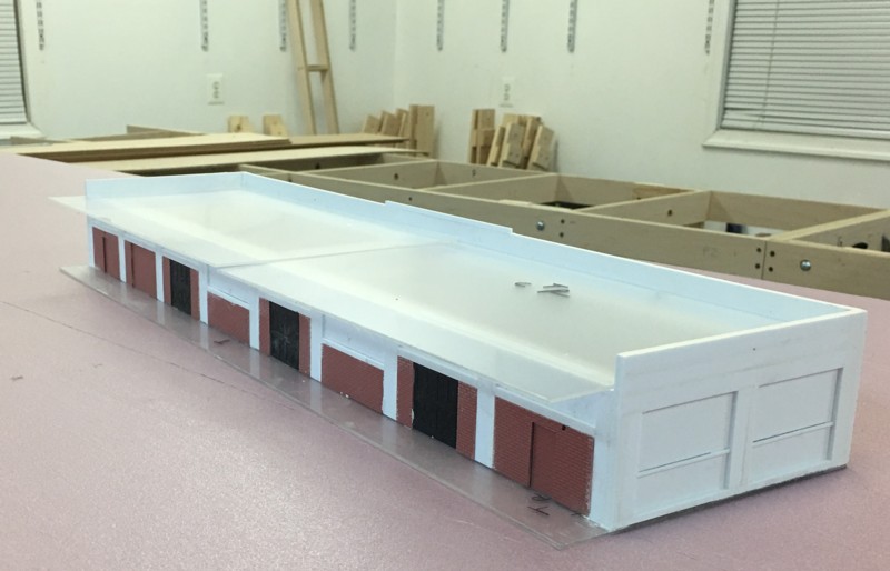
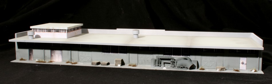
The 4300 District Blvd. structure is now finished and also wraps up the structures on the LAJ layout. Although, at this point, the layout would look complete to the casual visitor, there is still work to be done. The next step is to go back and add details, do some blemish cleanup, and fine tune the rolling stock. The structure itself was built using traditional styrene methods with the exception of the windows and doors which are photographs. The core was first given a base coat of Rustoleum Light Gray Primer. I then followed up with an overall spray of Model Master “Light Gray” applied with an airbrush. There is slightly darker gray lower band under the windows. The exact color label escapes memory at this point. The chipping was accomplished by applying a film of Mr. Thinner to the surface and “pecking” the surface with a soft wood block. I did find that this process is more difficult if your base coat of paint has cured for a day or two. Live and learn. Next time around I’ll do the chipping withing a few hours of the base application. I didn’t find it necessary to apply an ink wash to the face of the building but did do so on the back. I’ve made a point of fully detailing the back (rail) side of all of the structures. Although not visible from aisles they would be in photographs and I want to see what I can do working a small camera into the “canyon” behind the structures.

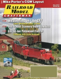
I’ve received a number of emails on how I weathered the LAJ CF-7. In the May issue of RMC I give a detailed explanation as well as an overall way to approach weathering in general.
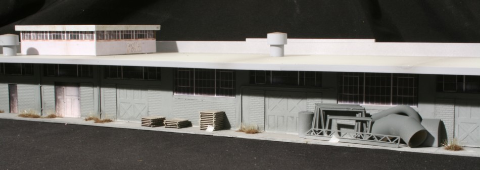
As I build the trackside industries I want to be open to the possibility that I may want to work a small camera or video camera in at some point and photograph the back side of the structures. That means detailing said back sides. I continue to chip away at the 4300 District Blvd. structure. Shown below is the detail on the rear side which includes brick sheet, Grandt Line doors, and styrene columns. The roof is .050″ acrylic sheet from the Home Depot.