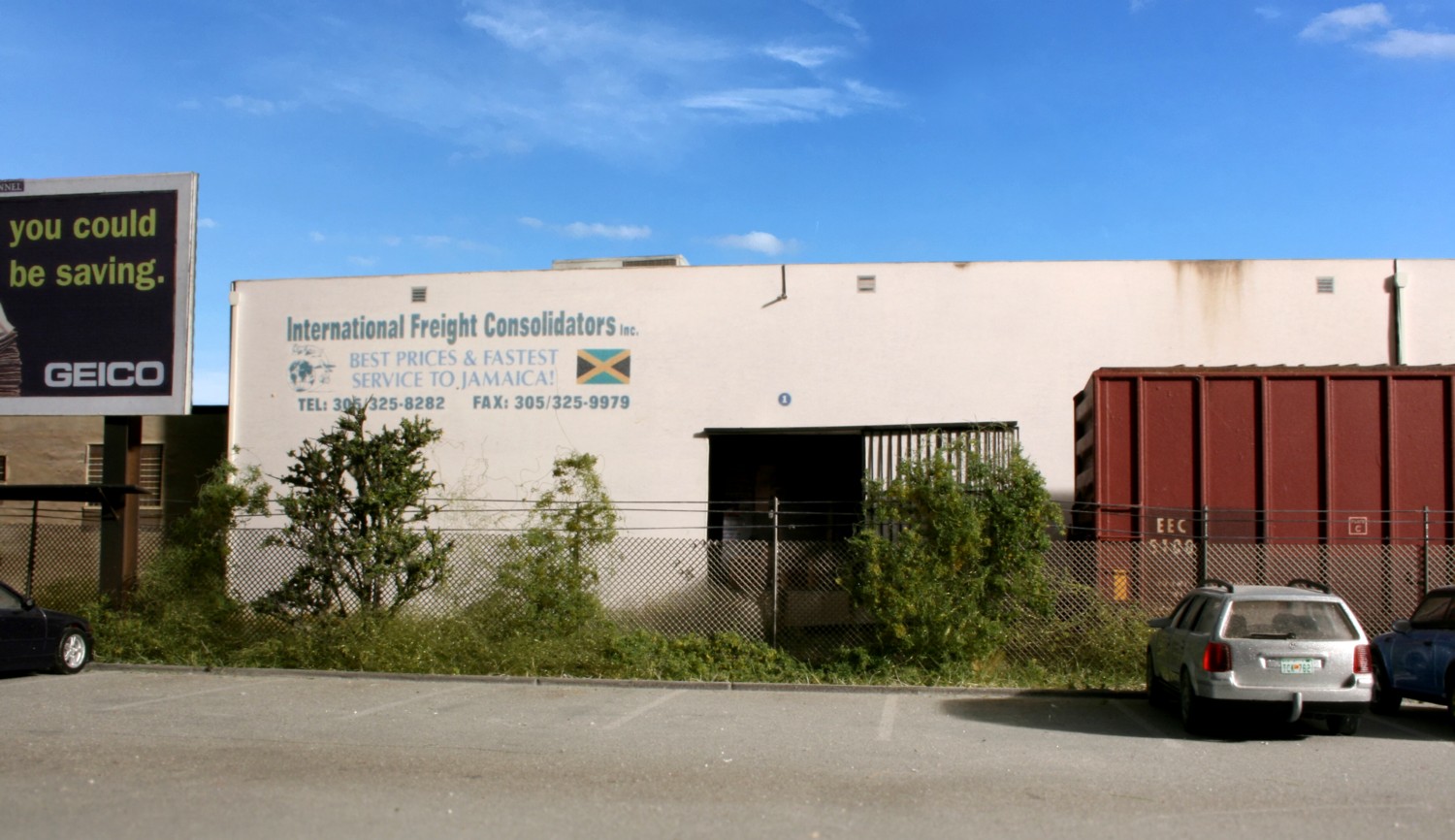
A-1 Farmers Choice and International Freight was located on the far west end of the switchback. At the time I started rail fanning the line in ’06 it was still receiving cars on a fairly consistent basis. That tapered off and eventually dried up several years later. A decade ago I shot a similar version of this image but it was lacking in a few areas. In cases like this I’ve been slowly doubling back and doing re-shoots.
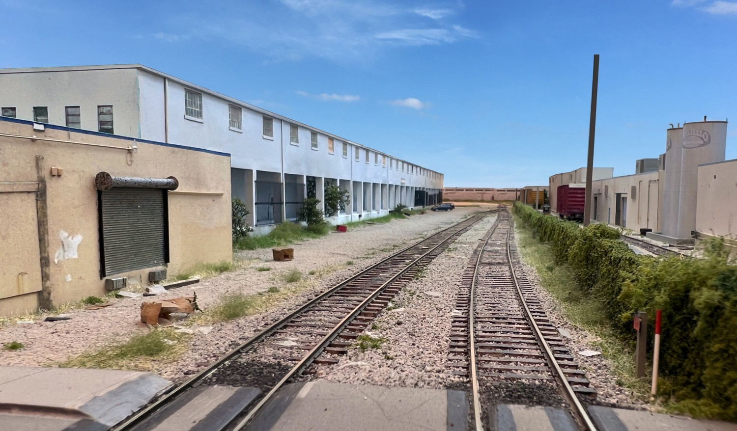
Some photo shoots fall together in an hour and give you the perfect ten as far as images go. Then there are those like the one above that you have to really fight with to get something even remotely useable. The problem with this shot was getting the lighting in position which, in the end, I was never able to do. I I had to use the room’s overhead fluorescents and a lot of photo editing. The two Trujillo tanks to the right are tight against the wall so I couldn’t light the white warehouse from that side with photo floods which is what the shot needed. Then there was the low ceiling and a benchwork footprint in this area that made it hard to get lights into the necessary position.
Some interesting things came out of the shoot though. I used my new iPhone 13 with the triple lens configuration. Note the depth of field without using Helicon Focus. This camera gets really “jittery” with shots such as this and the camera height won’t lock at the closer-to-the-ground shots I could get with the iPhone 6. I found though that if I point the 13 down at the ground it locks the focus tight on that. If you then tilt the camera up into position up it will hold the low level lens position for a second or two before “hopping” to a higher angle shot. Weird.
In this photo of a scene taken on the project currently in my shop, the emphasis was on put on the numerous scenery layers and matching the complex color patterns of the structure. At this point I haven’t added one traditional “detail” part such as a switch stand. When those parts are added, they will contribute far less visually than the efforts put into the scenery layer and structure coloring.
For those with short attention spans (like me): You will achieve the most visual impact if you associate the term “detail” with the number of color and texture layers of your scenery and structures and not with the number parts you dump into your scenes or the prototypical accuracy and number of bristling details you apply to your subject.
For many of us, our goal is to build better models. The better we do, the more satisfying the process is and the more we enjoy looking at the results of our efforts. We can’t move the bar however, if we don’t understand where to put our emphasis. To get the best results we need to understand which elements in the hierarchy carry the most weight in terms of visual impact. The catch all phrase “detailing” is one such example. If we don’t understand what we’re dealing with, we can spend a lot of time on things that are not at all noticeable or worse, do some damage visually.
In our model railroading universe the term “detailed” is linked one to one with “better”. In other words, the more detailed a model is, the higher the quality. As with anything, achieving success begins with how you define it. Detailing what?
Typically the subject of detailing is thought of in two ways. The first is sprinkling tons of “stuff” on the layout. The conventional wisdom being that the more trash cans, crates, barrels, tools, pallets, drums, etc. we pour into a scene the more “detailed” it is and, by direct association, the “better” it is. With this approach it is pretty easy to start sliding down the slope into caricature.
The other is defining it as having a placeholder for what exists on the prototype. The more delicate parts of the prototype we match, the better. This is fine “if” and it’s a big if, the model parts are finely detailed and not cast metal, flash laden, soap carvings. It’s a noble end and I admire the folks that are masters at it. While enjoyable and satisfying in its own right, such details often don’t carry much visual impact as far as the layout as a whole goes.
At some point it warrants examining our end game. Is it representing everything tit for tat? Or, is it visual impression? If it’s representation, representing what?
If it’s overall visual impact you’re after, then two other elements need to be brought into the discussion and put in front of the line ahead of “parts sprinkling” and “parts matching”. First is the number of “detailed” layers we add to scenery. The other is the number and accuracy of the color/weathering layers on our structures.
Mother Nature hasn’t made it easy on us. Representing nature effectively is probably the most difficult of all of the modeling tasks. Typically we stop with way too few color and texture layers. We make one pass of static grass and call things “done”. The end result is more like a carefully manicured golf course than the complex chaos of what you see by the typical rail right of way. Thinks in terms of five, six, or seven, scenery layers and colors starting from soil, then grass, then underbrush, and finally the trees.
Effective and detailed color detailing will catch the eye much more than the accuracy or existence of a given part. If you’re drawn to a masterfully done model locomotive you’re being pulled in by the modelers skill with subtitling adding color layers (weathering) not whether there is a whip antennae or not or whether the antennae is the right size or prototypically correct. The same goes for structures. An exceptional structure model is pulling you in more by its color layering and weathering than whether a window has eight versus ten panes.
These aspects of “detailing” are far more difficult to learn and carry off effectively. If a) you understand their importance and b) put the work in, the end results will pay enormous dividends.
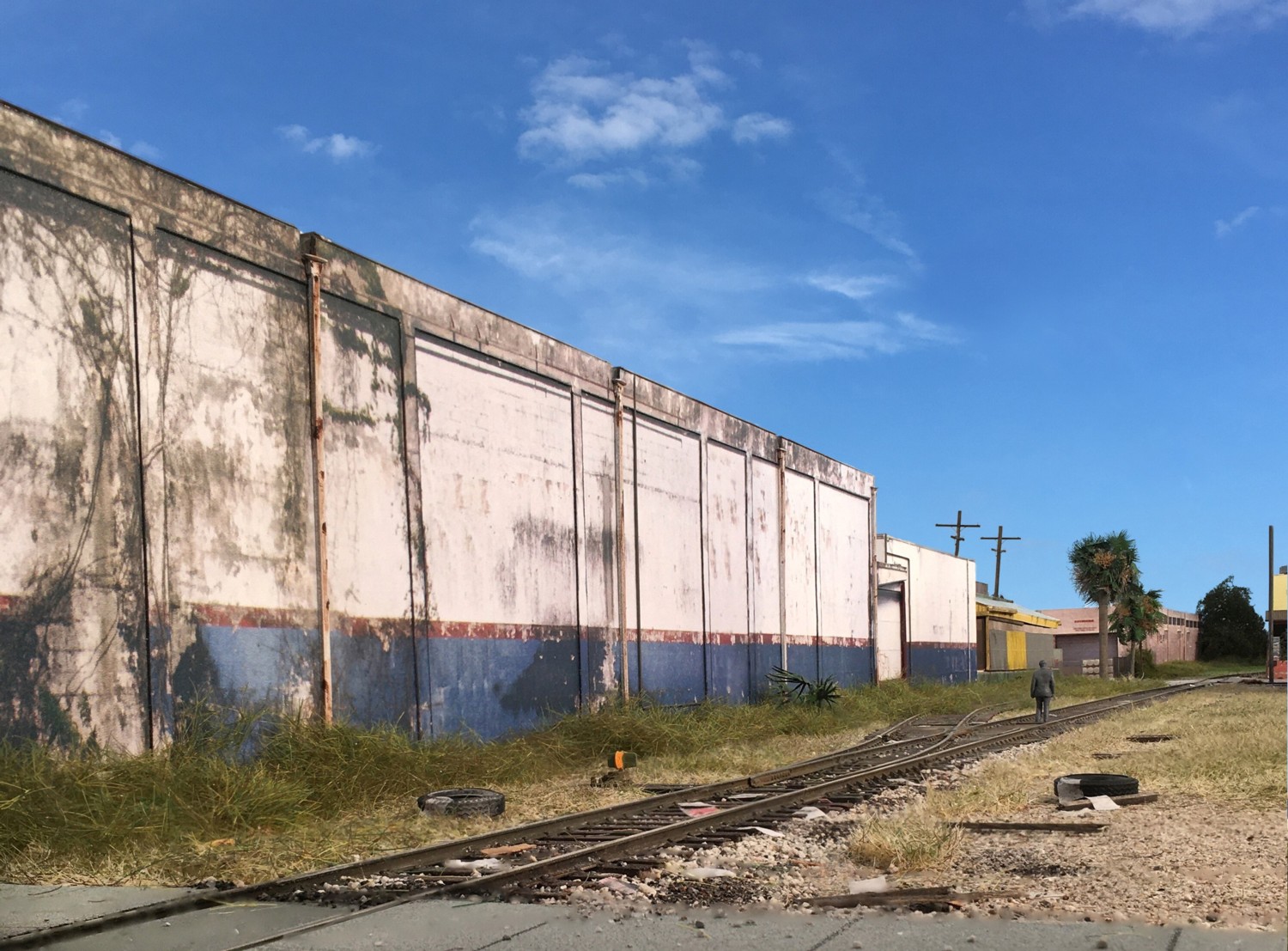
This scene was shot on the layout from 14th Avenue facing eastward down the tracks with my iPhone 6sPlus. Man that thing has a damn good camera on it when it comes to model photography. I also tried getting this shot using the iPhone13. As I moved the focal points, it kept jumping among the three lenses. I’m not sure if there’s a way to lock on just one lens or not? The figure was painted gray and placed fairly far back in the image. One challenge with a theme such as The Downtown Spur as there is very little variety in motive power. If you put a locomotive in the image, by and large, it’s going to be the same (or essentially the same) one in….every…..shot. That gets old pretty quickly. The solution is to simply take photos without locomotives in every one.
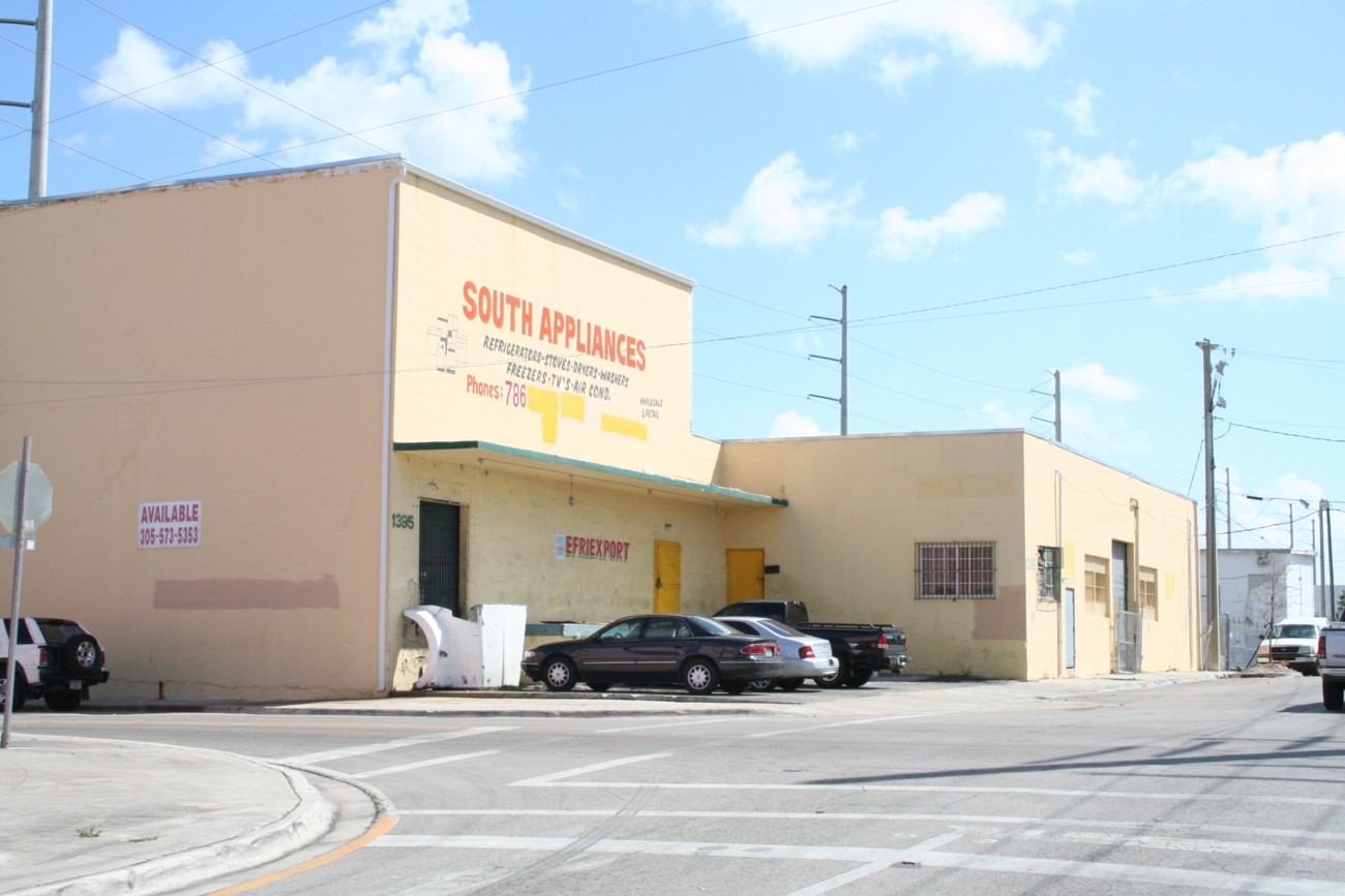
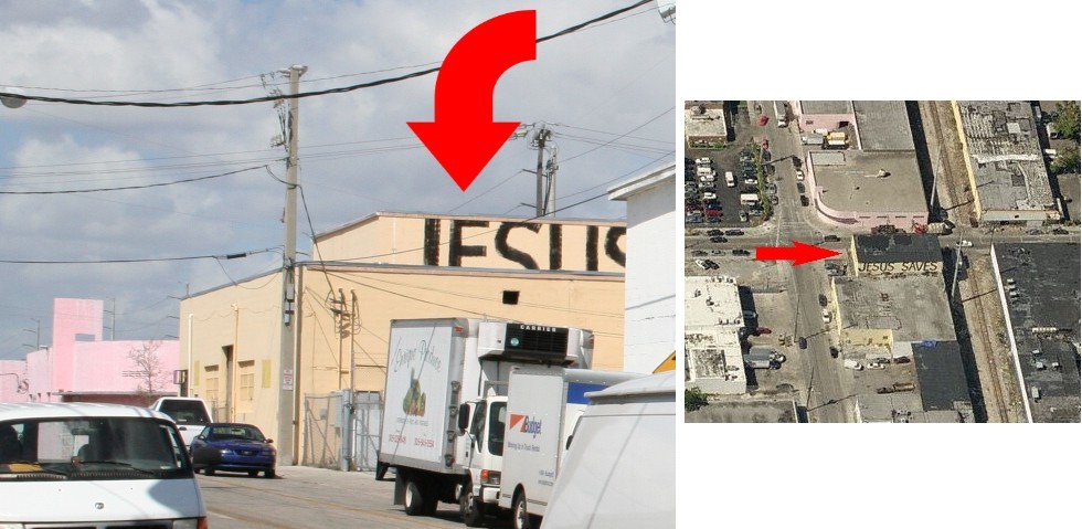
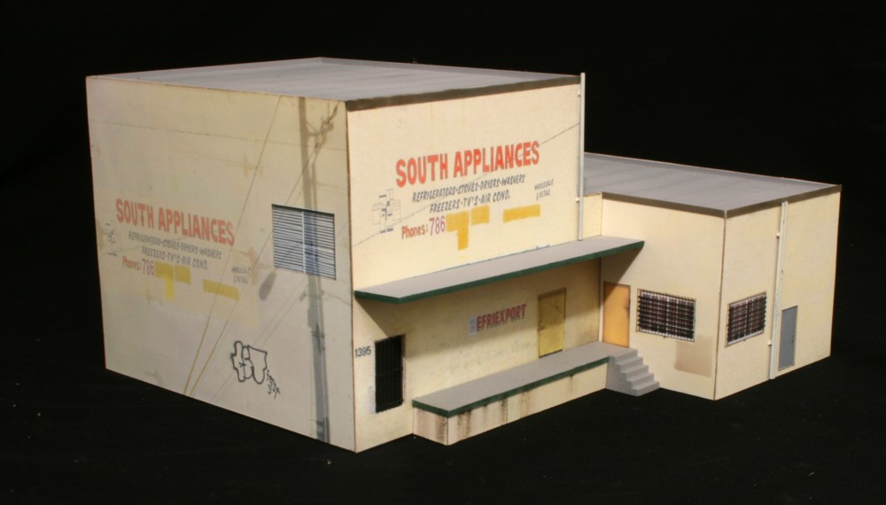
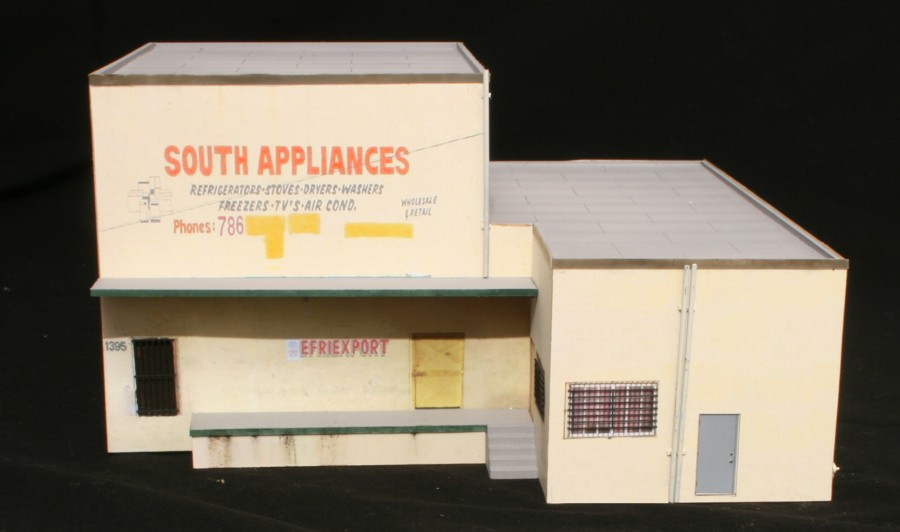
Sadly, not even Jesus, or Allah, or any other deity for that matter could save South Appliances, once located at 1395 22nd Street, NW in Miami. It went belly up sometime in ’07. Located adjacent to the Downtown Spur at the corner of 14th Avenue and 22nd Street two things made it unique. First was its height. Rising over thirty above the street it was the tallest structure in the area. Of more interest was its east facade.
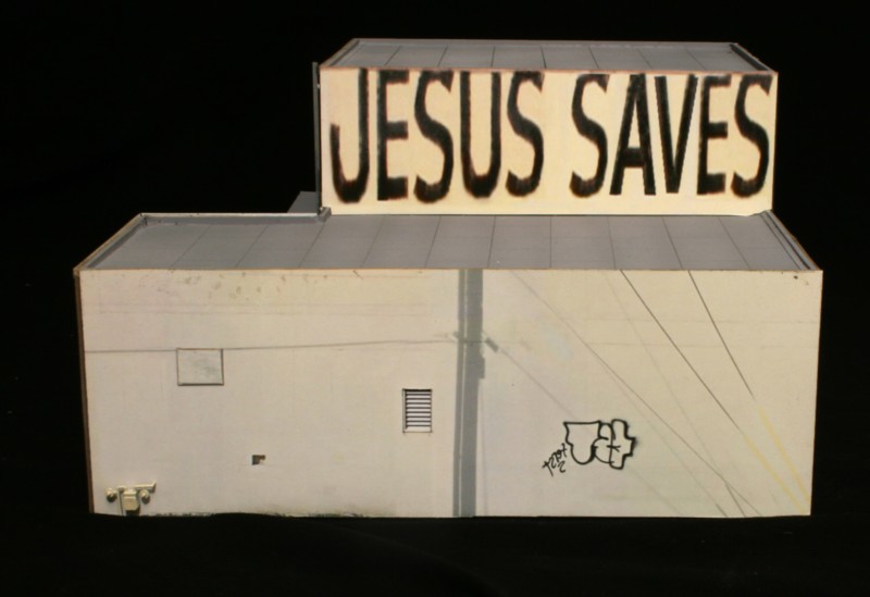
At some point a rather motivated tagger emblazoned the entire east face of the upper story of the building with massive “Jesus Saves” graffiti. The lettering must have been twelve feet tall at least. Whenever you were rail fanning near the runaround, and looked westward, there it was, the huge sign on the horizon imploring all to reconsider their life path.
The model itself was a fairly straightforward project using the photo wallpaper technique. The only challenging aspect was the fact that I didn’t have that many decent pictures, and none existed on Streetview, so it took many hours of photoshop to create the veneers.
With no full image to work from, recreating the graffiti was a very time consuming exercise using the few letters I did have.
Standoff details include parts from Tichy, Rix, and scratch built piping. Almost a decade since placing the mockups of this structure on the layout, it was gratifying to consign them to the trash can and have the final model in place.