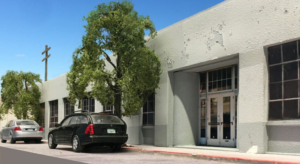
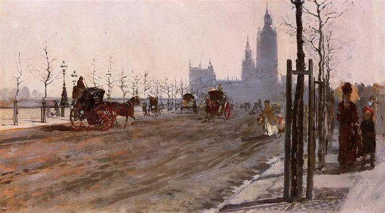
Victoria Embankment, London. G.De Nittis. Last weekend I attended a lecture at the Phillips on the work of Italian impressionist Giuseppe De Nittis (more well known in Europe than the US). On the panel were two art historians and two museum curators, all excellent speakers. They’d put up a slide of a piece of work and break it down in terms of composition, vanishing point, color, mood, etc. Not only was the discussion fascinating, the applications to model railroading were pretty direct.
How deeply a person wants to be immersed in the hobby is a personal decision. The modeling population as a whole contains the full spectrum. On one end you have the interested observers, the non-participant fans of the hobby. In the middle you have the largest group, the fairly involved recreationalists. Finally, at the other end of the bell curve you have, for lack of a better term, the most “serious” modelers. That’s the group I’m going to talk to today.
The serious modeler, the more passionate one, is driven to produce the absolute best results that they can. For them it’s not a case of beating the other guy, winning contests (which I think are nonsense but I digress), pats on the back, or earning certificates. Their measuring stick of excellence is internal. The more they like what they build for themselves, the more they enjoy looking at it, the deeper their level of satisfaction. A gradual but steadily increasing improvement in skills over time can add a very gratifying dimension to life. To throw out an overused phrase, it’s not the destination but the journey. It’s not just about acquiring skills, it’s the fun of learning them.
You can’t achieve mastery, however, if you don’t know what the necessary skills are and that’s where old habits and cultures die hard. The conventional thinking and orientation in model railroading is that excellence is all about neatness of assembly and, to a lesser degree, prototypical accuracy. All well and good if you’re a military or freight car modeler where you are dealing with an individual piece that is going in a display case. For the sake of argument, let’s say that we could assign a number to absolute mastery. If that military modeler gains the skills to perfectly assemble a piece, and weather it equally well, we could say he’s a “99”. Hey, nobody gets a 100.
That won’t work in model railroading. Those skills alone will only get you to an “80”, an 8 out of 10. Why? Because we aren’t dealing with individual models. We are dealing with an entire composition with very complex elements such as scenery, color management over an entire vista, structures, backdrops, and how they are composed to pull together an overall scene. Without that awareness, you end up with what amounts to essentially a neatly assembled architectural model. Neat and tidy, a perfect ““80” of 100. “8 out of 10”. Getting there will likely get you awards too if you pursue that route.
Why only an “8”? What’s missing? The artistic element. Even if a modeler does a great job with an individual component, such as a structure or freight car, they still need to pull everything together. That’s the hard part. It’s the composition that’s historically the problem. Masterful color management runs a close second. While clean assembly is vitally important, the upper echelons of excellence require the artistic aspect ….and those skills are far more difficult to master. That’s the missing piece that gets you from “80” to “99”, the subjective “something extra” that brings a model railroad over the top.
Where do you start? The information is out there but you’re not going to find it in the traditional model railroad venues. So, where does the motivated, “serious”, modeler gain the knowledge and skills to pull all aspects of modeling into a masterful, cohesive, balanced piece of work?
You get it from the art world. Check the model railroading culture at the door and take advantage of the vast resources of knowledge accumulated and refined over the centuries.
If you are truly driven to produce the absolute best results, you need to begin the process of studying and understanding the fundamentals of art. Not only will the journey bring a new and positive dimension to your life, the improved modeling results will bring you a sense of personal satisfaction you’ve never felt before. You won’t need a certificate on the wall. You’ll look at your work and just know it.
What would be a “training roadmap” for all of this? To start it’s important to understand that a big part of this is improving your creative intuition (as opposed to taking art classes which I’m not talking about). This intuition improves gradually over time through exposure to and immersion in artistic excellence. Numerous studies have shown that doing so essentially rewires the brain…..and……in contrast….my two cents worth….
“Social media and forums are where brain cells go to die”
-Develop a habit of spending time in great museums, gardens, and around architectural masterpieces. I try to go once or twice a month.
-Attend a lecture on “Visual Literacy”. “In person” lectures are a lot more beneficial than online courses.
-Attend a course or lecture on “Composition”.
-Go to lectures, tours, and panel discussions at the museums. They will spend a lot of time breaking down a painting in terms of composition, color, vanishing point, everything. In my experience the speakers that do these are far better than you would encounter in everyday life.
It’s a combination of immersion and exposure to excellence, that essentially does this “rewiring” of your brain and improves that creative intuition.
Nothing is immediate, but if you add artistic study and exposure to your lifestyle, things will start to sink in and you will see improvements in your modeling that you never envisioned. For more on the subject, check out my recent book, Model Railroading As Art.
————————————————————-
Need Help Designing Your Layout? Check out my model railroad design services HERE.
