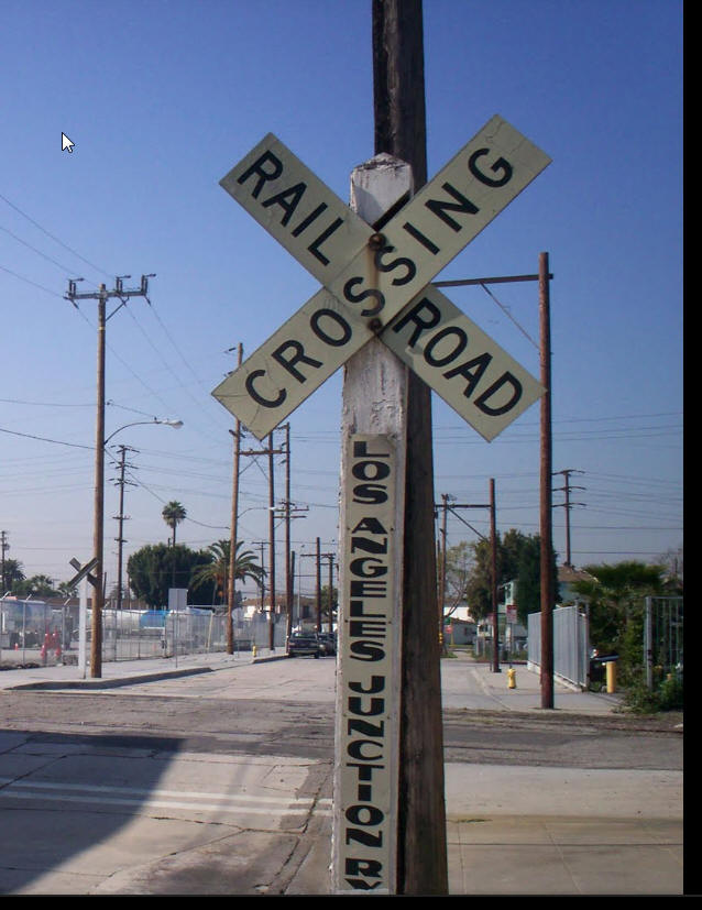
Model Railroad Blog

Working Successfully with Structures

MeWantIt!

Exercise self restraint when purchasing structures.  Determine what you need and only then start the purchasing process.  Avoid the natural tendency to randomly “buy and plop”.


Incorporating structures into your layout in a way that works visually involves a little more than “buying and plopping”.   Some things to consider………………

  • Color:  Color and weathering drives everything.  Successful color application and weathering can dig you out of a lot of holes. The colors you select and your weathering strategy should be your primary focus.   Paint everything.  Those light blue, totally appropriate, Rix Products light blue injection molded steel structure kits?  Paint them.  Those pre-assembled/built ups made from colored styrene?  Problematic.  Study photos carefully.  Work in subtleties and use ink washes.  Teach yourself to weather and repeat the mantra, “keep it subtle, keep it toned down” over and over.
  • Appropriateness.  Is the kit appropriate for the location you intend to use it?  When I attend a train show, and see the shopping bags stuffed with structures, I wonder how many actually get built.  Not many I bet.  Buying a kit and then trying to find a place for it doesn’t work.  You need to do the opposite.  Determine the structure you need and only then buy one.  Sorry, I know, this requires self restraint!
  • Be keenly aware of cross sections.  Overly thick rails, guy wires, vents/pipes and window mullions are tip offs that you are looking at a model.  There is a growing range of photo etched products that make replacing overly thick parts a viable option.  Tichy makes some very thin injection molded parts.  Many manufactures make etched stairs and walkways.
  • Basic neatness.  It takes practice but learn to produce gap free, tight joints at corners and joining points
  • Pay attention to what else is around the structure and the environment it is placed in.  Don’t place other structures, roads, or elements too closely to the model you’ve just finished.  Allow some space.  Again, I know, this requires self restraint.
  • Beware of “seen it before” disease.  Some kits are so immensely popular that you see them on thousands of layouts.  The Walthers ADM grain elevator and New River Mine are  two such examples.  The brain shuts down when it sees these on your layout and screams the “it’s a toy!” alarm.  These are nice kits and the work around is to creatively modify them.


Federal Cold Storage

IMG_5695

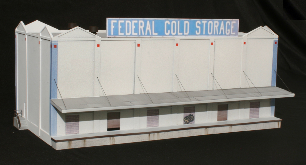
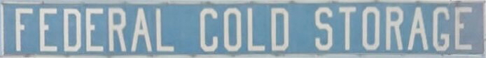
I put the wrap on Federal Cold Storage to be placed in the crook of the “L” on the LAJ layout (the corner if you will).  Getting the first structure under my belt gives me some momentum.  Built to the “reasonable representation” standard it wasn’t intended to be an exact replica of the prototype. Walthers RJ Frost was used as the basis.

FederalColdStorage

 A few of the techniques:

  • For the overall base coat I laid down a foundation of Rustoleum textured paint (rattle can).  This was followed by Rustoleum light gray primer.  Finally, I lightly fogged on white primer allowing a hint of the gray to show through.
  • The light blue columns were an airbrush dusting of Model Master “Azure” applied lightly enough that some of the white underneath would still show through.
  • I flipped the kit canopy upside down exposing the flat side and applied Builders in Scale corrugated roofing adhered with 3M Super 77 and few drops here and there of CA.  The metal was then sprayed with Rustoleum light gray primer.  Weathering was with an India ink wash (1 teaspoon of ink per pint of alcohol) applied with a soft brush using strokes parallel to the corrugations.
  • Guy wires are .015″ music wire.
  • The loading ramp corner protector was painted with Rustoleum Earth Brown camo. paint, one of my favorite colors for dark rust
  • Cracks on the loading ramp face were simulated by very, very lightly dragging a Crayola black pencil about.  Several India ink washes were applied to the face afterwards (2 teaspoons of ink/pint)
  • To create the rust streaks on the platform face, I lightly dropped a few specks of brown weathering chalk at the top of the ramp, put on a latex glove, and then wiped the chalk downward with my finger
  • Four of the doors were blocked in with cinder block (photo wallpaper using photos of actual block).  If you want to use the file below, print it out 1.3″ tall so the blocks are the right size.  Use gloss photo paper and seal with with Krylon “Preserve It” (Matte)

BlockBase

  • The two steel rollup doors were photos as well

IMG_5902e2

  • The sign on top was a photo edited screen capture of the prototype sign using Google Streetview.

FCSsignLight

Creating A Color Vintage Skyline

SkylineCropped

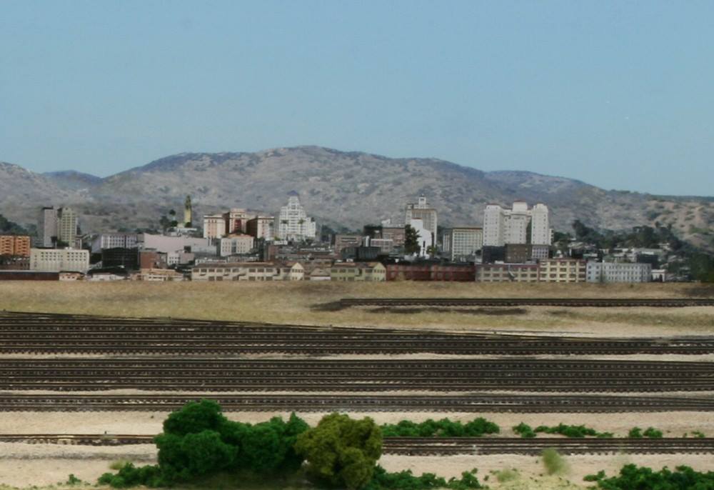
Backdrop image of San Diego skyline circa 1955


My most recently completed commercial project is an N scale, proto freelanced, SP project set in San Diego in the 1950’s.   It was important to my customer and friend Jim that we create at least a reasonable representation of the San Diego skyline IN COLOR from that era.  Creating the almost four foot long image inset became a fascinating and extremely challenging project in and of itself.  Finding images wasn’t a problem.  Finding them in COLOR was a major problem. Between the two of us we spent hours searching the web to no avail.  Jim made personal visits to the San Diego historical society.  Nothing.

BWskyline

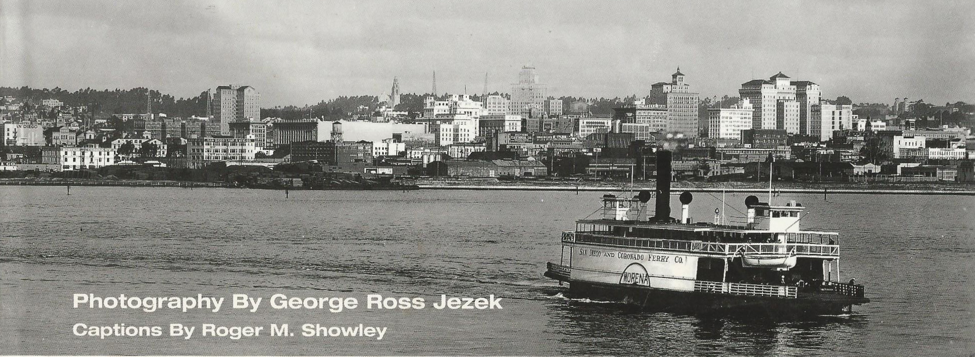
My first approach was to purchase “colorization” software to add color to the image shown above from the cover of the book “San Diego Past and Present” by George Jezek.   How do I put this diplomatically….said software was as useless as tits on a bull.  Just worthless.  Long on hype, short on power, these programs do nothing that a select/bucket fill in Adobe can’t do.  Back to square one.  I let it sit for awhile and then a thought occurred to me.  I wonder how many of the iconic structures in the photo above still stand.  I called Jim and he started digging around.  Bingo!  To our total amazement almost all of them still exist in perfectly restored form, they are just obscured by taller, more modern buildings in front of them.  Jim did some more digging and came up with the names of the key buildings.

On to my tool of choice, Google Streetview.  Between street view and commercial photos I captured shots of each key structure and squared them up the best I could in photo shop.  More research on the web and I found a good shot of a low rise San Diego background hill.  What followed was almost eighty hours of cut and paste as I painstakingly edited each structure.  Using the black and white photo as a guide, I first pasted the hill in the back and then pasted the structures in place working back to front.

Dave Burgess of Backdrop Junction produced the custom printouts on peel and stick vinyl.  I can’t speak highly enough of Dave’s professionalism and patience in working with me.

SDskyline

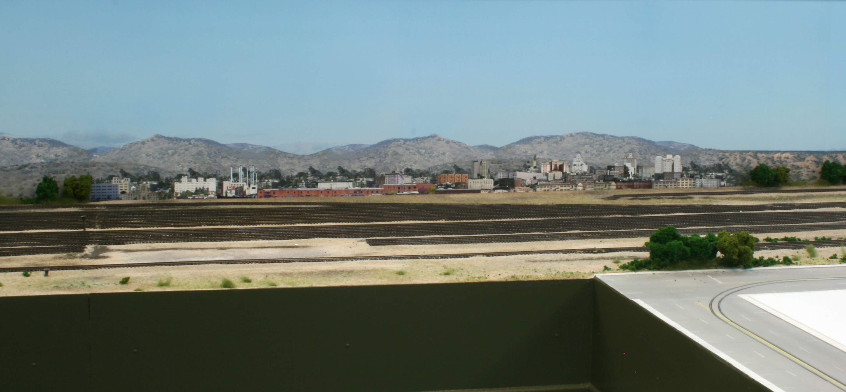
Once the  skyline was finished, it was inset into place on one of Dave’s Southern California images and printed out.  The roll of vinyl was then placed on an MDF backing following the instructions Dave provides in a video tutorial.