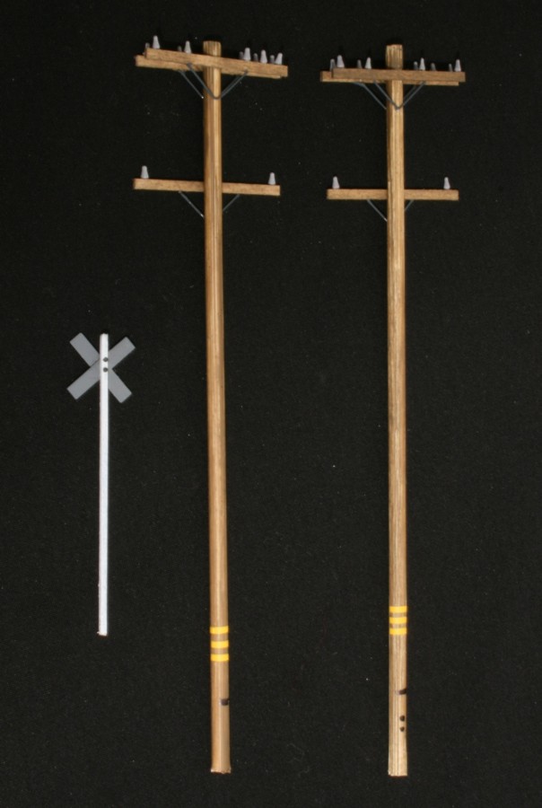
I spent the better part of Saturday scratch building two utility poles and one cross buck for the Everett Avenue crossing. I’m guessing I had about six hours into the project and the cost of materials probably didn’t crack a buck. (lots of recreational play value per dollar!) On top of that, when I was done, I had something better looking than anything I could have purchased ready made. This would be a good project for a student or deployed military because the parts are small, inexpensive, and will, without question, be needed once you get a layout. They are also details that create a fair amount of visual impact.
Crossbucks
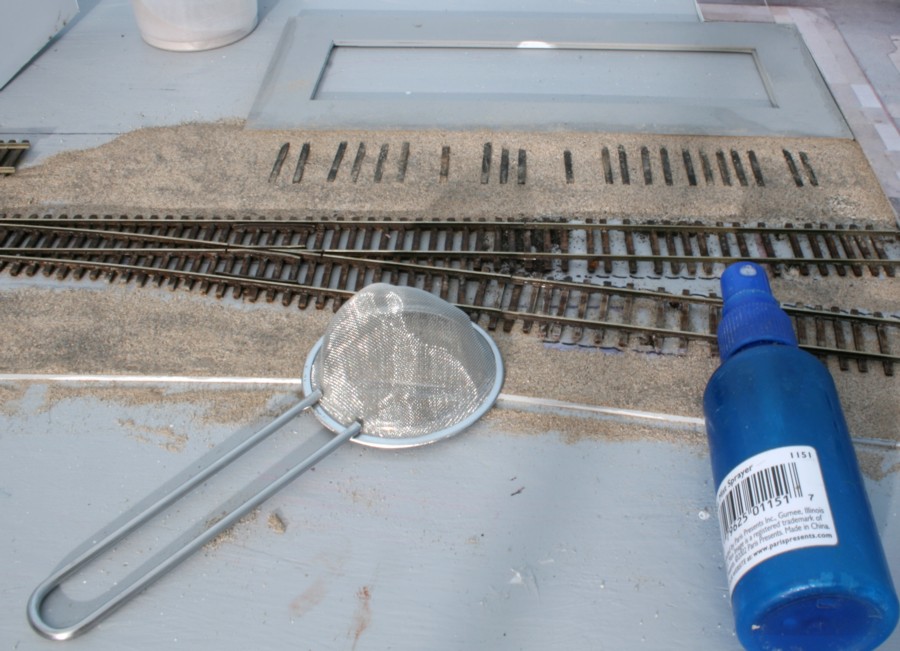
Take a Tichy plastic cross buck and shave the cast on post off. Spray paint the back of the cross buck dark gray.
For the post, take .041″ basswood (Midwest pn 8016) representing a 4×4 and paint that gray as well. When the paint on the post has dried, give it a few swipes with 400 grit sand paper to get the “fuzzies” off of it. Lightly spray it with flat with white spray paint and give it another pass with the sandpaper.
Glue the post to the cross buck plate. Take two Ticky NBW castings, paint them with dark gray primer or camo. brown and glue them in place. All done!
Utility Poles
You’ll need:
- Bamboo skewers from the grocery store (pole heights vary but a common length is 40 feet with 6 feet of that buried in the ground)
- .0416″ x .0625″ basswood (Midwest pn 8017) representing 4×6 cross arms. Cut to scale 8 foot lengths. (8 feet is a common length although some cross arms are longer)
- Insulators scavenged from Atlas telephone poles
- .015″ Music Wire (K&S makes this)
- Yellow decal stripes from your scrap box
- Tan or earth colored solvent based paint
Lightly dilute your paint and stain the poles and cross arms. Mark the center of the cross arms.
Start with the top cross arms. There are two of these, back to back on the top. Glue them roughly a foot down from the top of the pole. Next, glue one more single cross arm a scale 6 feet below the top arms. For adhesive use a thicker viscosity CA. Snip off a half inch long piece of music wire, bend it in an “L” with 1/4″ sides, glue it beneath the cross arms and paint it a dark gray.
Take a spare Atlas telephone pole, spray it a light gray, snip off the insulators and glue them in place on the cross arms with CA.
Some streetside poles have yellow reflective tape near the bottom, I simulated these with yellow decal stripes from my scrap box.
Utility pole styles vary greatly and it’s simply a matter of looking at your window to get some ideas.