All done!
Model Railroad Blog
May-Vern Liquor 4 February
Some Videos of the Layouts
I finally had a chance to meet long-time internet friend Tolga E. from Miami. He was in town for a college physics conference and was able to break free to come over and see the layouts. He shot some video of both the LAJ and the Spur which you can see here: https://www.youtube.com/watch?v=70bFp-5gg-4
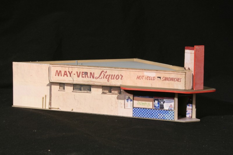
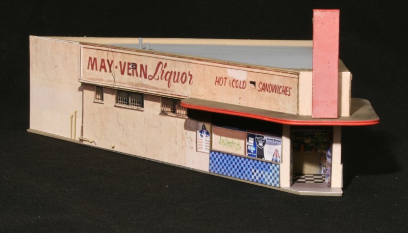
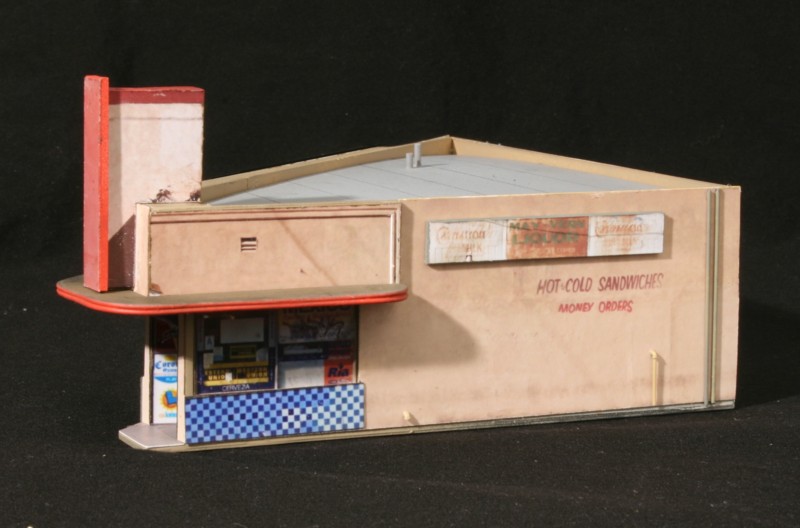
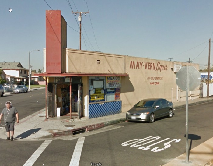
May-Vern Liquor (Jan31)
Scene composition is always a slippery slope, especially for freelance or proto-freelance layouts such as the LAJ. If you cherry pick and select a random collection of the most interesting structures you have what looks like a model railroad. Go too far in the other direction and you don’t have enough to sustain interest. Somewhere in there is a balance that is difficult to quantify. A starting point might be one focal subject framed by three more mundane structures. The mundane structures set a sense of place and provide visual contrast.
As District Blvd. slices diagonally across Vernon the actual structures on the north side of the tracks were exceeding unexceptional. Originally I was going to model what was there, revel in the boring, and leave it at that. However, this piece of real estate is essentially “the center of the painting”. If there was one place on the layout that needed a defining structure this was it. I spent a few hours aerial rail fanning Vernon looking at what I could find on other diagonal running streets besides District Blvd. I didn’t have to look long before finding May-Vern liquor (A play on the towns of Maywood and Vernon, CA). Small and Edward Hopperesque it was the ideal candidate. May-Vern will then be the centerpiece on the layout. I’ll place a more mundane structure next to it to act as a frame, provide contrast, and make sure the eye is drawn to May-Vern as the focal point as opposed to having the structure lost in the visual noise of other unique structures.
East Rail Update
It’s hard to believe but it’s been four years since I’ve been to Miami to check on things. A visit was long overdue. East Rail continues to be as enticing of a modeling subject as ever. Right out of the box we were treated to see the lead in front of Salco packed with eight cars, two at the door, two “offspots” waiting to be spotted plus four chlorine offspot tanks waiting for room to clear up at Sentry. The track to Guixens had long since been removed and, sadly, Seaboard/Archive America’s appears to be toast (although the track remains). I was also surprised to see a car spotted just down the street at Pan Am Paper. So, as far as active industries at East Rail in ’17 we have: Salco, Sentry Chlorine, Suburban Propane (formerly Weeks Gas), and Pan Am Paper all going strong.


