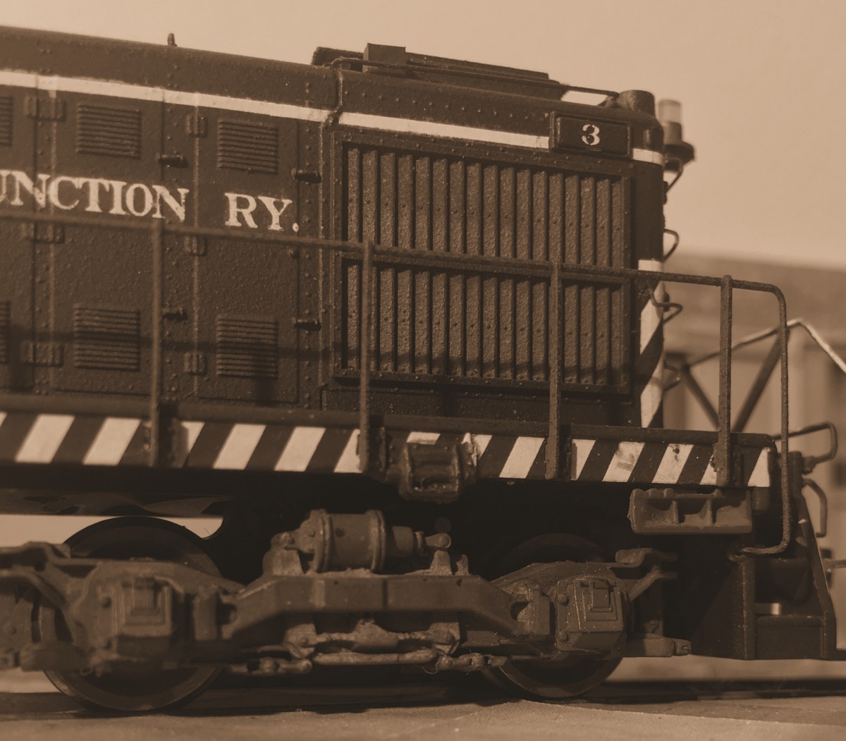
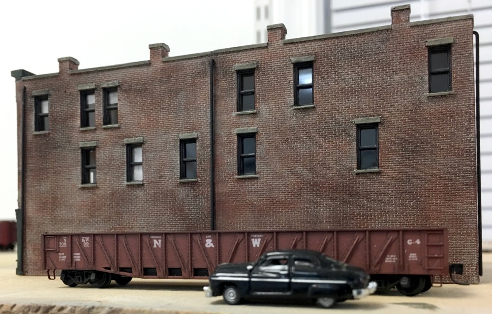
Los Angeles Junction Number 3 idles in the street at District Blvd., Vernon, CA. August 6, 1961
Model railroading offers the choice of of experiencing our work through two lenses, the naked eye or the camera. It’s the camera that opens up so many opportunities for interpretation, framing, and presentation.
The image above is of my recently completed Atlas Alco S-2 shot crossing District Blvd. on the LAJ layout. I used my iPhone 6sPlus and a single photo flood about two feet behind my left shoulder. Once in photoshop, I tightly cropped the photo and added a sepia tone effect.
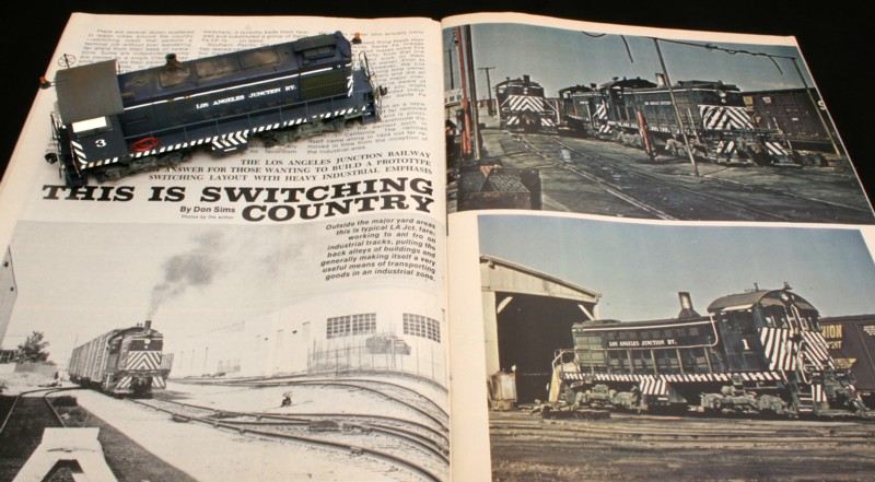
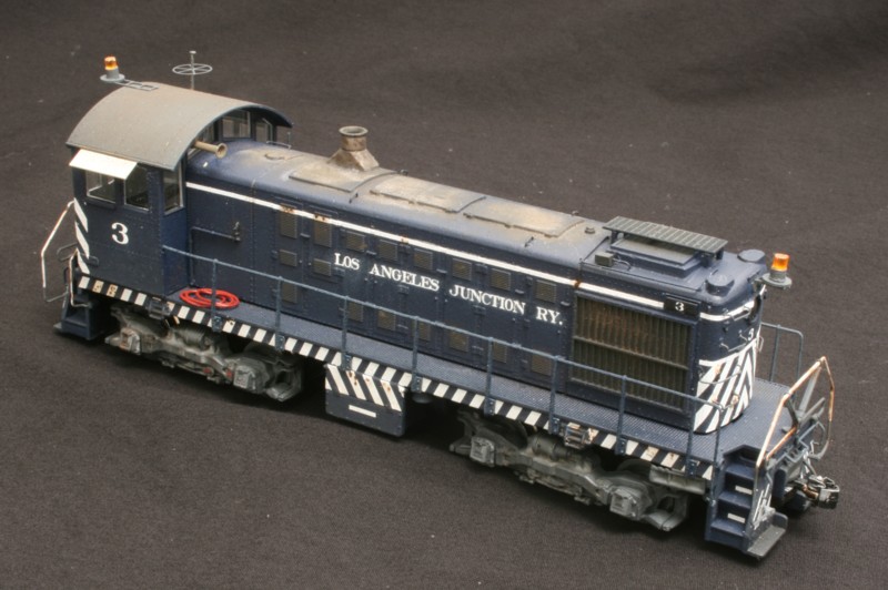
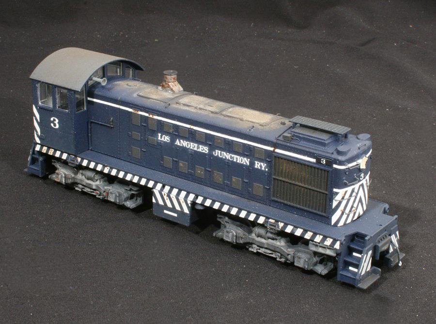
I was 16 when I picked up the December 1976 issue of Railroad Modeler magazine from the local hobby store. Inside was an article that would stay with me since. Written in a unique style, was a piece on the Los Angeles Junction by Don Sims. I was just riveted by the look of the zebra striped Alco’s and the description Don painted of the railroad. I guess I’m a “slow worker” but eventually I circled around, buckled down, and built the model I always wanted.
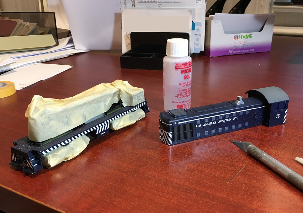
I’m starting to hit the home stretch with the Alco project. Most of the weathering is done and about half of the gingerbread details are mounted. Next up are the handrails and final details. I use photographs such as this to look for areas that need weathering and color pattern touch ups (I see a few that need attention) as well as parts that weren’t installed with straight alignment.
Something seemed a little off yesterday so I let it sit for awhile while I tried to figure out what it was. It occurred to me that originally the white striping was just too bright and I wanted a way to very subtly tone it down. For this project I used a thinned Dullcote mix applied with an airbrush. I poured some of the Dullcote in the airbrush cup and then added a tiny drop of US Army helo drab to give a hint of color. I tested it on a white card first which was good as the initial batch was too dark. I mixed a second, weaker batch, re-tested it by spraying it on a white card, and then fogged that on to knock the edge off of the white.
When you apply alcohol on top of Dullcote it reacts to create a frosty haze. This is something you can use to your advantage if you think things through. I used the frosting effect on the trucks and to create the ratty sun bleaching on the top of the hood. If you go this route you just have to make sure you don’t inadvertently hit it with Dullcote again or the frosting effect will disappear and the Dullcote will return to its totally clear state.
Mock up of WWII era N scale scene to test color and cross section size.
With only one locomotive project remaining, work on the LAJ layout is drawing to a close. As I mentioned before, I’ve been thinking a lot about “what’s next?”. Honestly, I thought I’d drift and wallow for awhile trying to find something that motivated me. Ideas come from the strangest places. I was tuning the layout in the basement and happened to glance down at my bookshelf. There they were, the genesis of what will keep me occupied for the next several years….three books on the NY Harbor railroads plus the exceptional Ted Rose watercolor book. It sounds sort of idiotic but my reaction was, “Wow, I forgot I had these books and had forgotten how interested I was in this theme”.
So that will be it, a proto freelance NY Harbor layout…..in N scale….WWII era….steam power. Having done strict prototype layouts and proto freelance, I really haven’t noticed any difference in how much I enjoy one approach over the other. They each have their pros and cons. For this project I want to model the general look of The Bush Terminal railroad in the WWII era in the general vicinity of 1st and 2nd Avenue between 34th and 65th Streets in Brooklyn. Tight curves, soot covered brick, street running. I’d like to capture the brooding smokey mood of Ted Rose and Hopper’s work.
The enormous advantage of N scale is how much you can easily fit in a small space. There are no free lunches and N scale has some pretty significant challenges: lack of product availability, overly thick details, cast on grab irons, a lot of poorly running motive power, sketchy quality control of turnouts. I do think though that with some careful planning and slight of hand I can work around a lot of this.
The Downtown Spur will remain due to it’s long run length and ability to host operating sessions. I’ll maintain it but I’m not sure how much more work I’ll do on it. The LAJ doesn’t take up any room at all and will remain. The Brooklyn layout will go in the same room as the LAJ project and will be equally small. I’ve learned the hard way that you have to really keep the shackles on with N scale when it comes to limiting layout size or it will eat you alive, especially with more time consuming urban themes. More to come in the months ahead.
I feel like I’m finally turning the corner on the Alco project. I knew going in the hardest part would be the striping, and it has been. The commercial products aren’t a match either in terms of the barricade angle or stripe width so a lot of extra time was spent working around what is available. Everything is in place so now it’s a matter of patience…applying Microset and Microsol, letting it dry, pricking the air bubbles with a needle and repeat the next day.