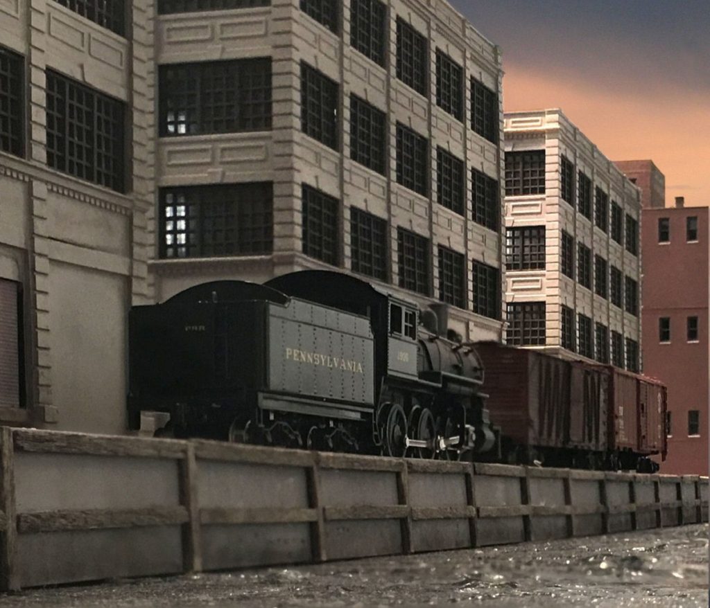
Back to work on the N scale Brooklyn Terminal layout. Currently on the docket is finishing the three large dockside warehouses. Lots of windows! As I was wrapping up last night I noticed the interesting lighting effect cast off by the overhead halogen track lights which lead to the image above. Smart phone camera’s convey a sense of mass that is hard to replicate with a traditional SLR.
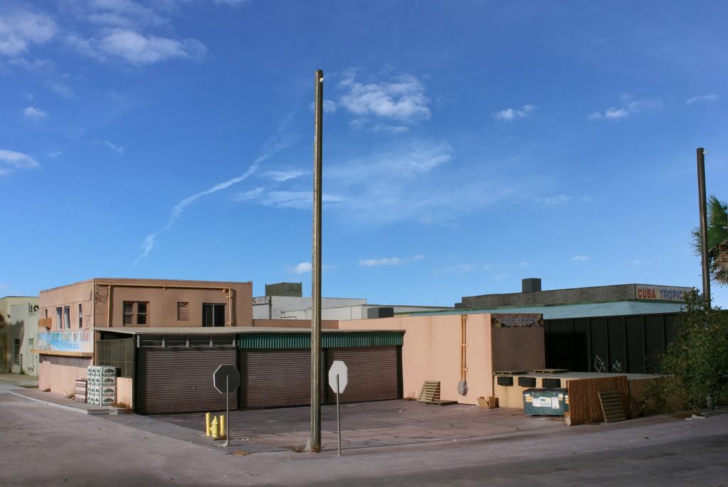
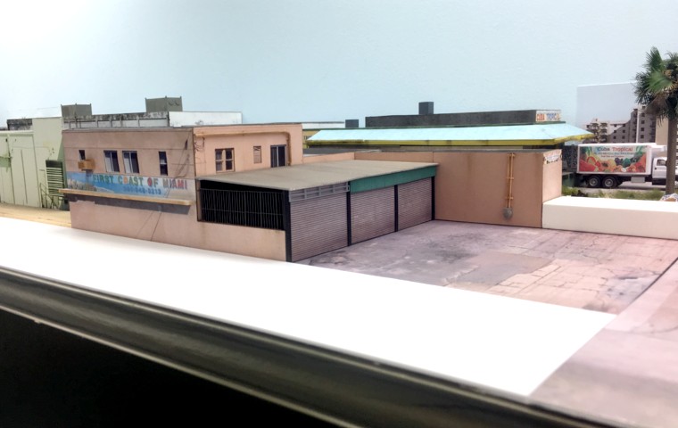
Facing west from 13th Avenue towards the First Coast of Miami produce stand on my Downtown Spur layout.
A recently saw the movie White Crow, a biopic on the life and career development of ballet star Rudolph Nureyev. Lots of lessons for us in there. How in the world could a movie on ballet have any applications to model railroading? I’ve always maintained that our hobby, if pushed to its upper limits, can enter the realm of art. Once you make that mental leap, you then open the door to taking all of the principles of the art world, techniques perfected over the centuries by the best that ever lived, and applying it to ours. It’s pretty empowering when you think about it.
In the movie, Nureyev consistently made a concerted effort to intensely study other fields such as painting and sculpture and apply the spirit of intent to what he was doing. Without being able to articulate why, I’ve noticed that my modeling ability took a major step forward after I began spending more time in art museums, reading biographies of world class artists, and taking courses on art theory and interpretation at the Smithsonian (note: I took no courses on actual artistic technique and have no desire to do so).
In addition to using cross pollination from other arts, a consistent theme hammered home by Nureyev’s coach’s and competitors was the distinction between dancing that was technically correct but lacked a hard to define spirit and soul vs. dancing that, despite subtle clumsiness, nonetheless had that hard to define element that lifted the emotions of the audience. In one key exchange one of Nureyev’s friendly competitors said to the effect, “we will always be technically superior to the Russians but will never ever be able to attain the levels of artistic brilliance that is cultural inbred into Russian ballet.” In model railroading we have a long standing culture of associating quality with prototypical accuracy. It’s a culture that often leads the viewer with a hard to define sense of ambivalence when looking at a modeling subject. On the other end of the spectrum is a culture that tends to reward a caricaturish approach.
The scene above on my Downtown Spur layout draws heavily on Edward Hopper’s style of relaxed melancholy and long shadows. Techniques such as symmetry, accents, contrast, negative space, and chiaroscuro were all lessons learned outside the sandbox of our hobby.
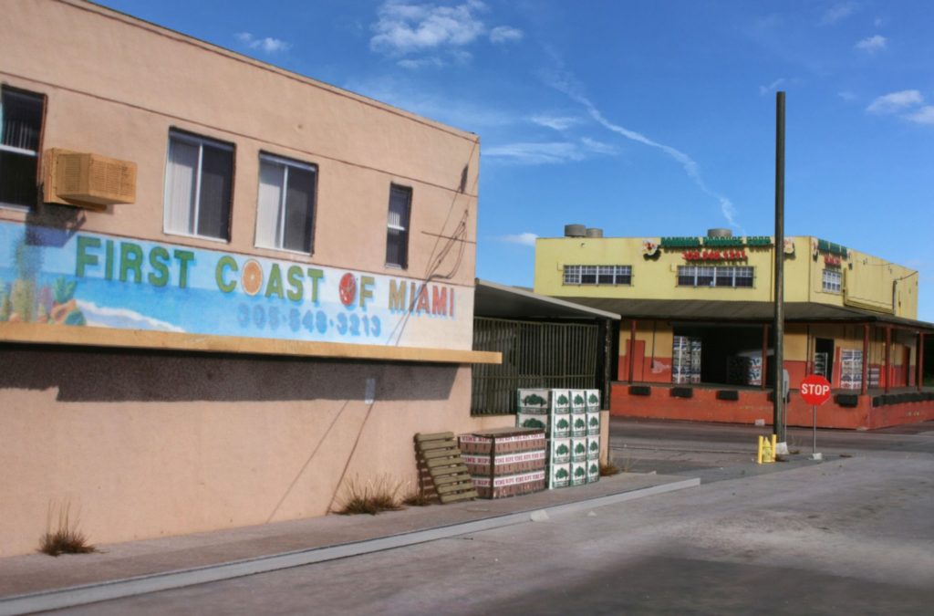
The First Coast structure is now in the bag. Photos can pick up errors the naked eye can’t. After looking at my previous construction shots it was apparent that I’d made the electrical conduits too large of a diameter so I needed to go back and replace those. One of the more effective illusions of photo wallpaper is in the window area. By stacking two sheets on top of one another the windows are very convincing. The bottom layer is gloss photo paper. The second stack, the wall with the windows cut out, gets the Dullcote treatment. The end result is the impression of window glass glare. You can also see elements just behind the glass such as blinds. The loading dock was made from a block of 1 x 2 PVC “wood”.
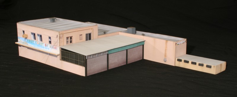
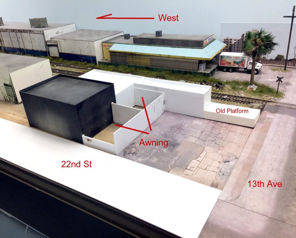
I was able to get most of the First Coast structure done this weekend. Still remaining are the loading platform to the right and the foreground pavement.
It’s nice having a layout that’s half to two thirds done. You have enough completed to run trains and convey your vision while at the same time you can throttle back and work on whatever project strikes your mood. Next on the drawing board is the First Coast of Miami complex. This week I finished building the core and doing the photoshop work for the parking lot out front.