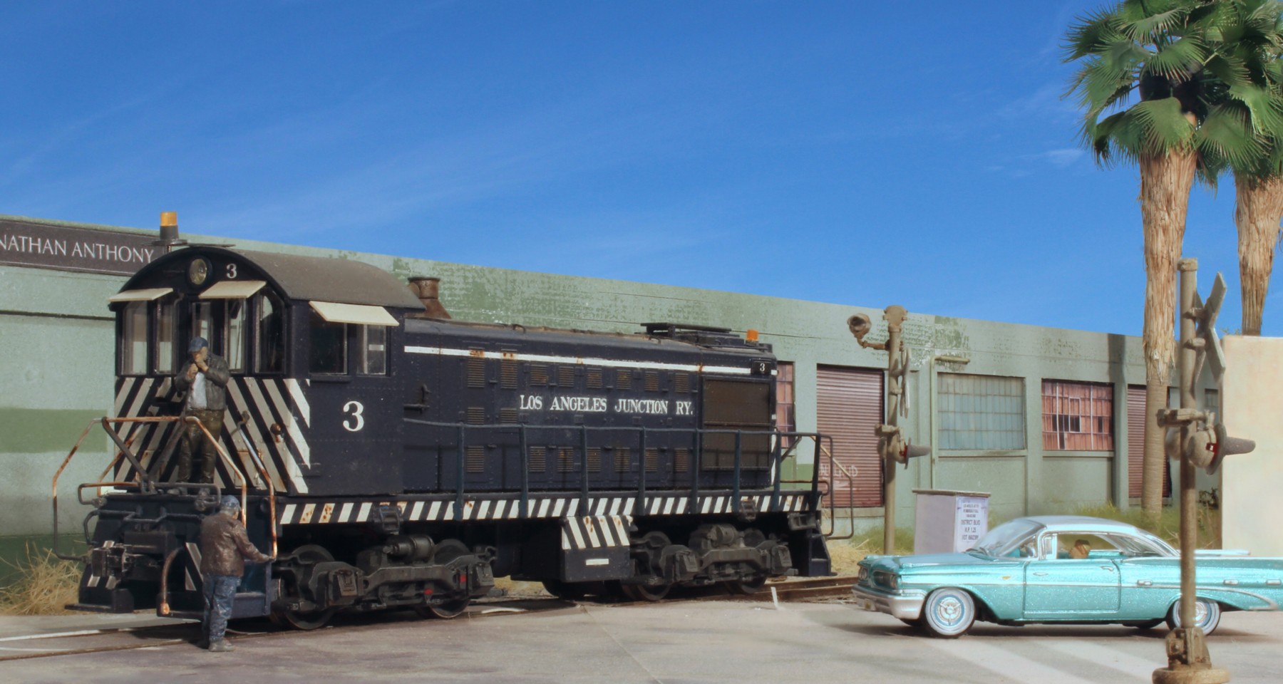
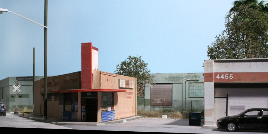
The above shot is an experiment in playing around with a 1960’s look. The figures are from ModelU’s upcoming North American figure line. The vehicle is by Oxford Diecast.
The above shot is an experiment in playing around with a 1960’s look. The figures are from ModelU’s upcoming North American figure line. The vehicle is by Oxford Diecast.
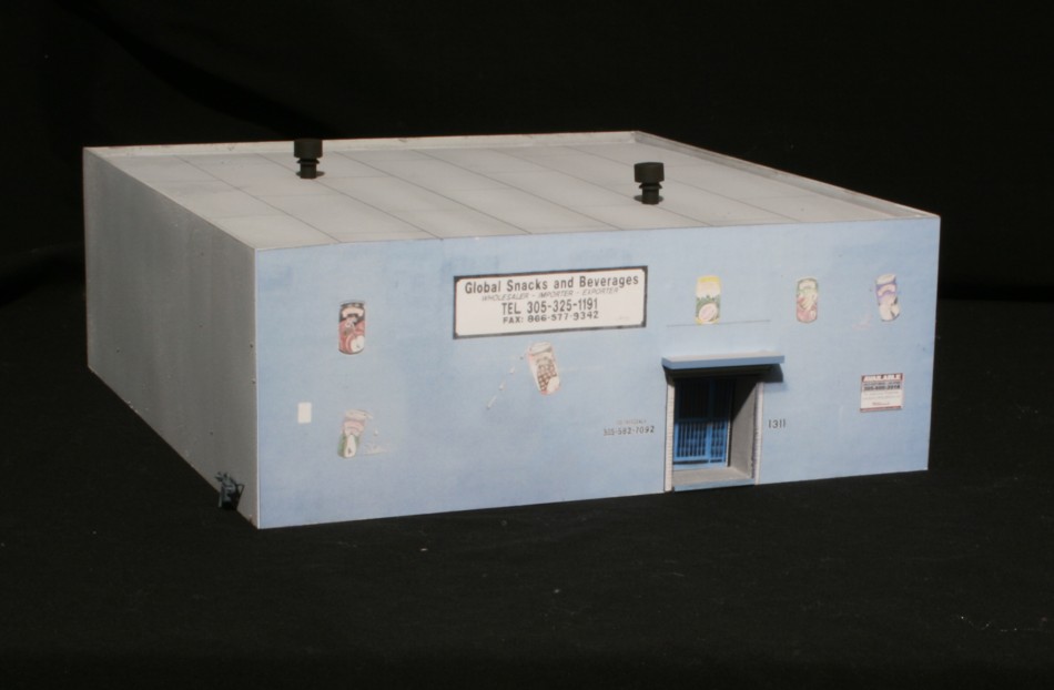
The final remaining structure on the block between 13th and 14th Avenues was Global Snacks. There is very little to it, just a stucco covered cube of cinder blocks.
I found an old image buried in my files and decided to play around with it to see if I could approach the style and look of renowned photographer Jack De Lano’s Kodachrome work from the 1940’s. Shown above is the end result. (Full format version on my Flickr site)
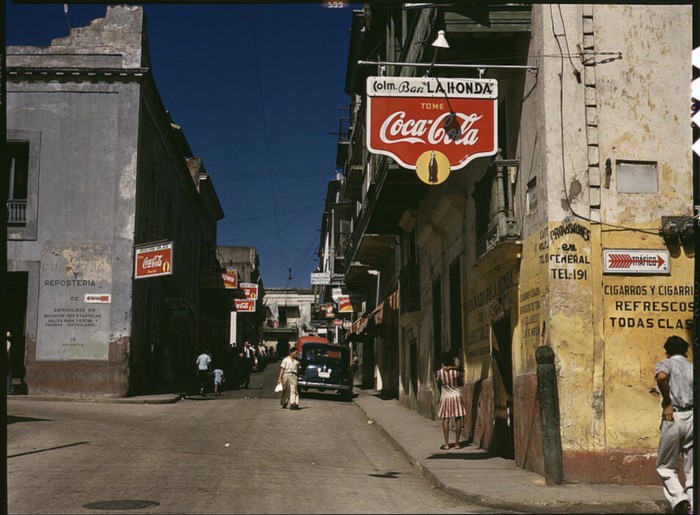
The Jack DeLano photo above (Library of Congress) has that hard defined “it” quality that just draws you in. It’s hard to chase a look if you don’t know what the look is. Easier said than done when you’re talking about intangibles. DeLano shot with Kodachrome in its earliest days. Googling “what defines the Kodachrome look” wasn’t particularly helpful other than quotes from professional photographers describing it as “amazing”, “vivid colors”, “images that make you feel like you are right there”. Agreed, but what do you do with that description? More digging turns up that Kodachrome leans more towards reds, yellows, and greens and away from blue. Just looking at the image you can see how much he used shadows/contrast in his work. Finally, connecting the dots the other thing may have to do with film speed he used. (Film speed defines its sensitivity to light and that comes with a trade off. Low speed films, say less than 200 have very little grain but require lots of light. Higher speed films, say 400 for example, allow you to shoot in darker conditions but at the price of more grain). I shot with Kodachrome 64 back in the day. To Put things in perspective, DeLano used Kodachrome 10! That super low speed may account for some of the crispness in his images.
This is the photo I started with. The main takeaway is how I worked to deliberately insert shadows for contrast. All room lights were turned off and I used one photo flood up fairly high and off of my right shoulder. The big problem? Look at the backdrop, it’s just the room’s drywall painted sky blue. That’s the reason it looks so flat at this point. To correct that the next step is to crop in a sky.

This is the image I chose for the sky crop. As mentioned in a previous blog there is a smooth gradient from light blue to darker blue and not much in the way of clouds to distract you. This was shot over the Chesapeake Bay. I use a plug in called Corel KnockOut which allows you remove the background of a photo. Once that’s done, you can copy/paste it over your own sky image.
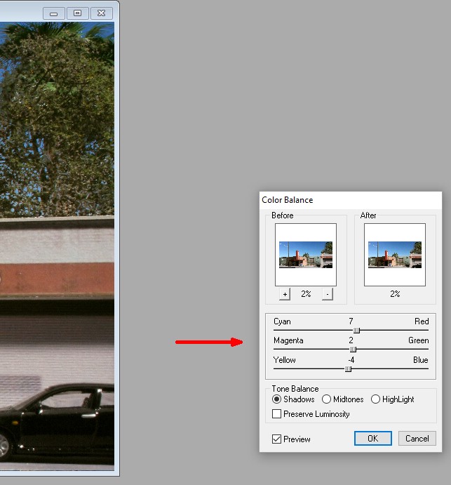
Using my ArcSoft editing program (ten bucks on ebay or free with Canon Rebel camera purchases), you can see how I very, very slightly changed the color balance towards red (7), green (2), and away from blue (-4). Totally trial and error. You just don’t want to go overboard.
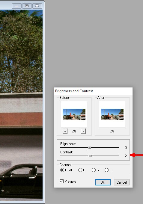
Also, using ArcSoft I bumped the contrast up just a hair, again I worked hard to exercise restraint and not overdo it.
Paint Shop Pro X has a featured called “digital noise removal” which smooths out any subtle graininess. I applied that as a final touch up.
Did I capture the Jack DeLano look? No, but that’s why he’s in the history books and I’m not! I did get closer though and it’s fun to play with.
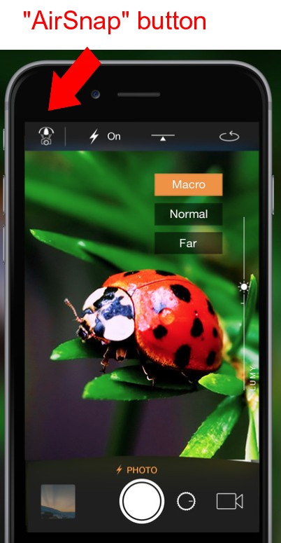
Screenshot of the Camera Plus app screen with the airsnap remote control button highlighted.
If you use your iPhone for layout photography as I do, there are several instances where it would be nice to be able to focus the lens and trigger the shutter remotely. First, you may have compositions where, although you can get the camera in position, it’s physically difficult (or impossible) to see the screen. Being able to have a second ios device that allows you to see what’s on the camera is very handy.
Second, for many photos I use “focus stacking” with the Helicon Focus software. Focus stacking means you take a series of photos at different focal lengths and the program combines them into one composite with amazing depths of field. If the camera location is such that you can’t use a tripod, and it often is, this means you need to lightly touch the phone for every shot to set the focus and trigger the shutter. If you’re not careful, you’ll accidentally move the camera and ruin your composition. Remote control means you don’t need to touch the camera.
The Camera Plus app is a simple to use program that has a feature called “AirSnap” that allows you to use one iPhone to take the photos. A second ios device can see what is on the “camera phone”, change it’s focus and trigger the shutter. The second device is called the remote. The basic Camera Plus app was either free or very cheap, I can’t remember. You’ll need to put it on both devices. Make sure wifi and bluetooth are enabled on both devices as well. Turn them on and they’ll “talk to one another” and connect.
There were two small glitches, both of which aren’t that big of a deal. When you hit the air snap button on the devices the screen will tell you which one is the camera and which is the remote. When I first did this, things were reversed and what I wanted to be the camera was assigned as the remote and vice versa. Apparently the order with which you tap the air snap icon one the respective devices matters. Second, the image on the remote screen isn’t nearly as clear as that of the camera screen but I found that didn’t really matter that much.
Having found a “mostly” non-glitchy way of remotely controlling my iphone camera opens up a lot of new possibilities in terms of composition because I can now place the camera anywhere I want without having to worry about seeing through the viewfinder.
I never thought I’d see the day. In what, to me, is one of the biggest technological breakthroughs in recent years, we FINALLY have miniature figures that are useable. Real people, in real poses, crisply cast. I’ve always been a believer in the adage, “no detail is better than a bad detail”. In that vein, I felt leaving figures off of the layout, or photos, was far better than having a soap carving that looked like a zombie being tased just to say that we had “people” in a scene . Up until now, miniature figures were eyesores that served no purpose other than as placeholders. In all fairness to the manufacturers, they did the best they could given what was an almost impossible manufacturing task.
Enter ModelU out of the UK and their amazing 3D technology. They’ve succeeded in capturing all of the subtleties of the shape and natural body positions of the human form. Even better, their figures are of ordinary people, doing ordinary things. I placed my first order a week or so ago and really had no idea what to expect. Without question the product matches the photos. Prices are very reasonable and shipping was fast. Even though many products show “out of stock” ModelU seems to be a print on demand outfit like Shapeways and my order was filled in a few days. No detail may be better than a bad detail but a great detail adds value.