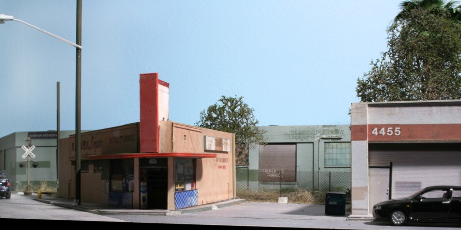
I found an old image buried in my files and decided to play around with it to see if I could approach the style and look of renowned photographer Jack De Lano’s Kodachrome work from the 1940’s. Shown above is the end result. (Full format version on my Flickr site)
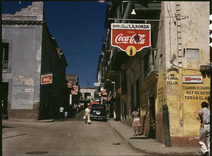
The Jack DeLano photo above (Library of Congress) has that hard defined “it” quality that just draws you in. It’s hard to chase a look if you don’t know what the look is. Easier said than done when you’re talking about intangibles. DeLano shot with Kodachrome in its earliest days. Googling “what defines the Kodachrome look” wasn’t particularly helpful other than quotes from professional photographers describing it as “amazing”, “vivid colors”, “images that make you feel like you are right there”. Agreed, but what do you do with that description? More digging turns up that Kodachrome leans more towards reds, yellows, and greens and away from blue. Just looking at the image you can see how much he used shadows/contrast in his work. Finally, connecting the dots the other thing may have to do with film speed he used. (Film speed defines its sensitivity to light and that comes with a trade off. Low speed films, say less than 200 have very little grain but require lots of light. Higher speed films, say 400 for example, allow you to shoot in darker conditions but at the price of more grain). I shot with Kodachrome 64 back in the day. To Put things in perspective, DeLano used Kodachrome 10! That super low speed may account for some of the crispness in his images.
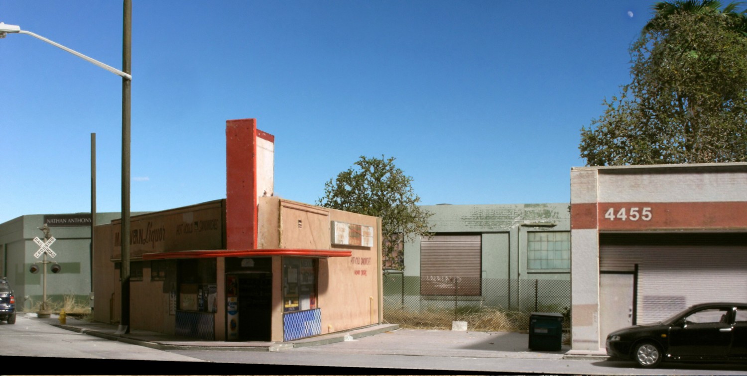
This is the photo I started with. The main takeaway is how I worked to deliberately insert shadows for contrast. All room lights were turned off and I used one photo flood up fairly high and off of my right shoulder. The big problem? Look at the backdrop, it’s just the room’s drywall painted sky blue. That’s the reason it looks so flat at this point. To correct that the next step is to crop in a sky.
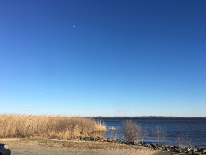
This is the image I chose for the sky crop. As mentioned in a previous blog there is a smooth gradient from light blue to darker blue and not much in the way of clouds to distract you. This was shot over the Chesapeake Bay. I use a plug in called Corel KnockOut which allows you remove the background of a photo. Once that’s done, you can copy/paste it over your own sky image.
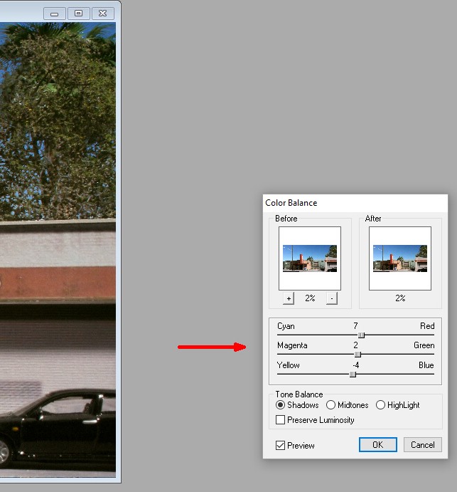
Using my ArcSoft editing program (ten bucks on ebay or free with Canon Rebel camera purchases), you can see how I very, very slightly changed the color balance towards red (7), green (2), and away from blue (-4). Totally trial and error. You just don’t want to go overboard.
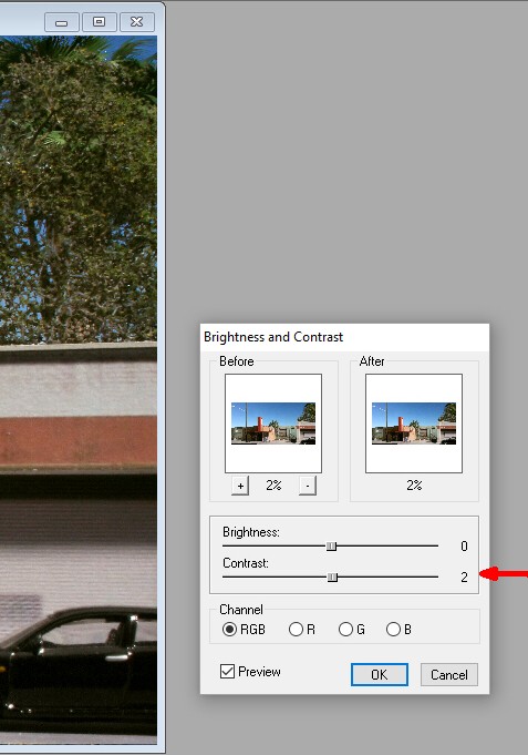
Also, using ArcSoft I bumped the contrast up just a hair, again I worked hard to exercise restraint and not overdo it.
Paint Shop Pro X has a featured called “digital noise removal” which smooths out any subtle graininess. I applied that as a final touch up.
Did I capture the Jack DeLano look? No, but that’s why he’s in the history books and I’m not! I did get closer though and it’s fun to play with.