Model Railroad Blog

Color Transitions

The smoother we can make the transitions from one color to the next, the less defined the boundary lines, the better subjects such as scenery and structure weathering will look.

One of the most important steps in improving a specific modeling skill, and it’s a hard one, is recognizing the subject is something that deserves attention in the first place. You can’t improve something if you aren’t aware it even exists! Case in point is how we handle color transitions, how smooth or sharp the flow is from one color to the next. Mastering this skill is exceptionally difficult but, the better you get at it, the more refined and advanced your work will look.

Examples where this comes into play are: bare soils, vegetation, the lines between soil and vegetation, pavement coloring, and structure weathering. Nothing is absolute but, in general, the flow from one color to the next with the scenery subjects we model is very, very subtle. In this same vein, in most cases we are dealing the numerous colors, all very close to one another on the spectrum, that gently flow from one into another. Rarely, if ever, are we dealing with a single solid color. For example, a street isn’t a uniform gray, it’s dozens of shades of gray.

The end goal, and again I’m not saying it’s easy, is to get away from harsher more defined lines when working with scenery and structure weathering.

Note the very subtle transitions in the two boxes at the top. There are no defined lines in the pavement color shifts. Note the number of gray shades in the pavement and gravel. Note the feathering of the grass into the ballast in the bottom box.

Mother nature is very complex. Note the color transitions from green to beige in the tall grass. Note the number of colors and transitions in the bottom box.

I can’t say I’ve mastered this myself. One thing that helps is application technique. For example, applying material with a sifter as opposed to pouring it from a cup. Just being aware of the vast number of colors, all very similar in hue, is important. Using smoother, delicate brushes (such as a ‘fan’ brush), gives you more control. Beyond that I think it comes down to practice, practice, practice.

East Rail Returns!

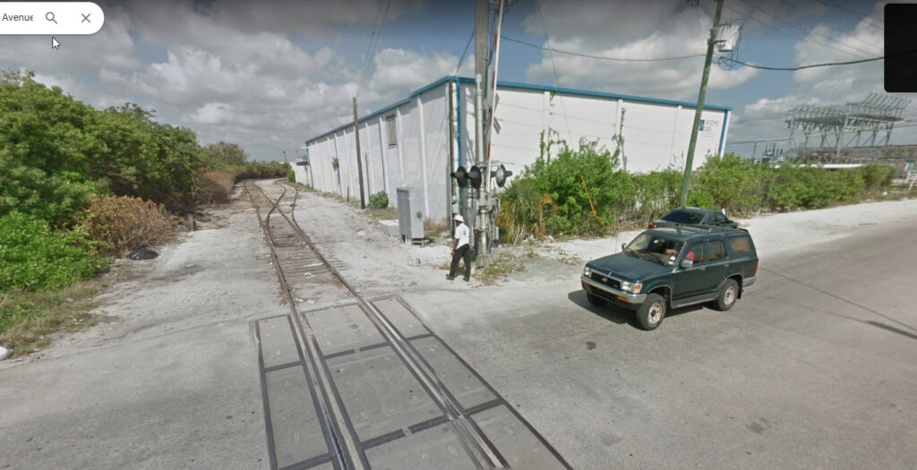
Looking east down NW 59th Street in 2013 we see several boxes spotted in front of SALCO, a swimming pool chemical supplier in Miami’s East Rail industrial park.

For many, many years I’ve bounced around the idea of building a second version of my old East Rail layout. The questions being: where would I put it? What form would it take? Is it crazy to do so!?

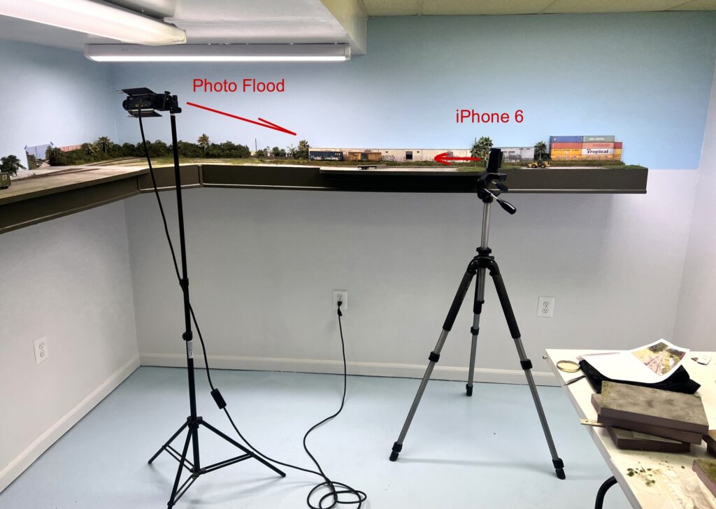
It’s been a slow decision in coming but ultimately I came to the conclusion that the layout had been so successful, on so many fronts, that it was worth making a replica. One of the main issues I faced with version 1 was dust control. It was located in my workshop and, no matter what measures I took, dust seemed to find a way to become an issue. I have a small photo studio in my basement. With a little re-arranging of furniture it became the ideal space for a version 2. Locating the layout there would largely eliminate the old dust problem.

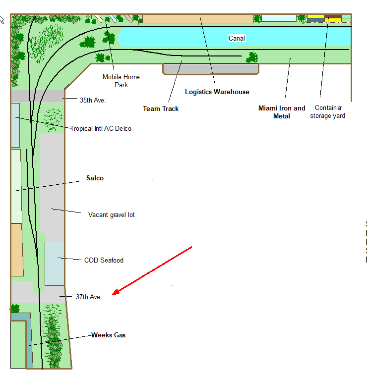
Over the years I played with a few iterations. Ultimately I decided to stay very close to the original design. The leg holding the canal stays essentially unchanged. I did some streamlining on the left leg of the “L” by removing a few spurs that were overkill but, other than that, it stays pretty close to the old plan.

Getting a quick launch and establishing early momentum is crucial. It took ridiculously little time to get the bench work back up. I’ve temporarily placed some Atlas code 83 track down as “proof of concept”. At this point I can pick and choose my projects and develop and detail the project at a leisurely pace. Stay tuned!

Quick Start: Photoshop Elements

In a recent blog we discussed learning Photoshop Elements. The main points were: despite all of the tools on the screen, you only use a few of them over and over. Last time we discussed cropping, color correction, and adjusting lightness and darkness.

Today we’re going to discuss the “selection tool”. As its name implies, the tool is used to highlight a specific area that “you want to do something to”. That something could be making a specific area lighter, darker, a different degree of saturation etc. The selection tool is identical to what you do everyday in MS Word or on your cell phone…highlight something….do something with it. Simple.

In the photo above, I’ve shown the location of the selection tool at the top left. There are three versions: magic wand (which you’ll use most of the time), the rectangular selection box, and the lasso (which I don’t use much).

I use the magic wand aka quick selection tool the most. Just drag it around the area you want to work with. You’ll see the dashed borders immediately appear. If you look closely at the image above you can see the dashed zone around the boxcar. At the bottom of the page are toggles that allow you to increase or decrease the area selected. Clicking add and waving the wand will add to the area selected. Hit subtract if you want to decrease the zone. After some quick adjusting you’ll quickly have the outline of the area you want to work with. If you want to hit the eject button, right click and hit “deselect”.

Lets say you have an image that is perfect except for one area. For example maybe a locomotive pilot is too dark but everything else is perfectly exposed. If you apply the lighten tool globally it will make everything brighter not just the pilot. If you outline that pilot with the selection tool you can then fiddle with it without impacting the rest of the image.

Wrapping up. The quickest way to learn Elements is to get it on your machine and fiddle with it. The most frequently used tools are:

-Cropping

-Color Correction (never needed for outdoor shots. Almost always needed for indoor model photos)

-Adjusting lightness and darkness

-Using the selection tool to adjust a specified zone.

If I get the sense that readers are actually getting the software and trying to learn it, I’ll continue the tutorials.

Downtown Spur Video

When he was up here last weekend, Tolga Erbora filmed what was probably the best video ever produced of my Downtown Spur layout. It’s amazing to me that he filmed this…while operating..with a cell phone. Throttle in one hand, phone in the other. Great job my friend! I have to say I’m very happy with the sound of the offboard sound system you hear in the back ground. Click HERE to watch it.

Quick Start: PhotoShop Elements

I have to say I’m impressed. I thought I’d have everybody running for the hills after my last photography post. A crucial step in getting better photos is becoming comfortable with photo editors. As a review, my suggestion was to steer clear of the expensive, highly advanced programs as they will just overwhelm you with stuff you won’t ever use. Even with Elements you won’t use most of the tools on your screen.

Some bullet points on the subject:

-The biggest step is just getting the program on your machine. Buy a disk on ebay or Amazon and get it on your computer!

-The fastest way to learn is by loading a photo and just “pushing buttons” . Click the tools, move the sliders and you’ll quickly see the results. That will be quicker than reading manuals or watching tutorials.

-To avoid “not seeing the forest for the trees”, there are just a few tools you use over and over, cropping, adjusting brightness, and adjusting color. Their buttons look the same as anything else so I’m going to list them here so you can see them through the fog:

The most used tool is cropping. Click the icon shown, drag the borders to the area of the photo you want to keep and hit the check mark.

The second most common tool is “adjust brightness”. Go the “Enhance” and then scroll down to “adjust lighting”. Just move the brightness slider to get the results you want. The levels tool gives you more control. Just move the triangles to the edge of the histogram to see improvement. Move them around a bit to see how the impact. Experiment with the middle slider.

The next most used tool deals with color. It’s common to end up with a photo that has an odd hue, usually yellow or orange. This is easily fixed. Go to “Enhance” and “adjust color” Click “remove color cast” Use the eyedropper to click on area of the photo that is known to be white, a sign or rolling stock lettering for example. The color will instantly fix. If you want to add a little “pop” you can move the “saturation” slider a little but don’t overdo it.

Once you have those basics down, you can gradually fiddle around and become more comfortable with the other tools over time.

If I get the sense that people are actually taking the steps to move forward with this, actually getting the program, I’ll add a few more tutorials.