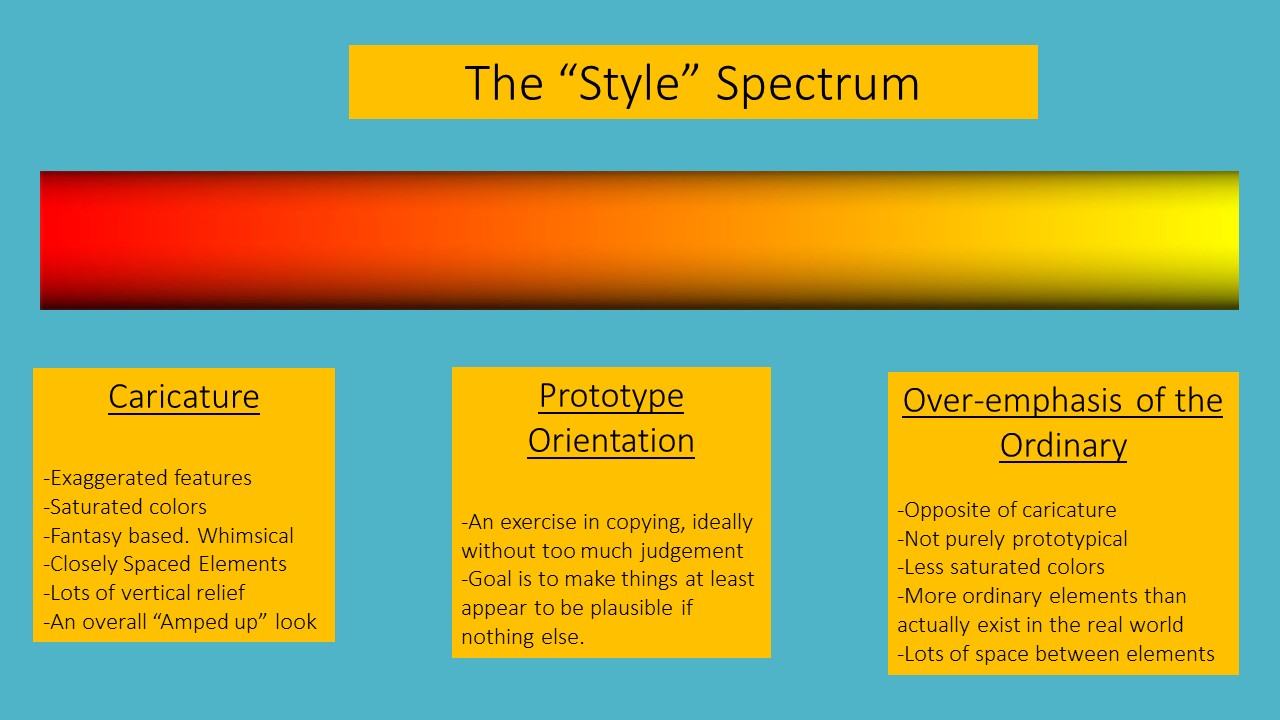
In August of last year I wrote a post on the topic of caricature, caricature being defined as an artistic style leaning towards the exaggeration of features. In model railroading terms it’s an orientation that focuses more on fantasy and whimsy.
Styles fall on a spectrum with modelers spread out among various approaches depending on their personal tastes. We tend to view the ends of that spectrum, the boundaries, as having caricature on one side and a prototypical orientation on the other. That’s not the case, and that reality offers the opportunity for a third stylistic approach. If caricature is an overemphasis, then following that same logic, it has a counterpart. That counterpart is underemphasis.
Decades ago I was watching an Allen Keller video on my friend and mentor, Chuck Hitchcock. During the interview, Chuck made the statement that, “The key to achieving realism is to not just represent the ordinary, but to slightly overemphasize it”. It’s a pretty profound insight that has stuck with me to this day.
What would “emphasizing the ordinary” look like? Take an example where you have a city block with six mundane, white, shotgun houses, one yellow one, and one red one. The white structures are the “ordinary” elements. The eye will be drawn to the red one. A stylistic approach of dialing things back would be to make the entire block white structures. If a section of town has a few faded, rusting corrugated, one story warehouses, you might emphasize those and give them more visual priority, more square footage, than something that is more eye catching.
Let’s take another example, illustrated visually. In my last newsletter, I discussed how vehicle colors played out by percentage, the numbers being supplied by one of the paint manufacturers. On a percentage basis it breaks down like this: silver 20%, white 16%, gray 13%, black 13%, blue 10%, red 10%, other 18%. In other words, two thirds of the vehicles on the road today are silver, white, gray, or black.
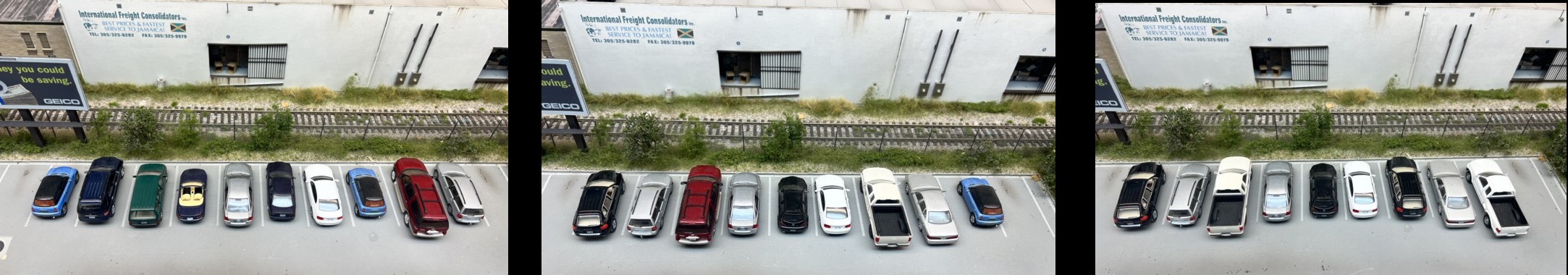
The left photo is caricature approach with no attempt to be prototypical as far as color percentages go. It’s overly saturated. The center photo matches the prototypical color percentages exactly. On the right, I’ve overemphasized the ordinary and used only “ordinary” colors (white, silver, gray, and black). Even though it’s technically not prototypical, in an odd sort of of way, it looks even more realistic, almost an optical illusion.
There is no right or wrong to any particular style. No style is superior to the other. If you’re enjoying what’s in your layout room then that’s what it’s all about. However…..what IS important is that the style you choose be by conscious decision, by thoughtful intent, and not out of benign ignorance or following the herd.
Ken Rusiska
What seems like 100 years ago, when I sold paint and customers would come in to buy spray paint we would ask what color are they looking for, and they would need to look at the colors. 85% of the time it was white or black. The other 58 colors were irrelevant.