In August I wrote about the caricature trap, caricature being a treatment that has an “amped up”, contrived, “model railroady” look to it. There’s no shame in that…..as long as it’s intentional….as long as it something you enjoy looking at. Often though it’s not intentional, and that’s where it’s time to take a pause and evaluate if the look you have is the look you want.
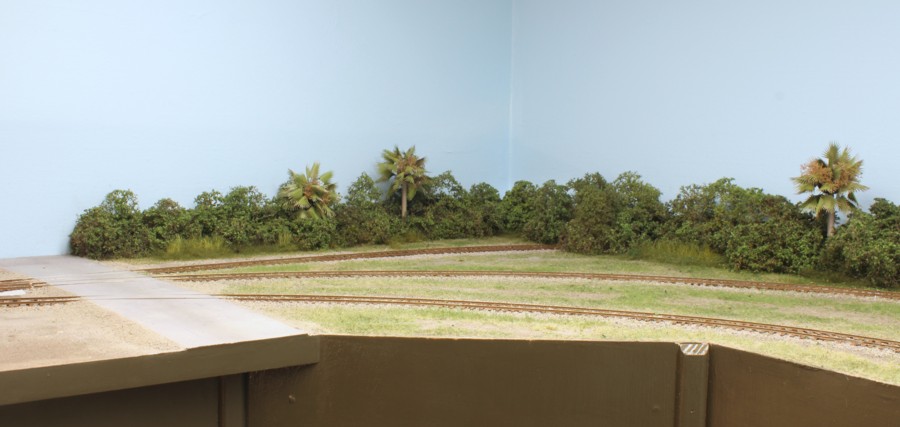
A key section of the East Rail 2 layout is the middle “L” where I’ve employed negative space as a scene separator. It’s very noticeable. In the top photo is my first run at things. Here you can see how the caricature issue can swing too far the other way to the point of being overly bland and lifeless. It can be tricky to dial in. On the original layout I put a billboard in the scene next to the 35th Avenue, the road that frames the left side. The only problem is that 35th Ave. is a quiet, two lane road in an industrial park. There is no way anybody would put a billboard there. The sign was a caricature, a little amateurish.
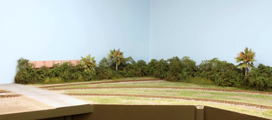
So, now I’m stuck. The scene in the top photo is too bland. Putting a billboard there for some snap would be model railroady. What to do? The solution I ultimately settled on was a flat of an industry called Garland Foods. The color was carefully chosen to contrast with the green foliage. Flats can be very dicey and if you don’t take some key steps they will really muck up your look. Some tips for working with flats against the backdrop to keep them from wrecking a scene are:
-Keep them low one story affairs
-Keep them distant and lower on the horizon
-Set the viewing perspective at ninety degrees
-Hide the edges of the flat as I did with the trees on both ends.
Scene composition takes careful thought and sometimes you don’t have a lot of leeway either way. If you don’t have enough snap it will look lifeless. Go too far the other way, which is usually what happens, and it slips towards looking like a toy.