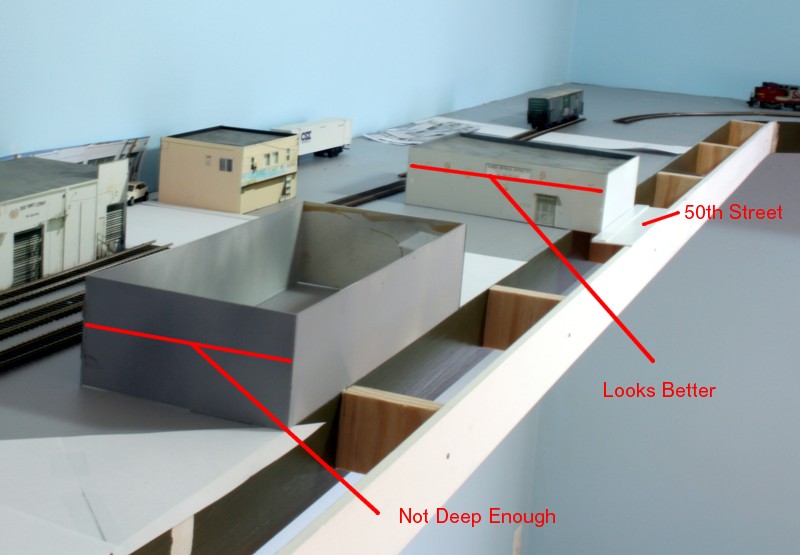
Damn. The last thing I wanted to do was have to modify the bench work. After a few days of rationalization I swallowed the bitter pill, realized I hadn’t made it deep enough, and added an extension which adds three inches to the depth.
In the continual quest to be more effective in our efforts to “model a railroad” we are constantly trying to root out and eliminate modeling approaches that tip the viewer off to the fact that, “hey, that isn’t real”. I’m not sure which is harder, developing an eye for things that don’t look right or fixing the problem once you know it exists. In the last post I emphasized the critical importance of layout to backdrop transitions, the difficulty of handling roads that meet said backdrop, and the importance of background structure height and depth.
This week I’m dealing with foreground structure depth. I’m often asked if there are formula’s or procedures that can be applied to effectively compose a scene. Unfortunately, a lot of it falls into the “I’ll know it when I see it” category. In my case it resulted in a case of having the mock ups in place and knowing what I had didn’t look right. My shelf width was limited to begin with. I decided to leave a gap between the backdrop and background structure to suggest a cross street. The three track right of way is a signature element of the LAJ in the part of town I’m modeling. I decided I needed to add a sliver of 50th street in the foreground. It’s a lot to squeeze in and I simply ran out of room. Since you aren’t getting a direct view of the sides of the buildings, you can fudge things a little and compress the depth, but there are limits. The space limitations were such that the depth of the foreground structures was too compressed hence the need for the extension.
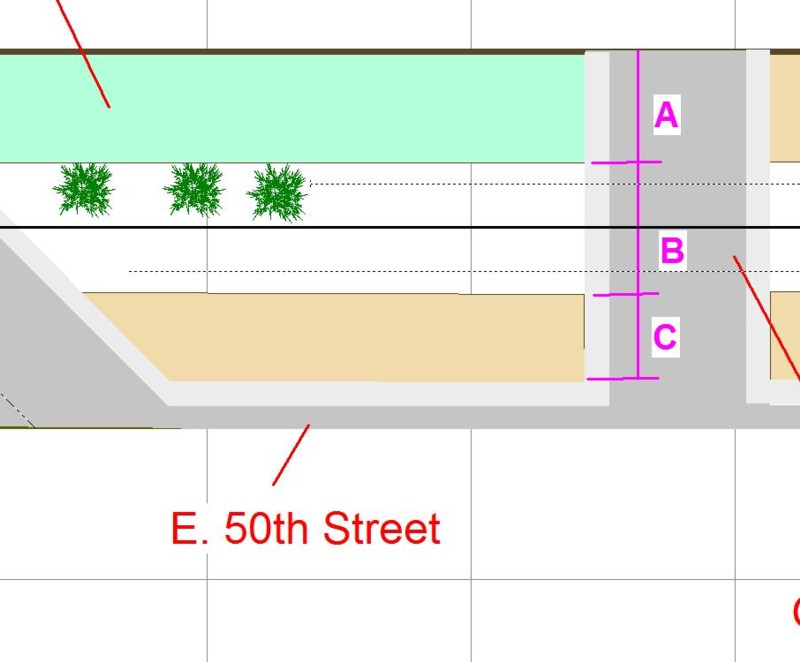
The sketch above shows how things look graphically. Dimension C was too narrow. The extra three inches of bench work depth looks much better, it’s done, and now I can move on to the next phase which is creating mock ups to perform the same type of testing with respect to structure width and spacing side to side (left to right). Over time the only way I’ve found to effectively dial in scene composition is to make heavy use of mock ups for real time visual testing.

