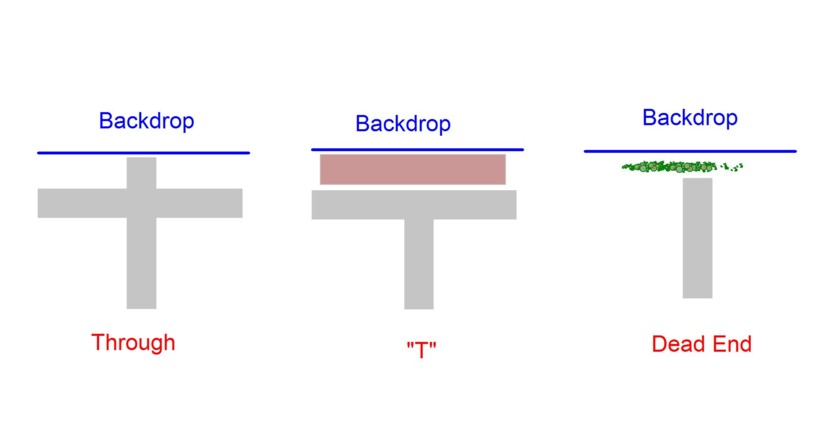
The transition from layout to backdrop is dicey even under the best of circumstances. Moving from a three dimensional flat layout surface to a two dimensional backdrop surface perpendicular to the eye, typically leaves the viewer with the subconscious nagging that “this just isn’t real”. If we are lucky we model a rural area and can screen the transition with vegetation. If we model an urban scene….no such luck. There is no way around the fact that cities have streets and those streets have to intersect with the backdrop. There are three ways this typically happens as shown in the illustration below.
The through street is the most common. Unfortunately the laws of physics are such that the layout to backdrop transition for a through street only works for one viewing angle. Even then you have the near impossible task of matching the street colors of those on the layout and backdrop. Sure, if you model a narrow two lane road and can tightly control the viewing angle by framing the edges you have a chance. This is rarely the case though as streets are typically much wider and the urban scene doesn’t lend itself to trees over arcing the pavement.
A dead end situation where the tree stops just short of the backdrop with trees behind is very workable but doesn’t occur often enough that we can use it in every situation.
This leaves the “T” a very workable solution in that we don’t need the road to continue on into the backdrop. In order for the “T” scenario to work, however, there has to be at least the suggestion of the cross street. You can’t just butt your structures up tight against the backdrop.
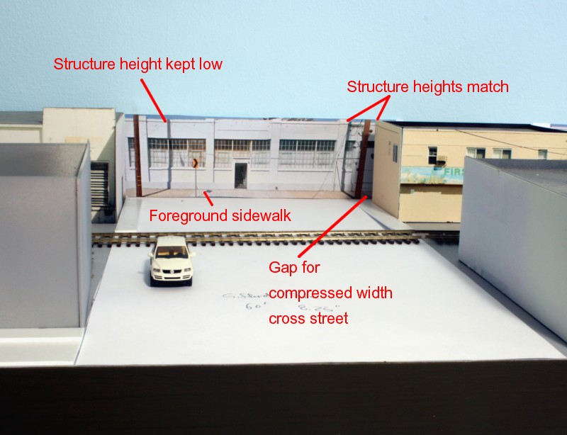
I’m still experimenting with the width of the suggested cross street but the mock up above illustrates a first attempt. Again, structures butting against the backdrop don’t work unless you can hide the intersection point with vegetation, rarely an option for the urban modeler. The taller the backdrop structures, the more visually jarring so, if possible, keep them to one story. Note in the image above that I’ve made the background structure the exact same height as those adjoining it on the layout. Experimentation showed that having the background structure taller or shorter doesn’t work. Note also, that I’ve included the sidewalk in front of the background structure to aid in the visual transition.

