Model Railroad Blog

Brooklyn Terminal Aug. 19

With the design book finished and submitted to Kalmbach, it’s back to your regularly scheduled programming. Next on the docket is finishing the Belgian block wallpaper overlays on the street trackage. This gets particularly dicey at the double turnouts.

The first step is to photocopy one of the turnouts and cut the pieces out to use as templates. I’ll then place the templates on a sheet of the photo wallpaper to cut the pieces. Finally, I’ll adhere the pre-cut wallpaper pieces in place. It would be nice to have the block courses actually curve with the turnouts but that would be a monumental task so I’ll utilize the good enough philosophy to ensure progress moves along.

The Book is Done!

More re-assurance that I’m not floating in the Miami River as some have assumed given my lack of postings recently. For the past several months I’ve been working on wrapping up my new book for Kalmbach, How To Design A Model Railroad. I’ve finished and submitted it. After taking a bit of breather, your regularly scheduled programming will resume.

Brooklyn Terminal May 12

Tom Flagg’s New York Harbor books are a virtual goldmine of ideas. It seems every time I go through them I notice something else. Helping the cause is the outstanding print quality Morning Sun Books brings to the effort. The images are so razor sharp they can be scanned and used for modeling.

A few weeks ago I was browsing through Volume 2 and noticed a great full page shot of Bay Ridge tower looking shotgun style down the yard towards the float bridges. I have a similar scene on the layout so a proto freelance version of the tower would be a nice feature. Here’s how I pulled it together.

Here’s the picture I started with from page 97 of the book. At a full page and with such high resolution there was a lot to work with. The first step was scanning the image.

After many hours of photo shop work I converted the book image to what you see above. The door is from my “wooden door library”. Note the Bush Terminal logo. above the door which was photo shopped in.

I printed out two copies of the images. One was left glossy, the other was dulled and the windows cut out. I then placed and adhered the dulled image on top of the glossy one so you could see the windows. The wallpaper was then glued to a styrene cube of the appropriate size.

The final step is adding 3D stand off details. At only an inch in length, the bay window was tricky and took a full afternoon to build. It’s one of those projects where you put on the coffee, turn off your phone, and concentrate. The windows are from Tichy, the rest is scribed styrene. Glazing was added and then the window blinds.

Final details included the door awning, electrical conduit, and window sills made from .020″ x .040″ styrene.

Matte vs. Glossy Photo Paper?

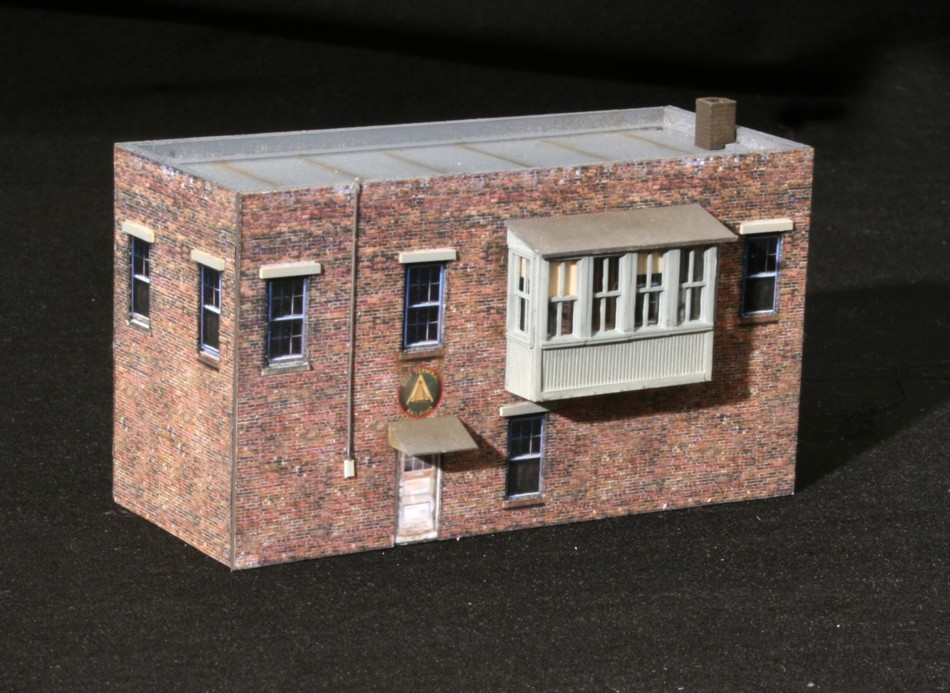
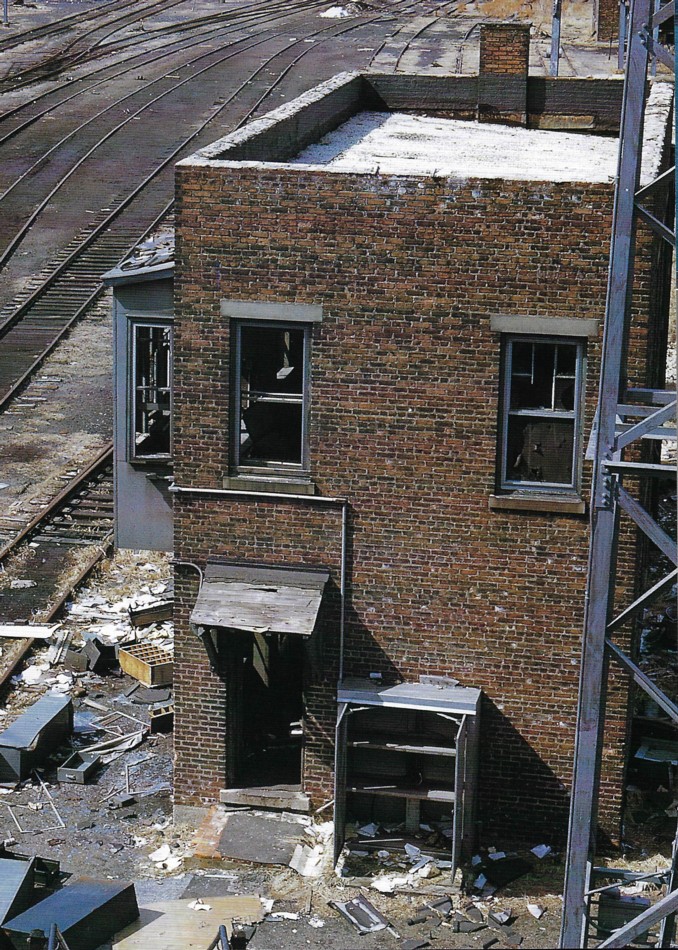
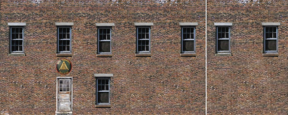
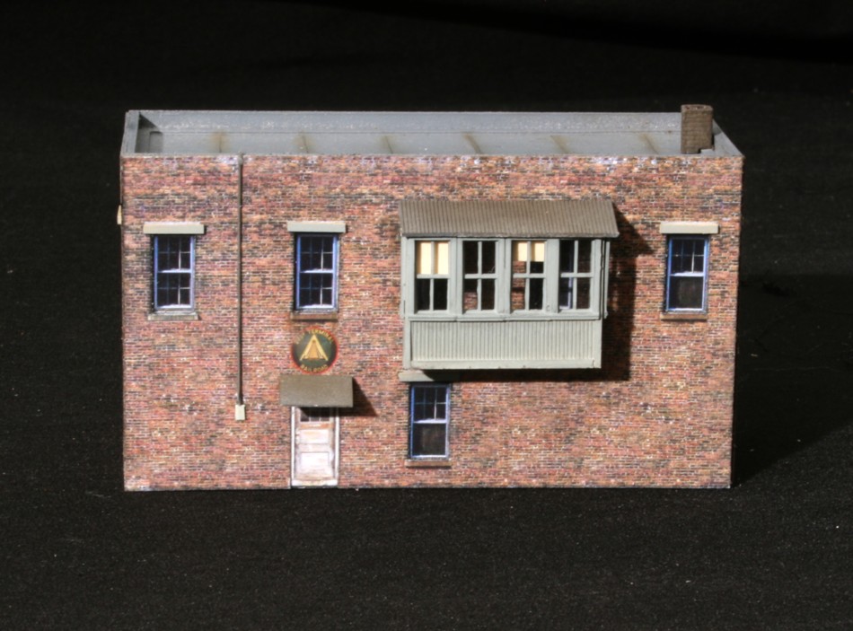
As I continue to refine my technique of using photo wallpaper laminates instead of paint, one of the primary questions continuouisly on my mind is whether to use matte photo paper or gloss. On the surface it would seem matte would be the logical choice. However, at some point, just by chance I noticed that the colors on gloss paper appeared to be just so much more vivid and deeper. Was it my imagination? I didn’t think so. The problem is, if you go with gloss, at some point you’ll need to dull it down. Who wants a weathered freight station that shines like a clean window? And therein lies the problem. Dulling is easier said than done.

Even within the HP brand of printers, results vary widely as far as how dulling agents react with the various inks. In some cases earlier on, the dulling agent changed the ink to a purple or green hue. Not good. The next printer and ink combo. was totally fine. I could easily mist on Dullcote with zero adverse effects. That printer died and the new one had a different set of reactions, a noticeable frostiness upon drying that takes a lot of care and multiple light layers to avoid (this is with Dullcote or acryrlic flats. ). Inkjet printers tend to vary a lot when it comes to print quality.

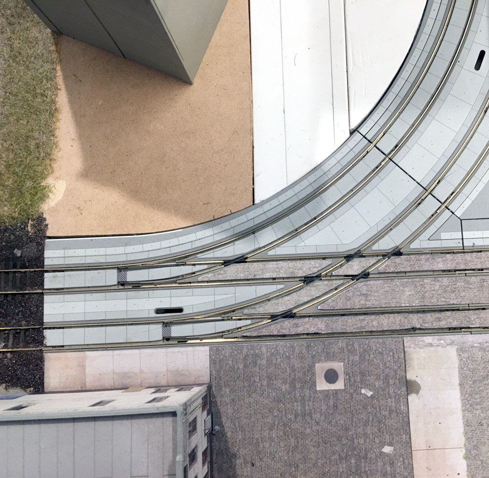
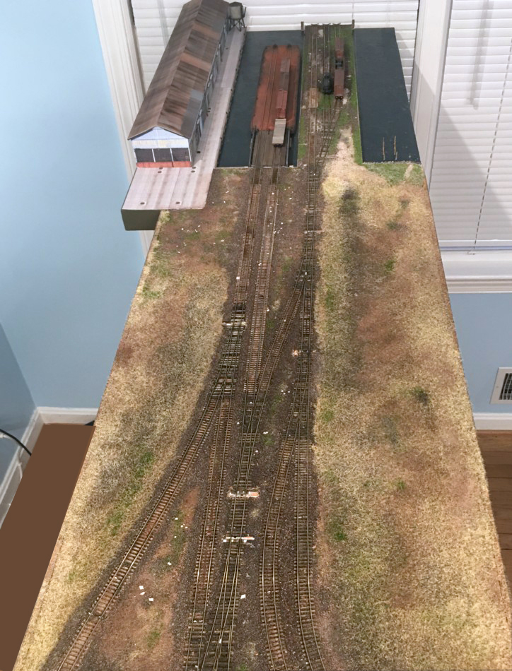
One issue with photo paper is fade over time. The Downtown Spur is getting up there in years. Some structures are exhibiting noticeable fade and color degradation (my basement is a terrible environment. Humidity. Flooding, etc). Others have stood the test of time. The difference appears to be whether I used matte or glossy paper.

Yesterday I stumbled on an exceptional blog written by Joseph Eiten for Photo Paper Direct that lays the matter to rest.

He writes, “…..Matte photo paper is an industry term used to describe a whole host of Inkjet high-resolution matte papers. Amongst industry professionals and photographers, the real debate is whether ‘Matte photo paper’ is a true photo paper.

So is matte photo paper is a photo paper, it is up to you to decide.

From our point of view, having examined many thousands of prints over the years I’ll say NO. A real high quality photographic paper that is used in inkjet printers will provide a full colour gamut and spread with many more sub colours. True photographic paper will therefore yield the all shades of greys and colours that matte photo paper can’t.

What are its pros?

– Cheap option

– Can be more artistic if you like matte finish

– Good for using on day-by-day presentations

What are its cons?

– Print quality is nowhere near true photo papers

– Longevity and fading are a real concern

– Not a real photo feel and look”

So, there you have it, a pretty clear answer from somebody that appears to really understand the subject.