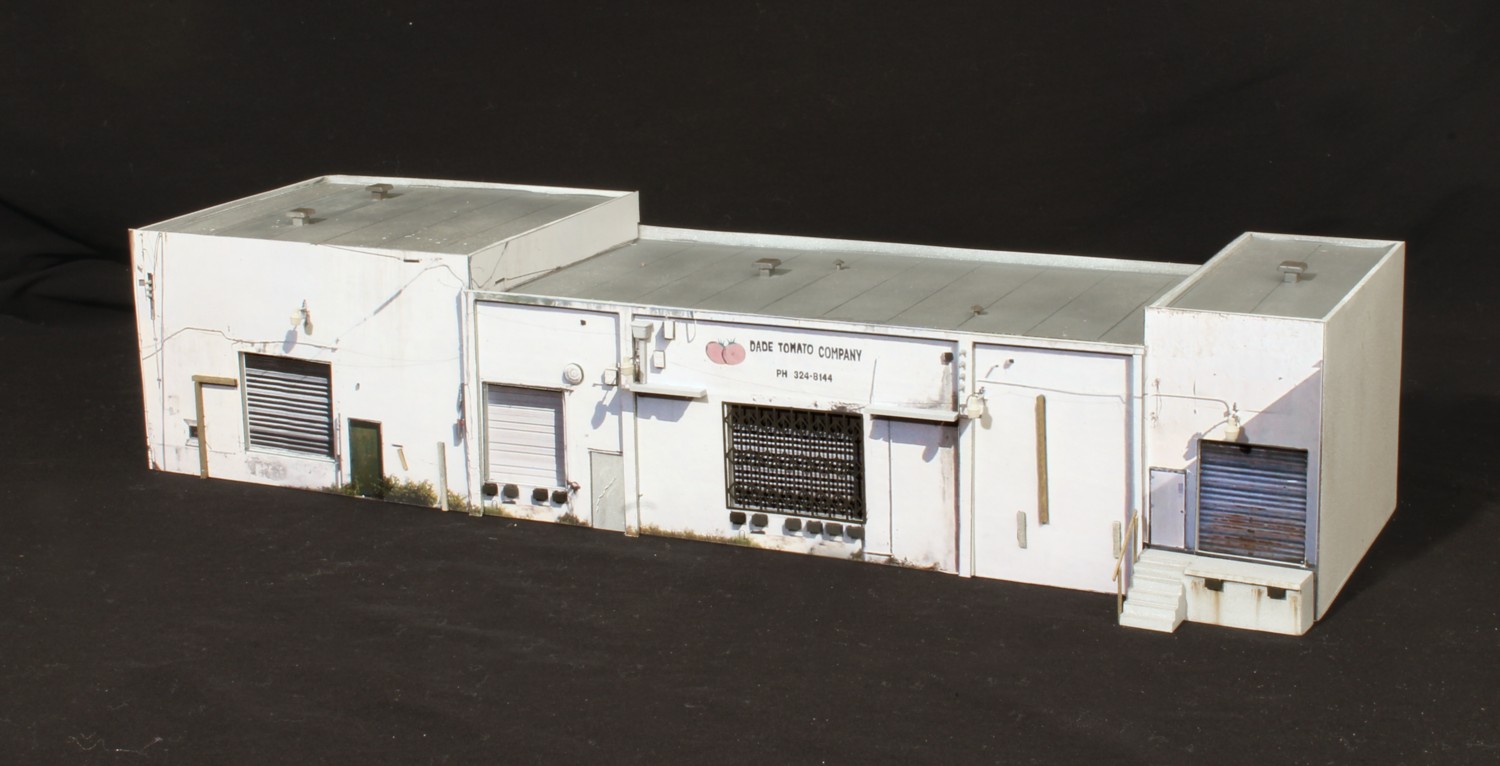
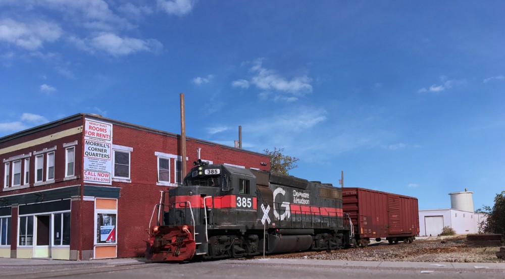
It only took me a decade to get around to it but the Dade Tomato structure is finally done. The base color layer is a photo laminate with additional photos “elevated” and layered on top to create relief. Details include: Shapeways security lights, Gold Medal Models security gate, scratch built dock bumpers, Atlas utility insulators, Pikestuff stairs, and stripwood.
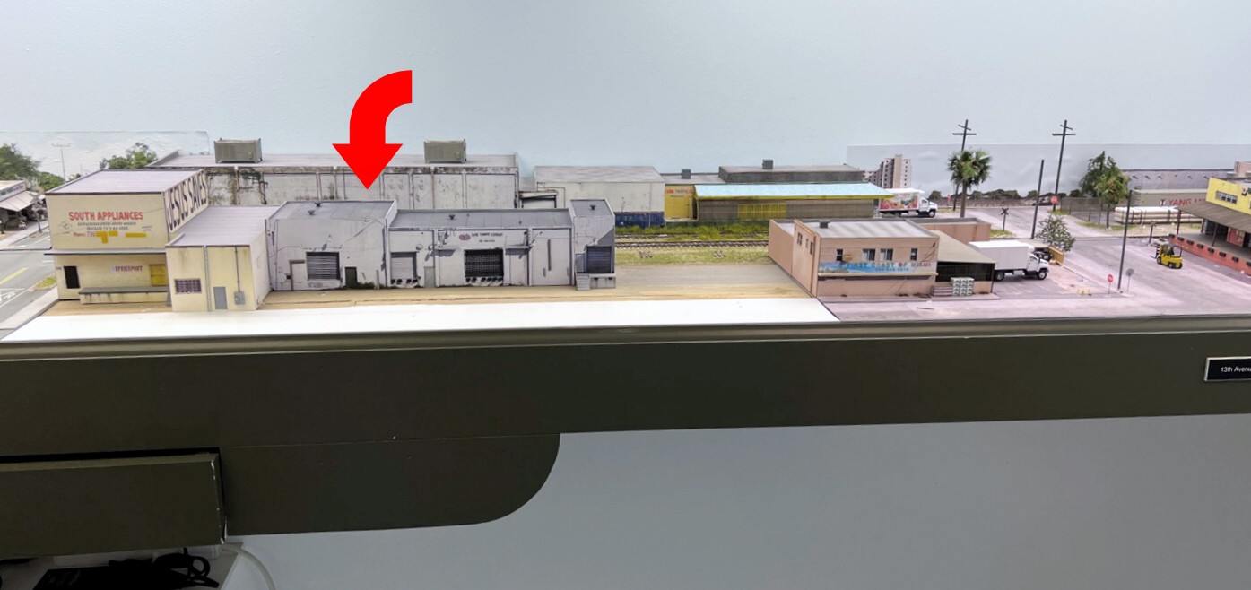
Here’s where it goes on the layout, between 13th and 14th Avenues. Next up is the street in front and the one remaining structure to the right.
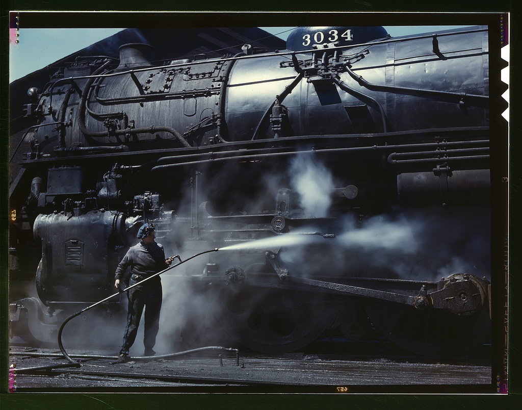
An argument could be made that Jack DeLano was one of the most gifted photographers of all time. His work showcases the mind blowing, intangible, qualities of Kodachrome film. Library of Congress photo.(1940’s era)
A recent publishing project has brought me back to the images of renowned photographer Jack DeLano. DeLano’s journey is a story in and of itself. What’s been on my mind though is trying to put my finger on what makes his images different. Can it be identified? If so, can we apply it to model railroad photography. Part of the equation is DeLano’s superstar compositional skills. The other part is the color film he used, Kodachrome. Once routine, I used it during my teenage railfan years, it’s properties are now considered legendary.
In his excellent blog, A Kodachrome Retrospective, James Tocchio writes, “In the short documentary The End of an Era, a National Geographic film crew follows Steve McCurry as he shoots and processes the final roll of Kodachrome to roll off the assembly line. A man who’s possibly shot more Kodachrome than anyone else (by his own estimation, over 800,000 images) calls it a legendary film, adding, “Probably the best film ever made.”
That’s pretty high praise. But what made it so phenomenal?
Kodak’s contemporary literature is decidedly understated when measured against all the lauding the film receives today. They described Kodachrome as nothing more than a moderate-speed, extremely fine grained film for daylight shooting. Nothing too special there. Even when rating the film’s resolving power, things were rather staid. With 96-135 lines per millimeter, it landed right in the middle of Kodak’s resolving power scale. But these descriptors fail even to hint at what made Kodachrome so special. For that, we have to talk to photographers.
When asked what made it his favorite film, Ned replied with one succinct sentence. “Brilliant, natural colors.”
This sentiment’s been echoed by everyone I talked to. The owner of my local processing lab, a shop that’s been in business since the 1970s and has weathered all the storms of the past fifty years, said of its colors, “Kodachrome was unreal. Actually, it was extremely ‘real’. No other film could make such true, vivid images. When you exposed it right, you got a slice of real life on film. It was incredible. The best photos I ever took were made on Kodachrome.”
In the film, McCurry confirms these statements on Kodachrome’s intangible qualities. “Sublime, rich colors. The best rendition of reality.”
So, the question becomes, can we edit digital images to replicate Kodachrome? Far easier said than done. McCurry eludes to the difficulty of doing so when he refers to the film’s “intangible qualities”. Capturing “intangible” and putting it in a bottle is an elusive goal. Photo editors with more talent than I’ll ever have, are giving it their best shot. One such editor is Jamie Windsor who has a great video on YouTube where he explains the challenges. He’s made an extremely respectable run at capturing the Kodachrome look, even offering an editing plug-in at a ridiculously low cost.
It’s going to be fun to watch people take a run at seeing if they can capture Kodachrome’s magic with digital. If they are ultimately successful, applying it model photography opens up an entire new world of creative possibilities.
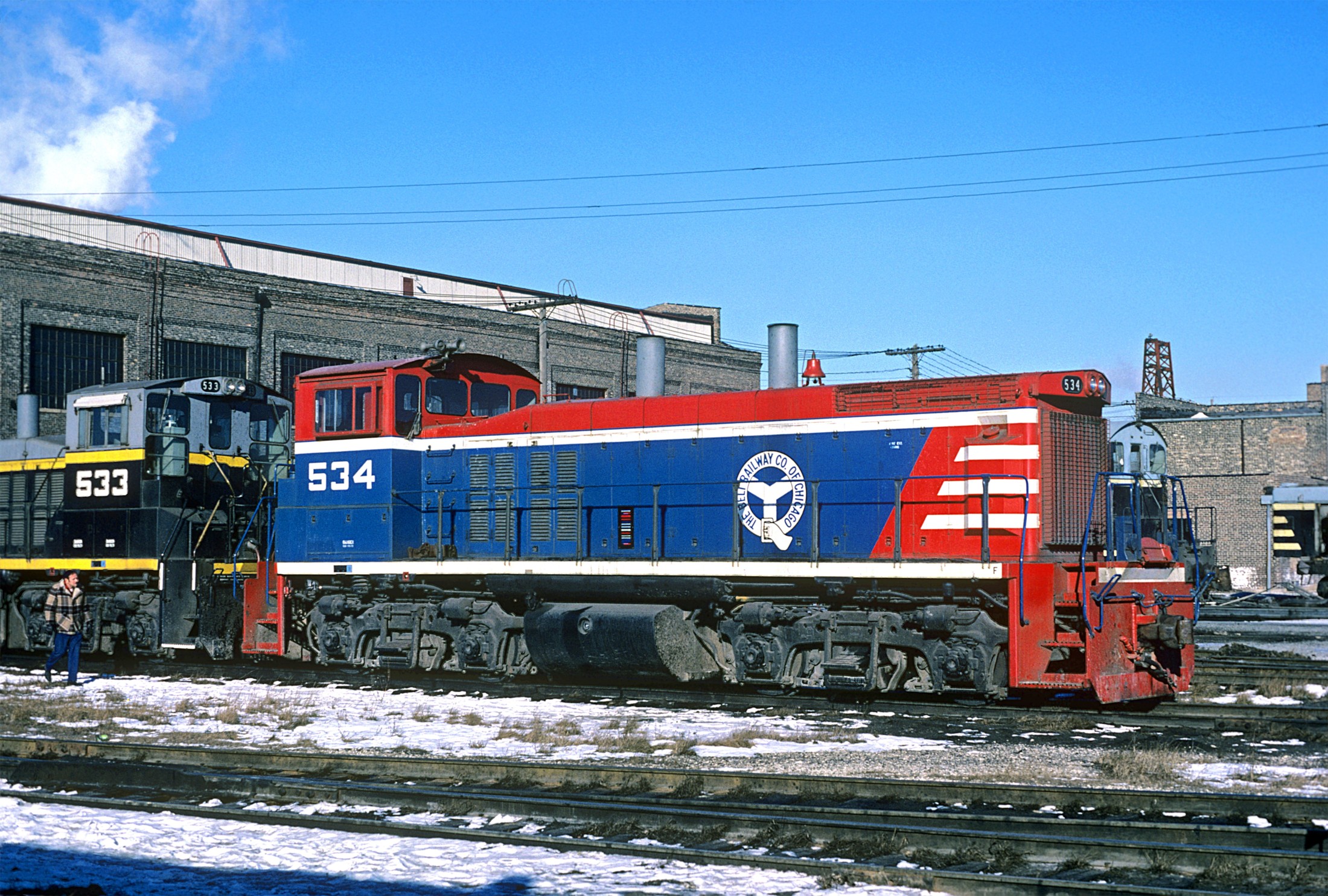
I took this image in the late 1970’s using Kodachrome. Back then we thought nothing of it. It was just what we all used. Digital is amazing but it has yet to capture the intangible qualities of this legendary film.
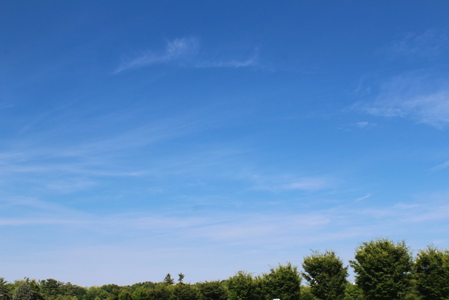
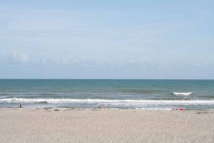
Cropping in a photo of an actual sky can create stunning results in terms of the appearance of the photos we take of our models….that is if you understand what your end game is going in. It’s easy to loose sight of that. I know I have in the past. With model photography we are trying to highlight the models themselves. They should be the focus, not the sky image. You don’t want to pick sky photos that work against that. Specifically, you don’t want images that are so dramatic your eye is drawn to the sky and not your work and you don’t want images that are so flat that everything dissolves into a pastel blob.
The shot above has the characteristics you should be looking for in a sky background. First, it has some clouds but they are whispy and not overly dramatic. The top of the image is a deep sapphire blue which gives good contrast. Moving top to bottom the color gradient very gradually shifts from deep blue to a paler tone. Although you won’t need it for every situation having a very low tree line can be useful in some cases.
Let’s look at some of my mistakes over the years so you can avoid them.
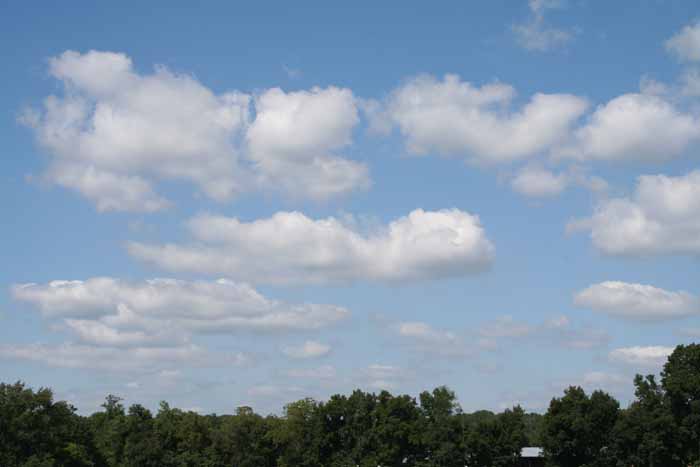
White puffy clouds. This is the most common error. Do you want people looking at your shot and thinking, “What cool clouds! That one in the middle looks sort of like an elephant playing a violin”. Puffy cloud photos are very distracting and tend to look “model railroady”.
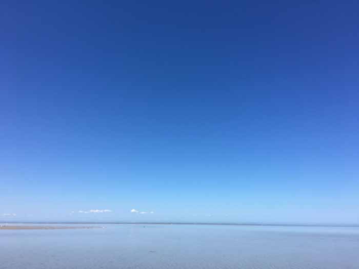
I liked this shot when I first took it, and used it for awhile. Ultimately I got away from it. The sky is almost too clear and too vibrant. The contrast with the model tends to be startling.
This image has the opposite problem, the colors are too faint and everything is too diffuse. It’s so washed out that when cropped into a model photo everything just melds into sort of a sea of gray nothingness.
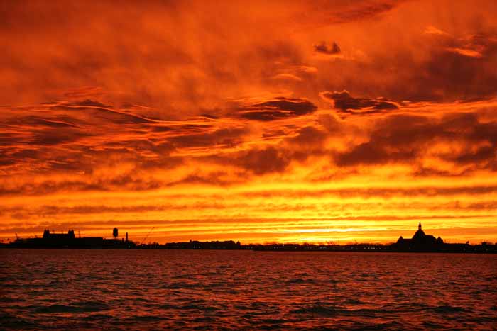
I took this shot in Manhattan a number of years ago. Can you believe that’s really how it looked? No photoshop. Dramatic sunset shots pull your attention away from the model and also look “model railroady”.
You don’t need that many background images. Once you get a good one you can photo shop mirror image versions and slightly different cloud patterns. Keep your eye on the sky and your camera ready!
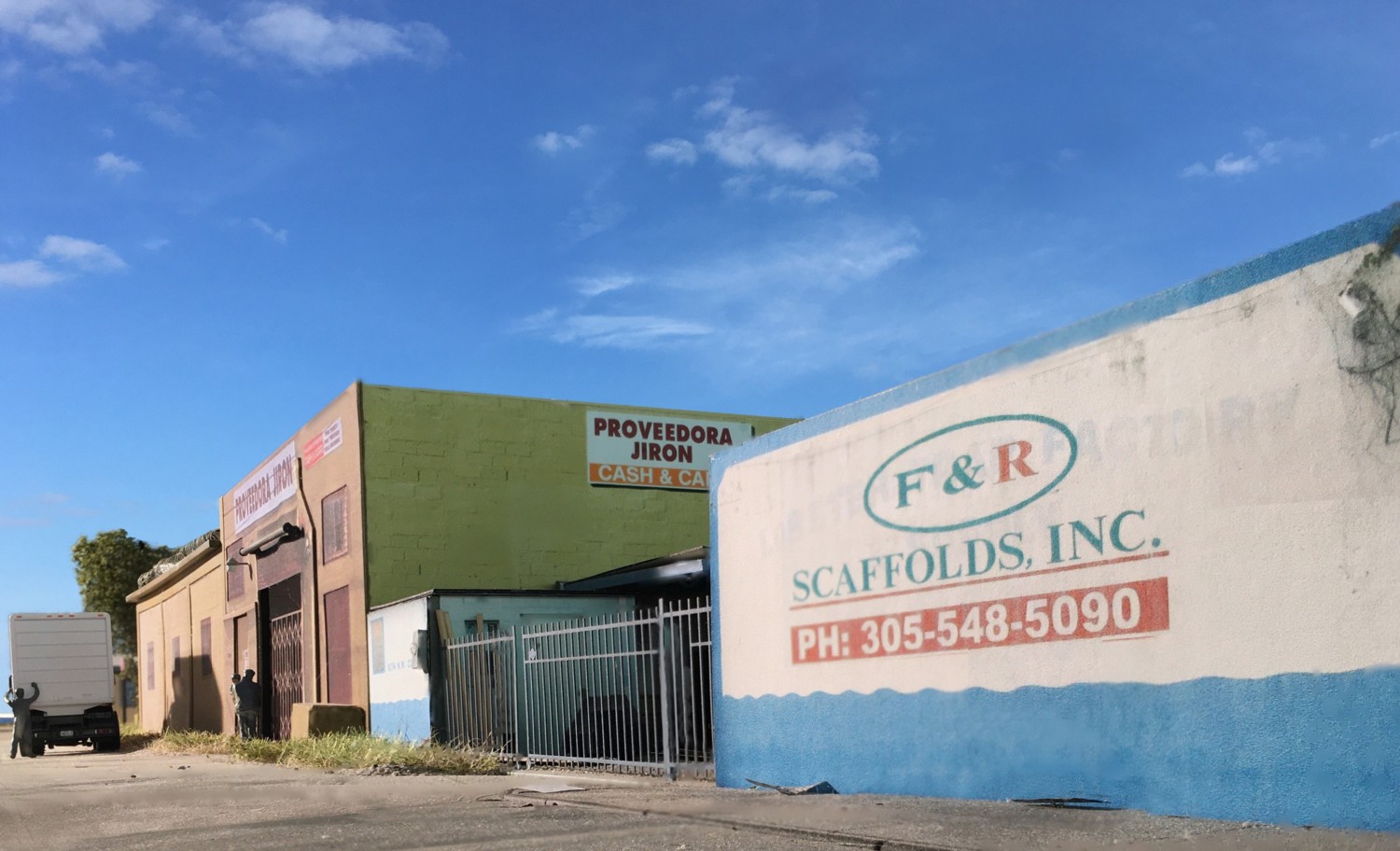
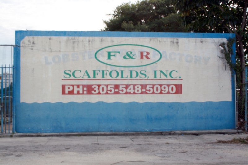
Back in 2010 I was walking down 22nd Street when I came across F&R Scaffolds next to Proveedora Jiron. I was drawn in by the faint ghost lettering of a previous business, Lobster Factory, barely noticeable under the paint. In this image I continue to try to work 1/87 human figures into the shot without their production deficiencies being too distracting. (same strategy as before: paint them dark gray, place them in the distance, back to the camera).