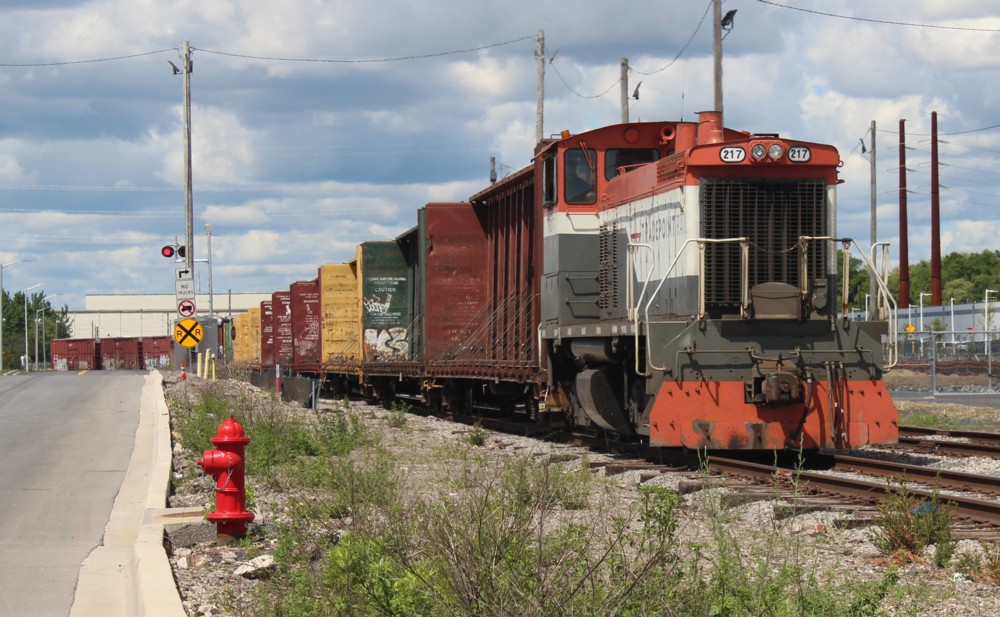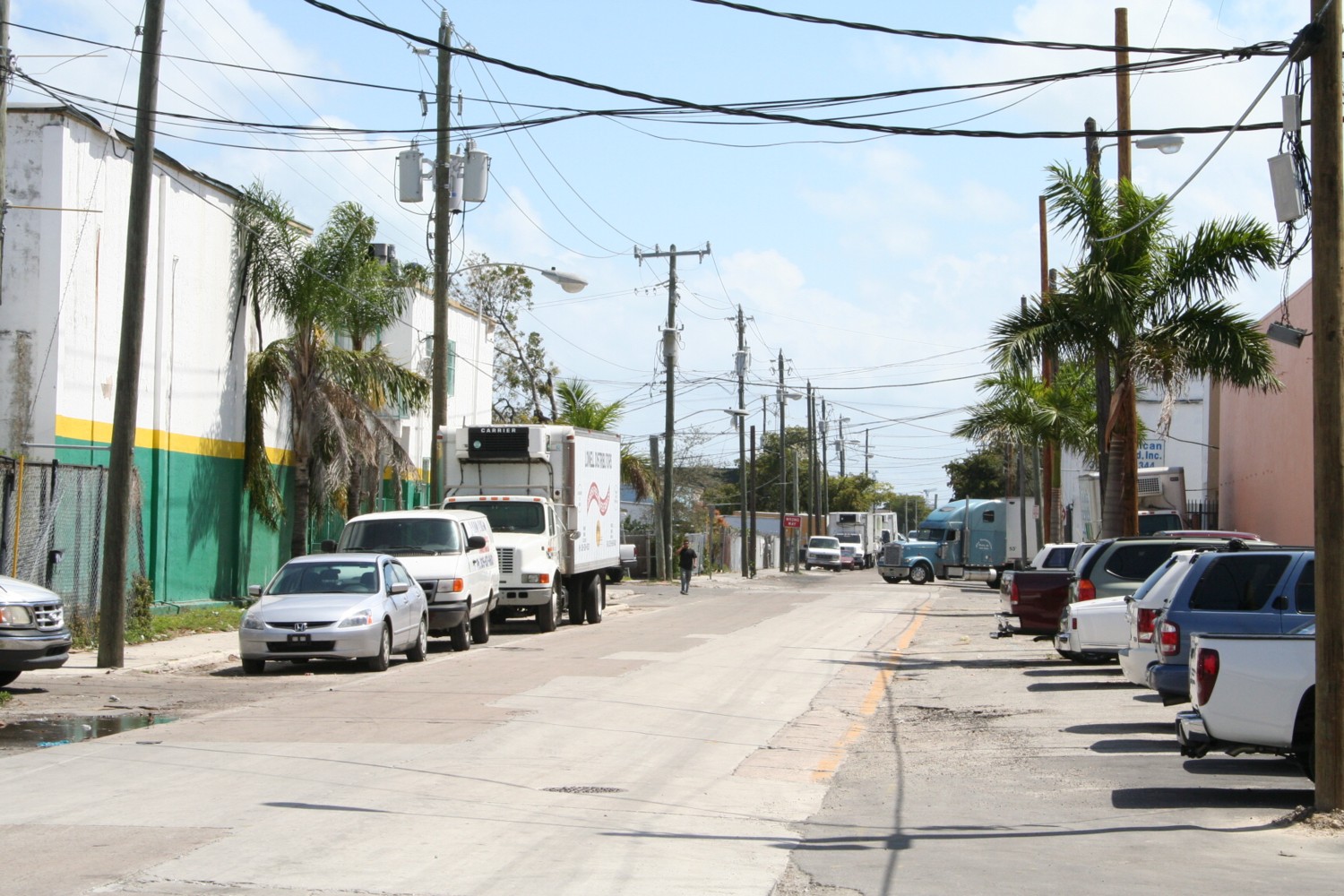
Visiting your site in person creates a mental link between you and your subject that you simply can’t get from looking at photos online or in a book. This shot was taken looking east down Miami’s 23rd Street in 2007. I was taking in the sound of the aircraft flying out of MIA, the humidity, the sun, the sights, sounds, and smells. I think of all of that when I walk into my layout room.
Visiting the location we’re modeling adds an entirely new and positive dimension to how we experience our hobby. It took me until recently to understand why. I used to think of the goal of the visits as being solely one of documentation. That’s certainly a big part of it…..but not the biggest.
What is really happening when we are at ground zero, in person, is we’re making a strong, positive, mental connection between an actual “place”, a “world”, and our model. Without the visit, it’s impossible to make that same link. When you’re there on the ground, soaking it all in, the location never, ever looks the same as it does in photos. It’s better. Far better. Looking back on my rail fan and site visits, I can confidently say they have been some of my most enjoyable days on earth. The exploring, the discovery, the excitement of having what we’ve previously only seen books now being right in front of us. The sun, the heat, the sights, the people, the sounds, the smells, you can’t get that from a computer screen.
Will having visited the site make the resulting model look different to others? Who knows. Will it look different to you? Emphatically yes. Having made the trip, every time you walk into the layout room your mind will roll back to the day, or days, you visited the inspiration of your model.
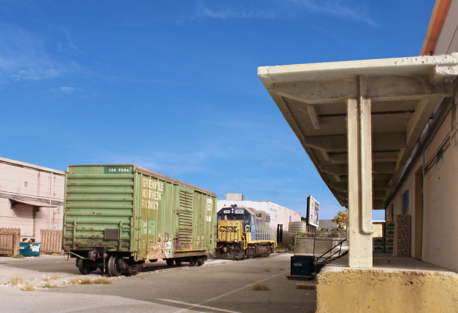
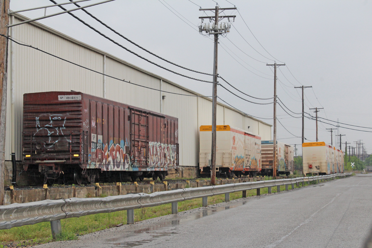
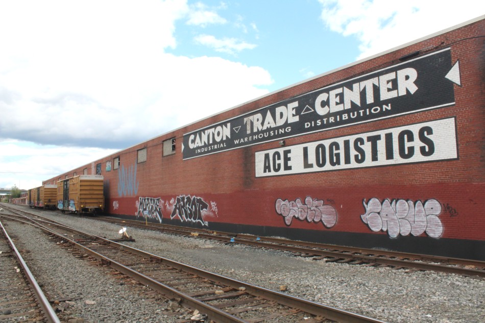
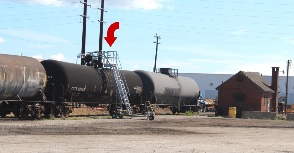
Having laid that groundwork here are some things to consider, in no particular order. There are likely dozens of rail fan “art shots” out there on the web already so you don’t really need those. Rolling stock photos can be easily had with the click of a mouse. Take lots of structure photos but do so at a fully square, ninety degree angle orientation. Get the structure sides too. You’ll need those for modeling. Take plenty of detail shots. Take down-the-street and panorama shots that give an overall view of the area. We are no longer in the film age. When in doubt, photograph it. Never assume a building will always be there, or be there in the paint scheme you like. If you have an SLR, make sure you have it on the right settings and check your shots after each one to make sure “got them”. I have some ugly stories about not having done that. Ouch. Make sure you have extra batteries. Make sure the camera is set to auto focus and not on manual (another ugly story). I generally bring a camera and my phone as back up.
Do some aerial recon. before the trip so you know where things are and don’t waste time searching when you’re there in person. Make a rough list of the things you want to photo and put them on a map printout. My readers are primarily industrial switching enthusiasts. Your typical industrial area or long spur can usually be well documented in a few hours. They aren’t that big and you won’t need a huge amount of time, certainly not days.
Mental blocks. I used to associate going from city A to city B as being a “trip”. A trip being something that is expensive, time consuming, takes a lot of planning, and in other words, a big “deal”. If you think it through logically, that doesn’t need to be the case. I only need three or four hours on site. There is no reason to stay overnight. Let’s look at an example. I live in the Washington, DC area. Railfan “heaven”, railroad heaven is Los Angeles, the opposite coast. You would think getting there is a big and expensive deal. It’s not at all. Let’s look at the numbers. Oddly, with a little advanced planning you can get coast to coast, non-stop, DC to LA airfares for three hundred bucks, even less sometimes. Then you can play the time difference to your advantage. It sounds crazy but you can get a 9am flight out of DC and be in LA at lunchtime (Their time. Remember the time difference). Pick up a rental car for forty bucks and make the short drive over to Vernon to take your shots. Get a 7pm flight home and it’s mission accomplished. Cheap, simple, and FUN! If you go during business hours you’re likely to see more rail action. If you want quiet, go on the weekends but you probably won’t see trains. Monday through Wednesday flights tend to be the cheapest.
Finally a note on safety. Actually it’s a commentary on how terrible your typical middle class American is at risk assessment, often assuming danger where there is…absolutely….none….ZERO. I routinely ask my friends why they don’t visit the sites. The answer is always the same. “I saw some graffiti in a photo. I’m afraid I’m going to get mugged”. It’s the prevailing concern. You are NOT going to get mugged. Your car is not going to get stolen. These areas are business locations not residential “hoods”. (Actually, the chance of being mugged in “the hood” is pretty much zero too but that’s a subject for another day). Further, most of these places have a Starbucks and Whole Foods within a few blocks. By being completely over the top in assigning risk where, realistically there is none at all, you miss out on one of life’s great experiences.
So, go on Expedia, check the rates, look at the maps, plan your trip and have fun!
Sponsored by the Shelf Layouts Company. Custom Layout Building & Layout Design