No matter how much of a prototype modeler we’d like to say we are, the reality of our limited space is such that everything we do is ultimately somewhere on the “proto-freelance” spectrum. Since we can’t copy actual scenes exactly, decisions need to be made with respect to composition.
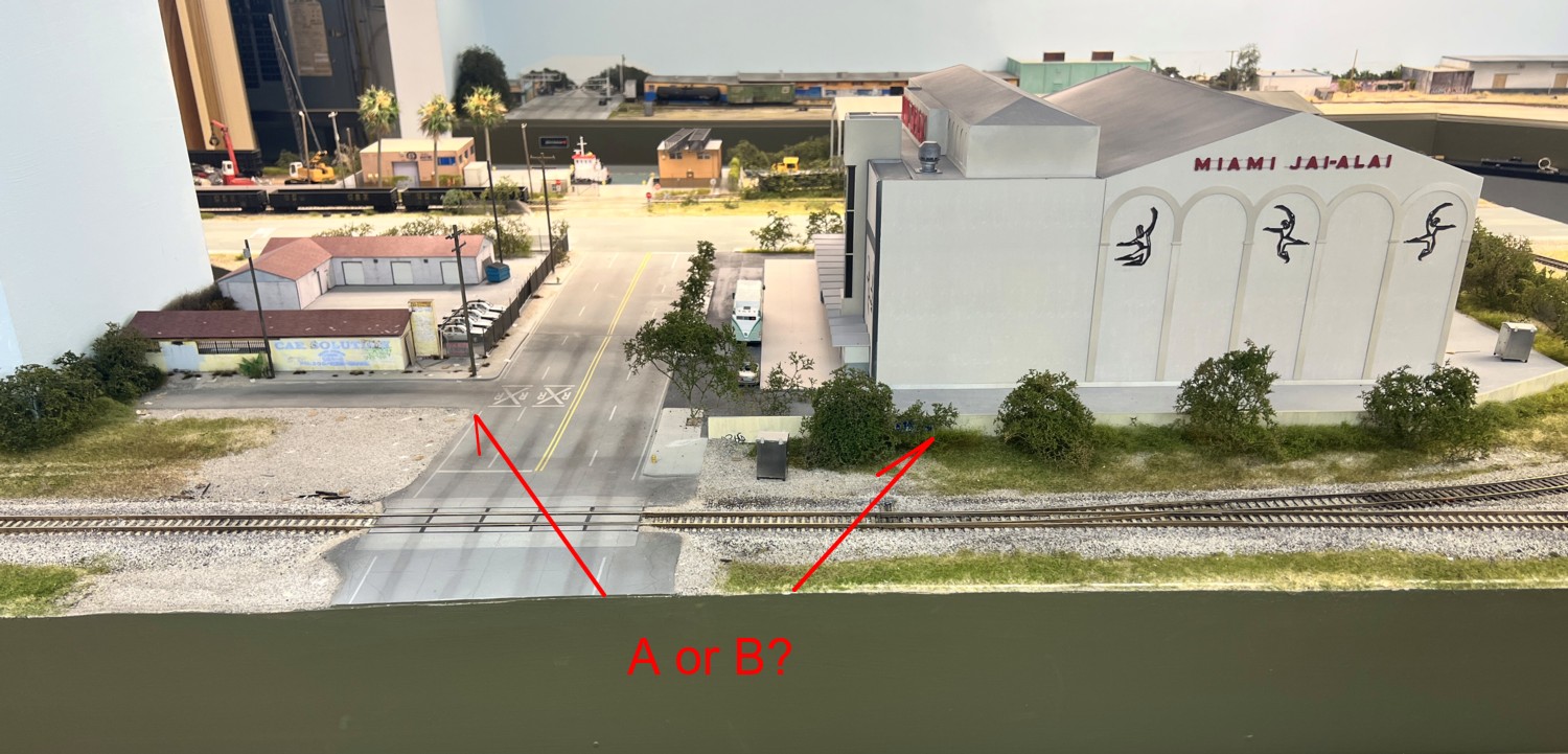
One of the key principles of art is that of directing the eye. If you look at the photo above, there are two basic scenes, Miami Jai-Alai (MJA) on the right, Miami Taxi Meter (MTM) on the left. I want the viewer’s eye to be drawn to Miami Jai-Alai which means I need to be be careful what I put across the street. A key issue factoring into the equation is the unsaturated, dusty sand color of MJA. MJA is larger which gives it some weight in directing the eye. However, if I had not been careful with what I put in the other scene, there would have been the risk of running into visual chaos with the eye dancing between the two. The main trap to avoid was that of color. Many of the businesses nearby are painted in brilliant, highly saturated tones. If I’d gone that route, selected one of the brightly painted ones, even though the structure would be smaller, the color would dominate and pull the eye towards it. By selecting MTM as the subject, it’s equally dull, low saturated tan, didn’t compete with the centerpiece (MJA).