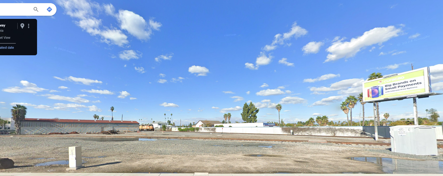
Creating an eye-catching model of UP’s Anaheim Yard has less to do with skill than effective decision making. That being the case, doing so is within reach for even entry-level modelers.
A world-class musician? Pure skill. A PGA golfer? Pure skill. Artists such as Vermeer and Hopper? The same. Exceptional model railroading results? Not so much. Nope, the lion’s share of a model’s visual impact isn’t related to skills that take decades to learn. In most cases, the necessary techniques are so basic that any first-timer could employ them. The cost of supplies and tools is minimal. Creating a great model railroad scene has far less to do with skill than it does with effective decision-making. (For our purposes I’ll define the term “skill” as anything that requires eye/hand coordination or motor skills. Masterful weathering would be an example). The decisions that are made are what drives the bus. Those crucial decisions center on:
- Material selection
- Color selection & application
- Element selection
- Generous spacing between elements
- Sheen (Flat vs. Glossy)
- Inserting contrast
- Basic neatness
Details? Who doesn’t enjoy detailing a model? However, the contribution to visual impact is minimal when compared to other aspects. Detail a model because you enjoy it. Just understand its place in the visual hierarchy. Looking at the seven elements above, in every case, an effective decision is as easy, or often easier to apply than a less effective one.
Materials: In the case of man-made elements, choose the parts and kits that have the finest detail and thinnest cross sections. With structures, look for those appropriate to your era and select ones featuring “ordinary” architecture. Buildings should be ordinary, mundane, and look like they belong. For soils and ballast use natural products.
Color: Lean on the side of low saturation to account for atmosphere and sun fade. When in doubt go “light, pastel, and faded”. Use brilliant, brightly saturated colors with caution. Don’t paint overly thick castings and parts (such railings and windows) bright colors
Composition: Spread your elements out. You are far better off with fewer, widely placed objects, than an overly crowded scene that contains everything but the kitchen sink.
–Give everything a dead flat sheen, even those are actually glossy in the real world. Shine is lost with distance and atmosphere. Pay particular attention to making sure things that are flat in nature are flat on your layout. Examples include masonry, wood, tree trunks, etc. (Glossy bricks and roofs are scene busters)
-Light doesn’t bounce off of a model the way it does in real life. You don’t get the necessary shadows and contrast. Inserting contrast manually with washes adds snap and realism.
-Basic neatness goes a long way. If nothing else, it prevents you from shooting yourself in the foot and letting sloppiness detract from an otherwise great effort.
To illustrate the skill vs. decision making point let’s run through a hypothetical thought experiment. Let’s say we have a motivated high school student, totally new to the hobby and talk him through how to pull off the scene.
- Use earth toned grout for the soil base. I’d start with a blend of “Bone” and “Neutral Gray” . Once that’s dried, take a slightly darker hue of gray or brown grout and rub it around in spots with your finger.
- Track. Use Micro Engineering or the new Walthers code 70. The finer details and smaller spikes are very apparent in photos. Paint the rail with Rustoleum Earth Brown camo. paint. Lay the track directly on the layout surface with no elevated roadbed cork or otherwise.
- Use only natural rock based products for the ballast, preferably Arizona Rock and Mineral. Apply it in several light passes. Make sure you have no grains stuck to the sides of the rail or laying on the ties (even if it does on the prototype). Neatness really, really matters with ballast. Go light. Work in layers.
- Walthers Clayton County Lumber would work well for the distant building. Paint the walls Rustoleum Light Gray Primer. Once the walls are dry, give them a wash of dilute India Ink and alcohol to insert contrast in the corrugations. Go easy on the roof color, making it even less of an orange than the prototype. Dial the orange back. (Start with a raw umber followed by a dusting of Rustoleum Earth Brown. Finish it off with an India ink/alcohol wash). Make sure that all of the paint has a dead flat finish
- There are decent commercial palms on the market. Don’t rely on the pre-colored plastic that they come in. Paint the trees and do so with a dead flat finish.
- Note the wall in the distance, boring yes, but a signature element of the area. Include it. It could be modeled with a strip of styrene. Paint it first with light gray primer and then follow up with a light dusting of white primer.
- Commercial billboards are easily found. Just make sure that you paint give it a totally flat sheen.
- When choosing the signal boxes be aware that not all parts are made the same. Some have much finer details than others. Develop an awareness of that. If you can find them, the old BLMA products are preferred. Note that the boxes aren’t silver. They aren’t grainy silver. They’re pale gray approaching white.
All of the painting could be handled with rattle cans. The cost of materials would be nominal. The good news is that a standout scene can be achieved largely by making the right decisions when it comes to material selection and color treatment. That being the case it’s achievable for anybody.
You are right on the money in your explanation.
Tank car wheel rims are painted. Consider scraping paint away and follow up with light cleaning with solvent on pipe cleaner bent into U. Appears railcar has been through hump yard retainers.
Have built 12′-6″ x 9′ single deck HO switching layout following your advice. Kept it simple. Keeps MMR guest operators busy for full three hour ops session validating your point that “It doesn’t take much track to be entertaining.”