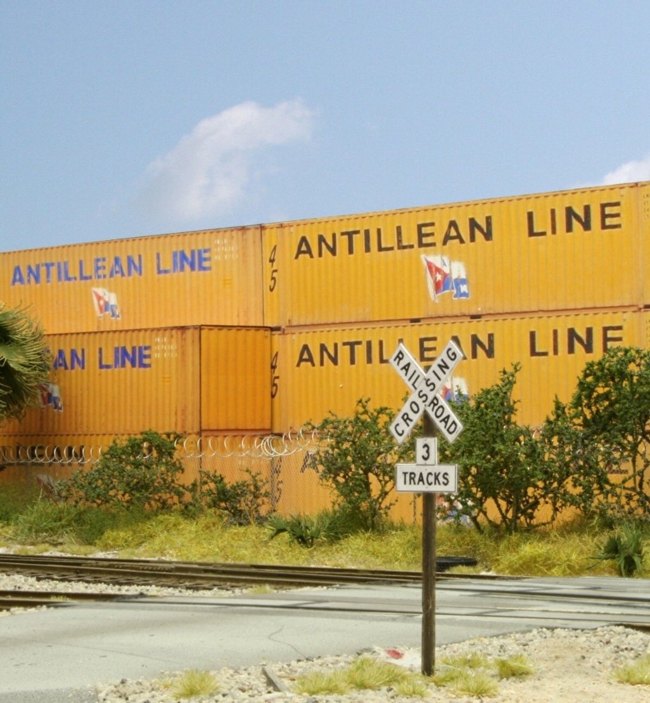
If you were in the field viewing the prototype of these containers from several feet away you’d notice that the surface is quite glossy. If we model that degree of sheen on the layout, however, it will look toy like.
Sheen (shine vs. dullness) and color saturation are tricky subjects for model railroaders. As real world viewing distances increase, even shiny surfaces quickly dull and saturated colors become much less so. The question becomes, what treatment do we give to the subject? Do we model subjects as they truly are or how we are used to seeing them?
Here’s where the mental disconnect occurs, the common situation where something we can’t pinpoint just seems off. When we stand in front of a modeled scene our mind tells us we are four or five hundred feet away and expect to see a degree of sheen and saturation accordingly. That’s because we use scale. If we’re five feet away from a model that translates to roughly 450 “scale” feet in HO. But we aren’t four hundred feet away, we’re only several. That, in a nutshell, is the problem. We’re expecting the sheen and saturation of distance but the mind is getting that of being relatively close.
If we have zero awareness of the issue the end result is a toy like appearance. So, how do you handle it? Sheen is the simplest. With a few exceptions I dull EVERYTHING. Saturation is a little trickier, I don’t apply blanket rules, and handle everything on a case by case basis.
Structures: Shiny or not I apply Dullcote to everything. Generally I don’t change the saturation unless I want a different artistic interpretation, for example wanting to make a subject look older or more dilapidated. Generally, I leave windows shiny, but not always.
Signage: Dullcote and dial the saturation back.
Vehicles. Dullcote the tires at least. Depending on my mood I may or may not dull the actual paint.
Trees and grass: Generally this isn’t a problem but if you’re modeling palms or conifers you want to dull them. Otherwise, I don’t make many changes.
Locomotives: Wow, this is tough. Particularly in the modern era diesel paint jobs tend to stay pristine and glossy. It’s a matter of taste but to me, glossy models of locomotives just seem really off. I dull mine. I would also give strong consideration to using at least a slight color fade, even if it’s not entirely prototypical.
Stone and rockwork. Always as dull as you can get it.
Backdrops: Dull. Dial the saturation back just a hair, especially if you have a horizon that is miles away. If a tree line is clearly ten miles distant on a backdrop, but is a vibrant green, it will look off.