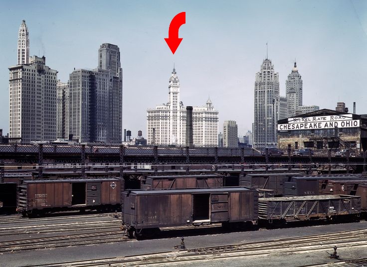
The Jack Delano photo above is an example of using contrast to emphasize a subject. Note how the white skyscraper stands out from its neighbors. Also notice that the neighboring structures are fairly similar in color. All of the hues are plausible.
A key concept in art theory is that of directing the viewer’s eye, and moving it to a primary subject. There are direct applications to model railroading because we frequently have a favorite structure or scenic feature we want to highlight. There are a number of ways of “emphasizing” a subject. It can be done by controlling its size, location, or contrasting it with neighboring elements. Today let’s take a look at contrast.
Contrast means different from neighboring elements. For now let’s focus on color. Unlike a painting, where we have the entire color palette available, modelers are constrained by the need for our colors to be plausible. If you study any photo of the popular steam-to-diesel transition era you’ll notice that the vast majority of the structures are white (more accurately an ultra pale gray), oxide brick, or gray.
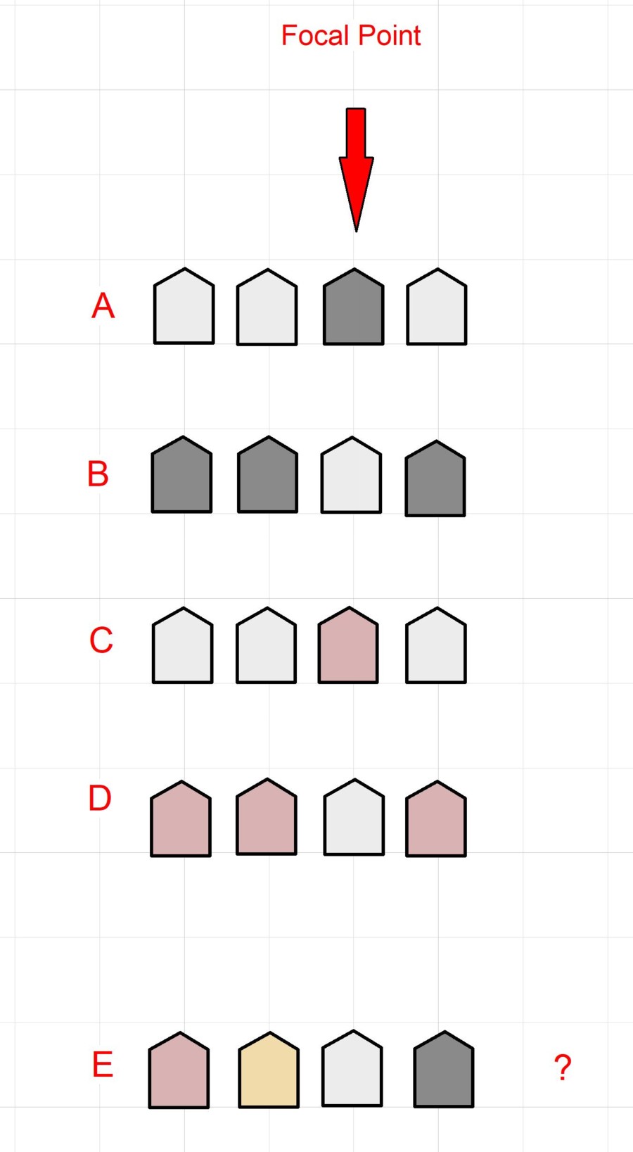
Shown above are some ways we can emphasize a favorite structure and do so in a way that’s believable. The key is to contrast the focal point with its neighbors. Notice that in rows A through D we’ve used commonly found shades. There are four structures three of which are basically the same color. The ‘favorite’ building is a different hue making it jump out. Say for example you had a typical residential street. If three houses are the commonly found white clapboard, and one is brick, the brick one will stand out. You can do the opposite and have three brick and one white one.
Where things fall apart is what you see in row E. Even though the colors of each home are plausible, there is so much variety that you don’t have contrast. There is visual chaos and the eye jumps around and can’t find your “favorite”.