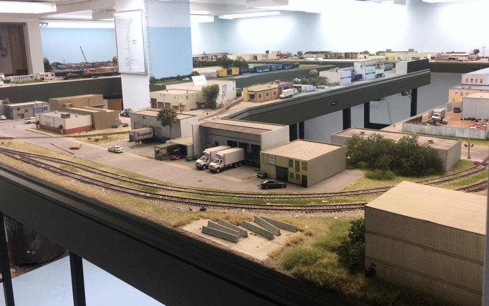
This older view of the layout is a classic example of visual chaos. The eye dances around a sea of pastel cubes and struggles to make sense of the mess.
Some of the most enjoyable, and useful classes, I took at The Smithsonian were on artistic composition and visual literacy. The applications to model railroading are very direct. A key concept that is discussed often is that of avoiding visual chaos, taking control of your work, and directing the viewer’s eye to where you want it to go.
When I originally planned The Downtown Spur, my focus was on being prototypically accurate, capturing the sense of the place, and providing a framework for interesting operations. Although individual scenes and industries turned out fine, I gave zero thought to the overall look as a whole. When you walk into the room you were presented with a sea of pastel, one story, cubes. It was exactly what art professors tell you to avoid, visual chaos. So, how do you fix a mess like this?
From a compositional standpoint there are a number of ways to direct the eye towards a subject. First, is its size. Simply make it bigger. Second is color. A bright, saturated tone will stand out more than a gray or beige. Closely related is contrasting a subject with its neighbors. Five red brick buildings side by side won’t contrast with one another. Throw a faded brick building into the mix and it will stand out.
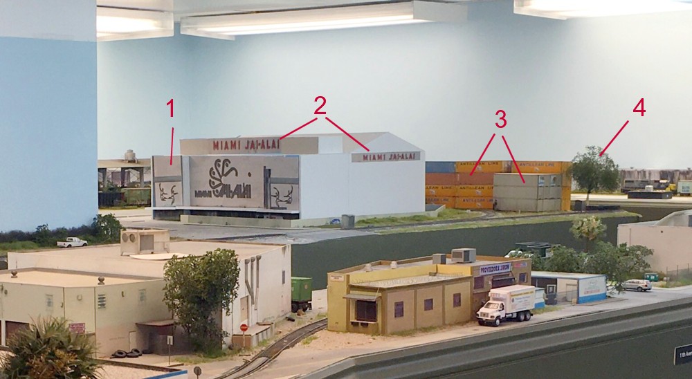
In the above mock up you can see how I’ve attempted to apply these concepts to my layout’s viewing experience. 1) The shear size of the Jai Alai fronton draws attention to it. The size also blocks out all of the noise behind it. 2) The red coloring of the signage on top draws the eye towards it. An added bonus are the words Miami and Jai-Alai which tell you where you are. 3) The container stack storage yard blocks out more visual noise behind it. In this case we want to take the opposite approach to color. I want the containers to serve only as a view block, not to draw attention. By using only grays and beiges, such as the containers on the right, they fade into the background. 4) The tree provides the extra few inches needed to block the bench work in the back.
With these changes, when visitors walk into the room the eye is naturally pulled towards a central subject that tells them they are in Miami.