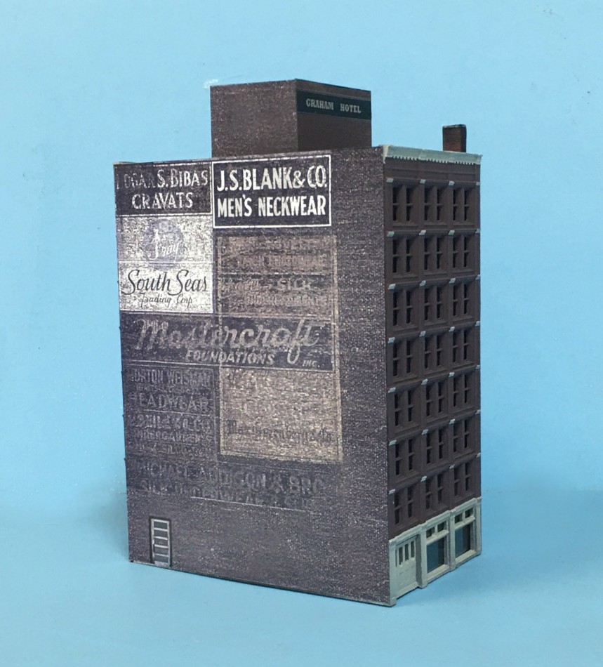
One of the signature structures on my old Monon layout was Bloomington’s iconic Graham Hotel. When I dismantled the layout I saved the model, thankfully. As luck would have it, the shape is a perfect fit for the Brooklyn Terminal skyline. When I originally built the hotel I left the side tight against the backdrop as an un-detailed slab of styrene. In it’s new location that blank side was the perfect canvas for whatever my imagination could come up with.
During my color strategies presentation at the Cocoa Beach RPM one point I made was the importance of getting away from overly saturated primary colors. They can be distracting, jarring, and unrealistically toy like. Faded, understated earth tones are more effective in our world. I went on the web and did a google image search for “ghost signs”. I selected the image above because it evokes an understated, somber, coal smoke theme.
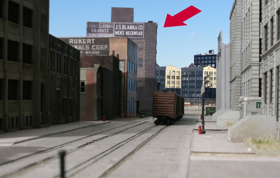
The faded gray of the hotel wall, emblazoned with faded signage, adds interest without competing with the adjacent elements.