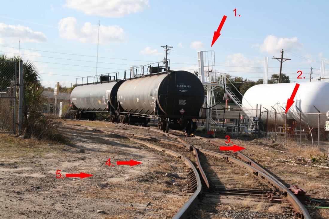
In the last post, I discussed developing an eye for “the typical” when it comes to structure selection and then applying a heavy dose of it. The shot above is of a small LPG facility. Compact, easy to model, an industry that just looks appropriate in most settings, it’s an ideal subject. Purchase the Walthers kit, assemble, paint, plop on the layout. Easy enough right? Not really. A major part of effective modeling is learning to really “see” what characterizes a structure and quickly identify things that could go wrong. By going “wrong” I mean modeling approaches that botch the desired look. Material selection is a major aspect of effective modeling and the beauty of it is that the more appropriate materials aren’t really harder to work with than the ones that don’t work visually. Let’s break the above photo down as an example.
- The unloading platform. There are two challenges here. First, the structure has very fine elements. To make matters worse, it’s white which means that if we use oversize parts (and most plastic platform parts are grossly oversized) they will really stand out. Paint the oversize parts white and the problem is accentuated. The solution: Instead of using plastic parts for the platforms, utilize components from Walthers etched brass stairway and platform kit part number 2939.
- The chainlink fence. I’ve written about this before. Most commercial fencing kits are oversize and the modeler is behind the eightball before they even start. Next, modelers have a tendency to paint their fencing silver which is both unrealistic and draws attention to the already deficient oversized part. The solution. First, you need something with a finer mesh. Second, you need to tone down the color. Note how the fence in the photo is a muddy brownish gray and not remotely close to silver? Solution: Use the BLMA etched fencing, hit it with Dullcote, and give it an airbrush or paint brush of India ink/alcohol to tone the color down.
- Grass. Even though this shot is in Florida, note that the grass is beige, not green. Solution: Apply a light layer of Heki “Prairie Grass” for the vegetation.
- Soil. Note the lack of uniformity of color and grade. You have a base layer of grayish beige “fines” with a sprinkling of coarser, dark gravel on top. If you just reach for the closest bottle of Woodland Scenics uniform ballast and sprinkle it about, you won’t match what you see in the photo. Solution: Locate a suitable product for the fines such as those from Arizona Rock and Mineral and apply with a sifter (not by pouring from a cup). When dry, lightly sprinkle on a layer of darker ballast.
Identifying problem areas early, and substituting more appropriate parts, doesn’t really change the construction difficulty at all but will result in a dramatically better-looking model.