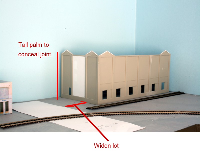
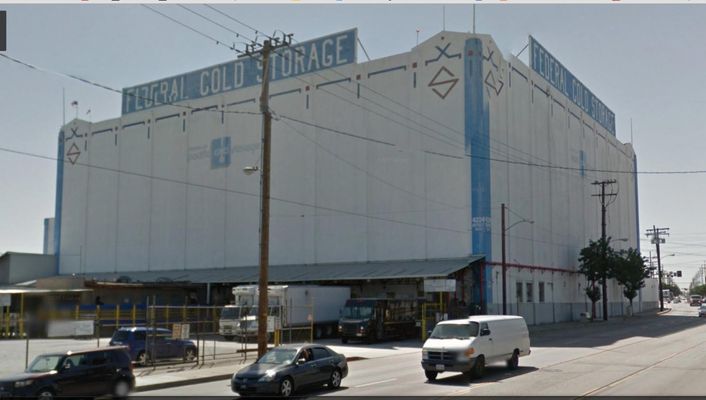
I’ve mentioned a number of times how much I rely on mock ups to test scene composition. Call it my blind spot, but I have a hard time visualizing exactly what things will look like when viewed in two dimensions on paper. My original plan was to put a low, one story building in the corner “L” of the layout. Tall buildings abutting the backdrop can be problematic visually, especially the thinner they are. I placed my planned, one story, subject in the corner location and it left me totally unmoved. Placed in the corner it just looked “wrong”. Breaking convention, at least in this location, I needed something taller. The answer was easy to find in the iconic Federal Cold Storage building a few blocks away. I “think” the width of the structure, along with some judiciously placed trees will get me by the backdrop transition problem. With the change in the layout, I’ll probably have to rethink other features such as the cold storage door, but I think the new layout can accommodate it better.
The model is based on a kitbashed RJ Frost kit from Walthers. There is always some interpretation involved in creating the look you want. There is also an art to avoiding the land mines that ultimately result in that hard to define “model railroady” look. As cool as the sign is on top, I have a hunch this will look better if I omit it. As bitter of a pill as it is to swallow, I’ll also need to allocate a fair amount of space for the lot out front to avoid the toy look.

