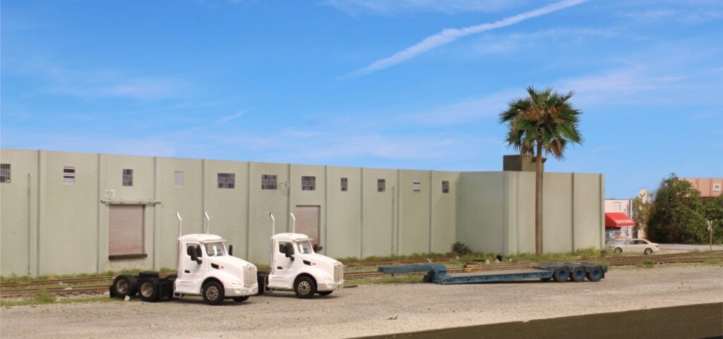
Tony Koester made some excellent points in his March Trains of Thought column. The piece dealt with one of the most important modeling topics, color management. He made a point that often gets skipped over and that’s the fact that we view things through atmosphere. As a result, saturation drops off with distance. In addition, sheen (aka degree of gloss) does as well. Since we view our models from a few feet away, we need to dial that atmospheric effect in manually.
I recently picked up the two tractors above from Truckstop Hobbies. They were decent but, like most vehicles models, had some toylike features that needed to be toned down. In real life these trucks would have a fairly glossy surface….when viewed up close. But….realism is enhanced if we take the gloss out to create a sense of distance. The windows were masked and I airbrushed on a few layers of Dullcote. The mirrors were removed and airbrushed flat black, a more common color for them. The wheels needed some major backstepping so these were given some layers of chalk weathering and an India Ink wash. A light ink wash was applied to the grills as well to bring out the detail. The end goal was to remove the look of a shiny toy and (hopefully) instill a higher degree of plausibility.
Amen! As a painter an early trick I learned was to analyze color using a gray card with a small hole in the center. Looking though the small hole isolates the observed object or area from the surrounding color and also shows the atmospheric perspective’s effect. This gives you the best read of what is really going on versus what you think is going on. Using this tool you become sensitive to the realities of color and better focused on finish across everything. The best layouts exploit these effectively tying everything modeled into a cohesive whole effect, and far more subdued and de-saturated than people realize.
Great tip! Thanks Dave.