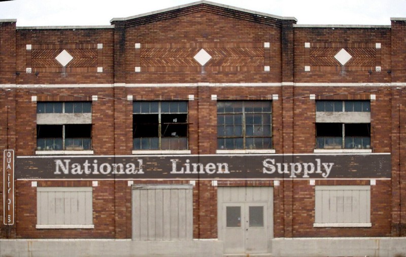
Looking at the BT track plan I’m going to start construction in the area that appears in the upper right of the track plan drawing. Next up is National Linen Supply across the street from the freight station. The challenge in capturing the feel of WW2 era structures is how to handle the signage. Printing the signs, cutting them out, and gluing them on won’t work and looks exceptionally cheesy. If you go that route the paper is too thick, the edges too obvious, and the lack of brick texture is apparent. Making your own decals will work but hoofing off to kinkos and begging them to run your decal paper through their (very expensive) machines gets old. That leaves the tried and true photo wallpaper technique which gives you the most control of the process. I downloaded an image from the net of an appropriate brick structure and squared the perspective up in photoshop.
The challenge was the sign itself which took the better part of an afternoon. I wanted a faded, peeling paint look with some of the bricks showing through. Photoshop font is too crisp so I used a blurring tool to soften the edges. The band is charcoal gray not black and the lettering is slate gray not white. Extending the column edge shadows down across the band completed the process.
