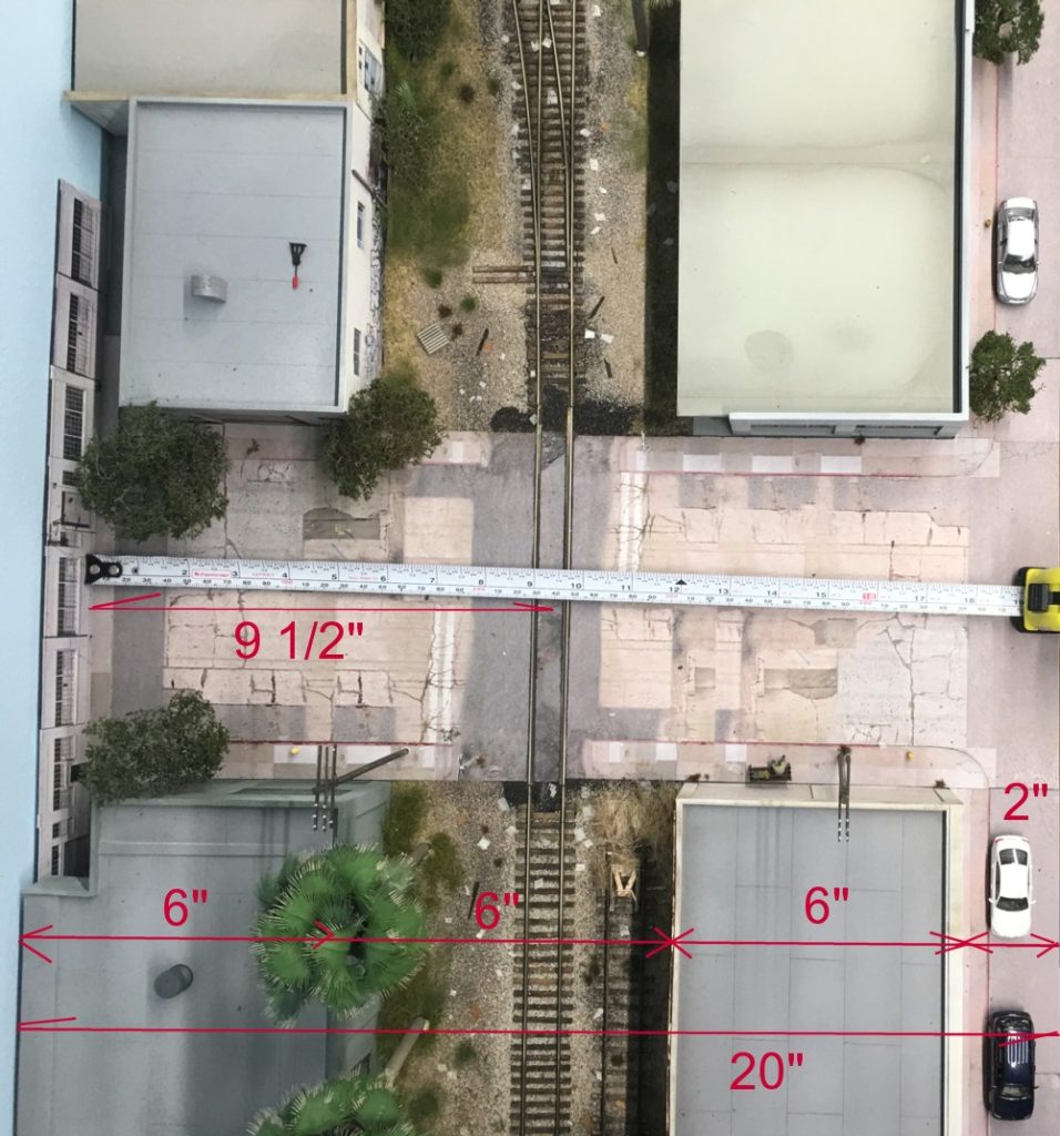
Recently David, one of my blog followers, wrote to ask how deep my foreground structures were (six inches to get to the point). David’s question made me realize that the spacing in the above photo is something I gave an enormous amount of thought to but never really wrote about. In terms of composition, the spacing was one of the more important artistic decisions to be made. There wasn’t a magic formula used to arrive at the above numbers but rather a lot of testing with mock ups and trial and error, in other words the “eyeball” test.
Clearly the depth of the structures is very compressed but because of the viewing angle it’s not that noticeable. Again, I did a fair amount of testing to see how much compression I could get away with before things started looking odd. As you look at the above photo the most important dimension isn’t the foreground, it’s the depth of the structures in the back (between the backdrop and rail). I settled on six inches in this case. There is a natural tendency in our space starved world to make background structures very shallow….from just an inch or two down to a pure flat. Unless you can hide the edge point where the structure meets the backdrop such a narrow treatment looks very “model railroady” Also notice that rather than running the street into the backdrop, which never really works visually, I made use of a “T” intersection (the road running back “Tees” into a road in the background running left to right). The background road running left to right road is highly compressed but because of the viewing angle that compression isn’t obvious.
