One of the most important decisions related to structure building, and one you don’t hear much about, is the actual selection of the structure that should be modeled. Masterfully building a structure that is an ill fit for your theme doesn’t get you anywhere. Easier said than done as it’s more art than science in many cases. Even in a purely prototypical situation, decisions will need to be made as to how to compress the scene, which structures to build and which to omit. Rail served versus non-rail served isn’t a very good guide as often it’s the structures that don’t receive cars that set the stage and put a geographic stamp on things. You really need to touch a lot of bases at once. You want something interesting. You want something representative of the area. However, you need an enormous amount of willpower and self-discipline to avoid “cherry picking” and ending up with a block of buildings selected only for their “coolness” factor. Failure to do so will leave you expending an enormous amount of effort only to have the vague, unsatisfying feeling, of not fully creating the prototype vision that you have in your minds eye. If I can give any advice on the subject it would be, when in doubt, go “boring”.
Although the LAJ layout is loosely patterned after the Horn Lead, it’s not an exact match. Hence the challenge. All of the structures used thus far exist in the general vicinity, but I still need to make decisions as to which ones to use and which ones to skip.
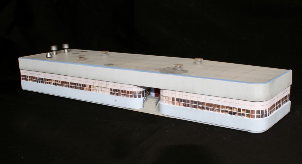
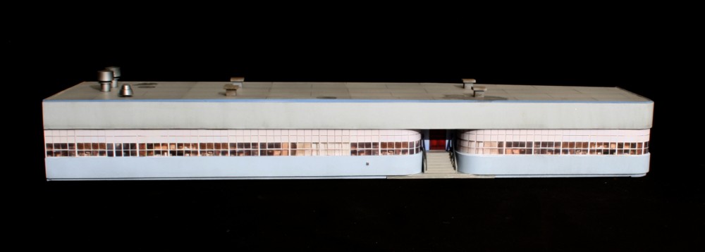
With this structure, color matching became an issue as I only used photo wallpaper for the windows and doors (I’ve posted the window image file in my photo wallpaper page). Originally, the color used for the lower band, while being close to the prototype, appeared to too stark on the layout. I made the decision to freelance with a custom mixed, very powdery blue (White with Model Master RAF Azure mixed in). Also, since the surface was painted with an airbrush, I didn’t get the natural color variation subtleties you’d get with photo wallpaper. The colors were too uniform. To break up the uniform color of the top and bottom bands I applied a very weak India Ink/alcohol wash (1/2 tsp. per pint) with a wide soft brush using vertical strokes.

