Controlling what portions of a layout a visitor sees at any given time, and from any given location, enhances the viewing experience. I can’t think of any layout I’ve been to where this is even an issue….except mine. In most cases the shape of the layout, walls, backdrop locations, or geography frame the layout in a natural way.
The actual Downtown Spur runs straight as an arrow for three and half miles, east to west, through flat urban scenery comprised of low lying one story warehouses. I didn’t have the luxury of a hundred foot long by eight foot wide room in my house so I had to bend the design into a G shape to make the straight route fit in the square twenty by twenty space. There are no interior walls in the layout room to block sight lines nor are there any hills or mountains to do the same. Most of the peninsula areas are set up to be viewed and operated from both sides. Operationally this works fine. Individual scenes look fine.
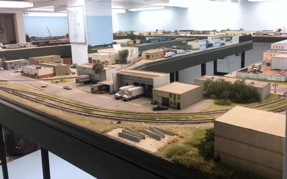
However…..as you enter the room the entire layout unfolds before you in what I could best describe as “visual splat”. The entire thing is there in front of you in one heaping portion. When newcomers visit I can sense the confusion as they to try to organize in their minds what they’re seeing. If I had an extra ten eight feet of room width and length (don’t we wish!) I could run walls down the aisles as view blocks. I don’t though.
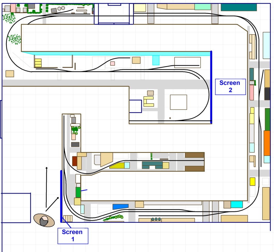
That leaves me considering adding some view blocks. Locating them gets tricky in a hurry. It’s not something you can work out on paper. You need to use mock ups. Located the screens isn’t as simple as I thought it would be and for each problem solved new ones arise in terms of blocking off lighting and access to track.

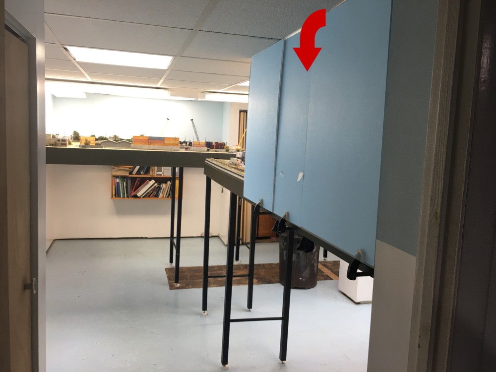
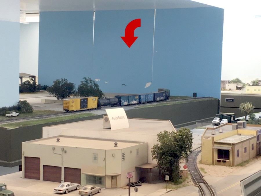
After spending a few hours experimenting with clamping poster board to the fascia the two locations shown above appear to be the most viable. Screen 1 helps quite a bit and isn’t in an area where access is crucial. Screen two is more of a “maybe”. In both cases I’d need to add more lights because the screens block the existing lighting.

Screen 1, mocked up above, would be the easiest to add and would give the biggest payoff. I’d need to add another room light though.

I’d have to think about screen two. It helps but, while it blocks off the views that are distracting, it also blocks viewing angles from the other side I’d like to keep.
The other thing I need to consider is how few visitors I have over. The regulars understand what I’m trying to accomplish and don’t seem to be bothered. Open houses are only every year and a half or so and I don’t have regular operating sessions with guests. Is it even worth dealing with? Something to ponder.