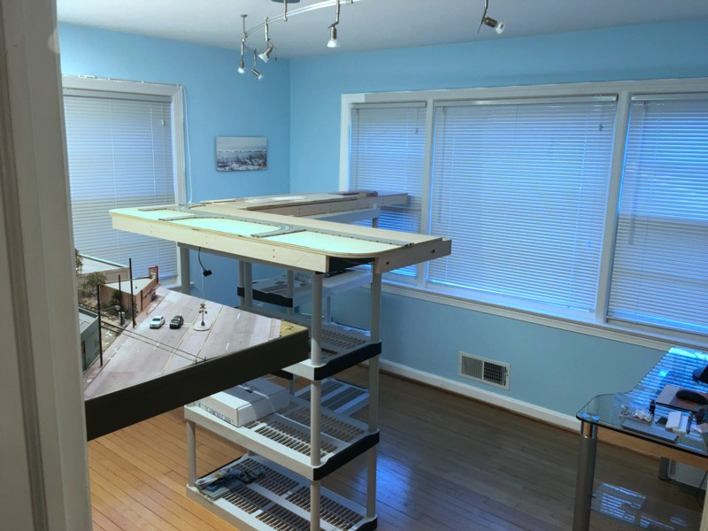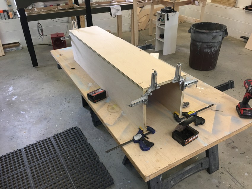
In addition to the satisfaction we get out of building and running our layouts, they can also provide enjoyment through the simple act of just looking at them. That is, taking them in and viewing them as we would a work of art. In that vein I’m setting up the front room of my home as a layout “art gallery” for lack of a better term. The goal is to create an environment where I can go to take the work in or allow visitors to see it. I’ve been trying to visualize how a professional sculpture gallery is set up and follow the same approach. If there is one characteristic that stands out it’s the lack of clutter. You have the sculptures (supported on pedestals) and that’s it, generally no other furniture. The first step was cleaning up all of the light and computer chord runs with zip ties and chord covers. All furniture was removed from the room with the exception of the computer desk. I was going to move the desk but the fact that it is entirely glass does wonders in terms of making it essentially invisible. The support of the layouts is important visually. The LAJ is on floating shelves. The Brooklyn Terminal, my present layout project, will be supported on three column like pedestals which will be painted semi-gloss black. I really wish I could have made the Brooklyn Layout one foot shorter on the long leg of the “L” but it simply wouldn’t work out operationally so I had to make a small concession visually. By luck, the room has two large windows which allow light to stream in for a pleasing effect in the afternoon hours.

