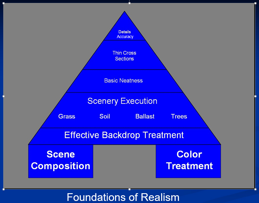
Scene composition, more than any other factor, telegraphs to the eye whether our work is believable or not. It matters more than detail, more than construction neatness, and more than prototypical accuracy. For our purposes, I’ll define scene composition as the elements we choose to incorporate, their size, shape, relative position, and spacing. Since composition carries the lion’s share of the weight, it makes sense that it carry a proportionate amount of our attention.
For the proto-freelancer, which to some extent we all are, it becomes an exercise in threading a needle. We want to select elements that strike a balance between interesting focal points and non-descript “frames” that don’t distract from the central viewing subject. If all of the subjects are boring it’s like looking at a gray screen. If all of the subjects are “interesting” they compete with one another, the scene looks like a circus, and believability is compromised. To start, ALL of the elements should be representative of the region are modeling. Next, select elements so that you have roughly one “interesting” focal point balanced by three or four non-descript “boring” framing elements. With this balance, the eye is drawn to the focal point and not distracted by competing structures or scenery.
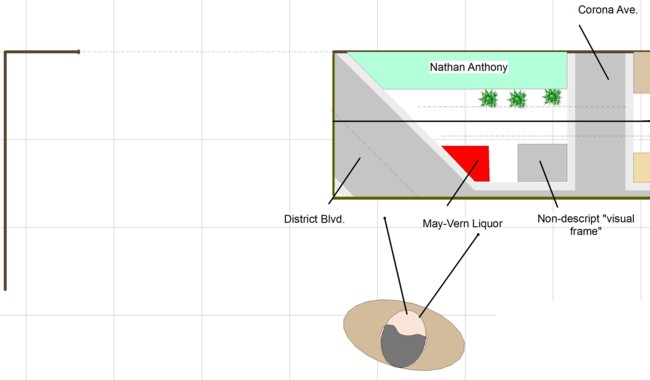
Put into practice, here’s how I composed the scene you see as you walk into the layout room. May-Vern Liquor is the focal point. The art deco appearance is interesting, the name gives a regional stamp, and yet it’s not so large as to be in your face. District Blvd. runs diagonally across the viewing area to break up the ninety-degree planes. May-Vern’s diagonal shape dovetails into the diagonal corner of District Blvd. With the centerpiece fixed, the next step is to frame it in such a way that the adjacent element isn’t a distraction. We want something that fits with the region but isn’t too over the top.

My original candidate for the framing structure was the art deco building at 4330 District Blvd (left). After thinking about it, this building was just a little too interesting and as such would distract the eye from the focal point. A little digging around turned up the low-key faded cream and rose garage on Fruitland Avenue (right). The garage has a lot of surface texture and subtle coloring interest but isn’t over the top visually.
The palms were placed to provide a visual stamp but oriented to the right of May-Vern, not directly behind it, again to provide a frame.
Background structures can be dicey and need to be handled carefully. Any depth at all you that you can squeeze in will help and the lower the height, the better. If you go more than one story tall, then you run into a transition problem where the edge of the background structure touches the backdrop.
Vertical elements such as poles create much more “pop” than you would think but again, they needed to be handled carefully. Rather than going with the prototypical reddish brown of an actual pole I painted the poles Model Master US Army Helo drab to subdue them slightly. It’s also important that poles be neatly constructed, aligned perfectly vertical, not spaced too closely together, and modeled without wires (because wires don’t scale down). Getting the correct pole and cross-arm thickness is important as well. The shorter pole next to the signal box is a little too thick and will be replaced with something thinner.